
Choose a Theme
Use one of four professional themes:
- Use out-of-the-box
- Customize to meet brand guidelines.

Accelerate app development with Telerik UI for Blazor - a complete set of 120+ high-performance, accessible controls, MCP Servers and more.
30-day FREE trial. Free technical support and training during your trial. No credit card required.
Blazor UI components are also included in DevCraft bundles. Learn more.
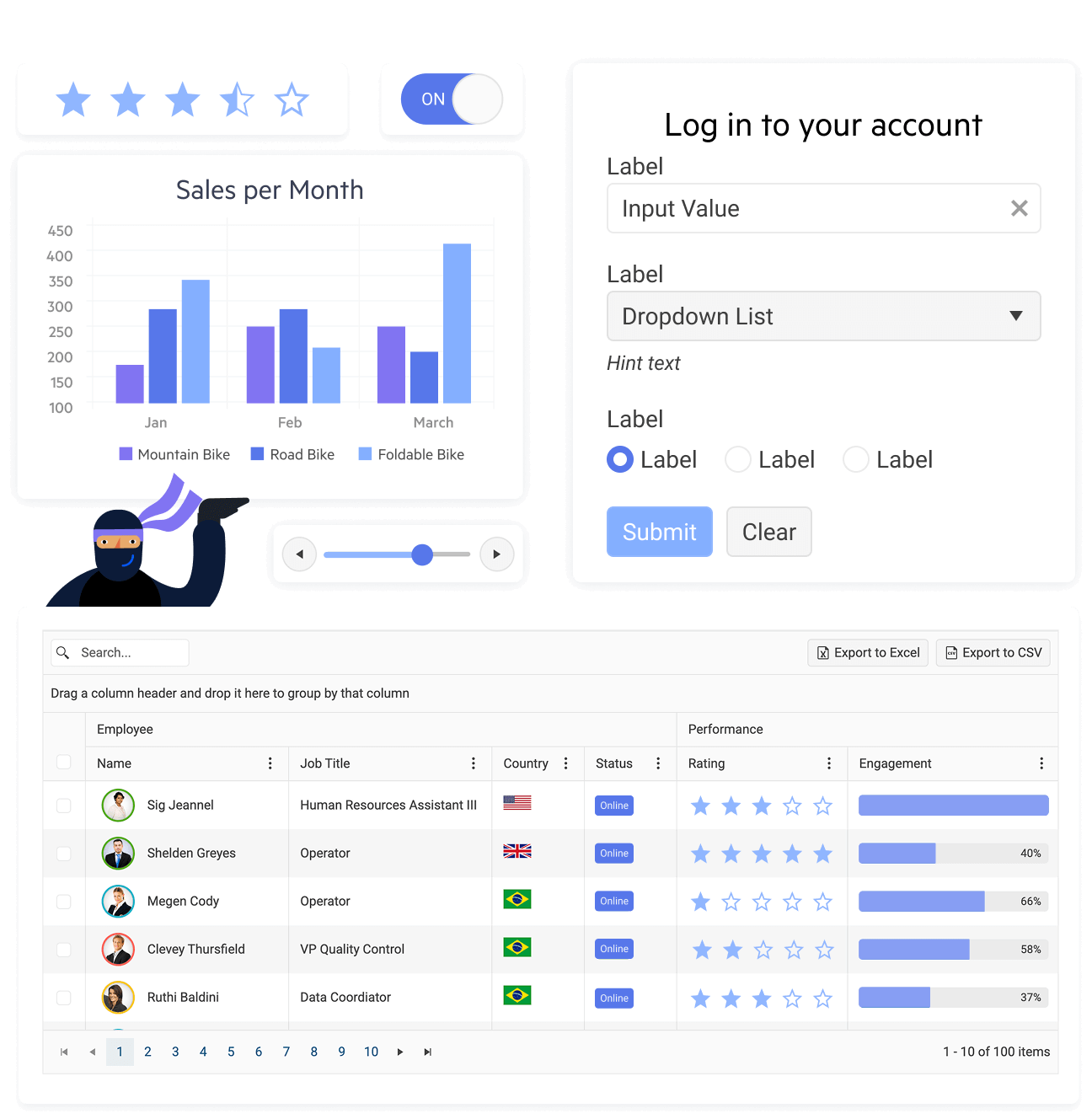
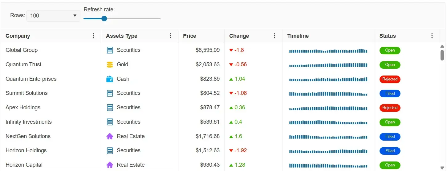
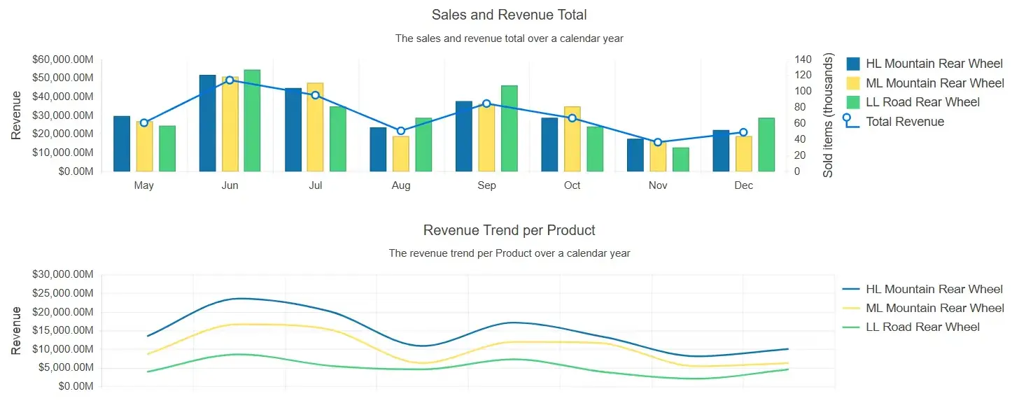
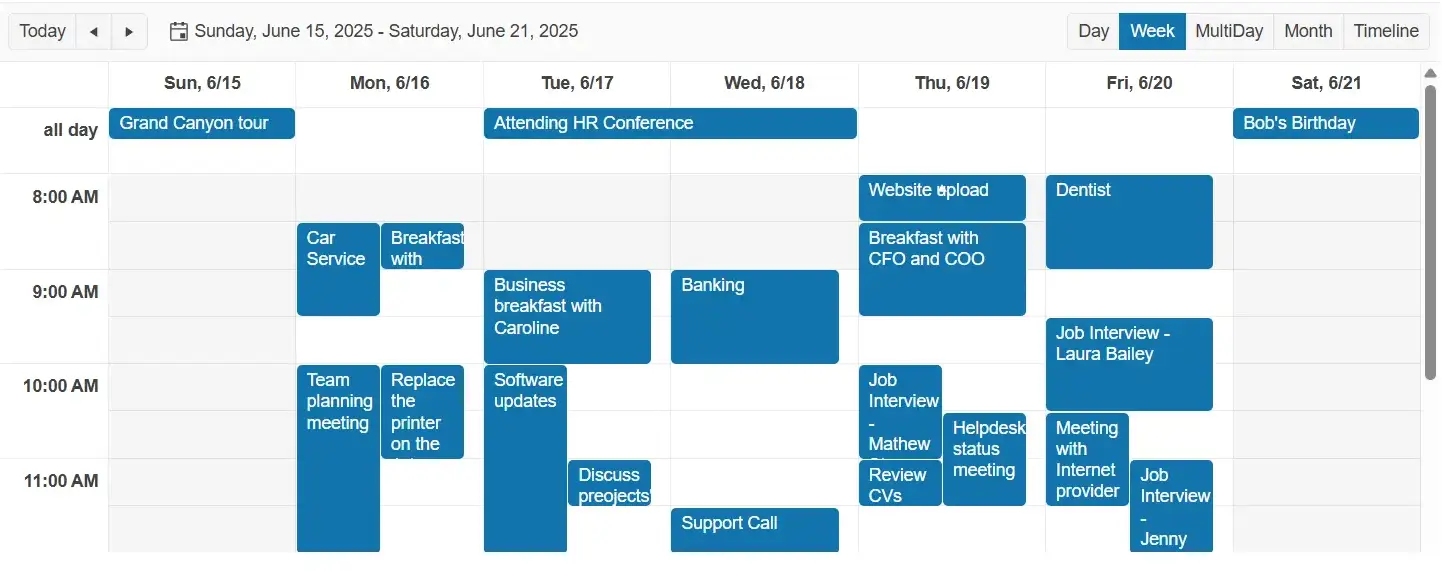
A Blazor developer has too many tooling decisions for every project. Replace separate purchases for grids, schedulers, charts, PDF viewing, and form controls with one integrated Blazor component library.

MCP Servers for Developer Productivity
AI tools that bring Telerik UI context to your LLMs for better outputs.
AI and Agent-Ready Components
Build modern apps faster with AI-ready UI components, smart features and WebMCP integration.
Explore components, modify code, run code snippets, scaffold, style and theme entire pages, and see results live using the Telerik REPL for Blazor – a browser‑based, cost-free Blazor playground.

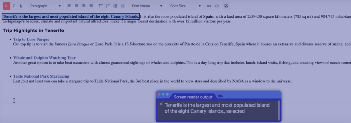
Telerik UI for Blazor components offer unmatched built-in accessibility and comply with WCAG 2.2, WAI-ARIA and Section 508.
Telerik UI for Blazor makes your job easier without getting in the way.
30-day FREE trial. Free technical support and training during your trial. No credit card required.
120+ enterprise-grade components for Blazor, AI tools, ThemeBuilder, four professionally designed themes, and Visual Studio Code productivity tools.
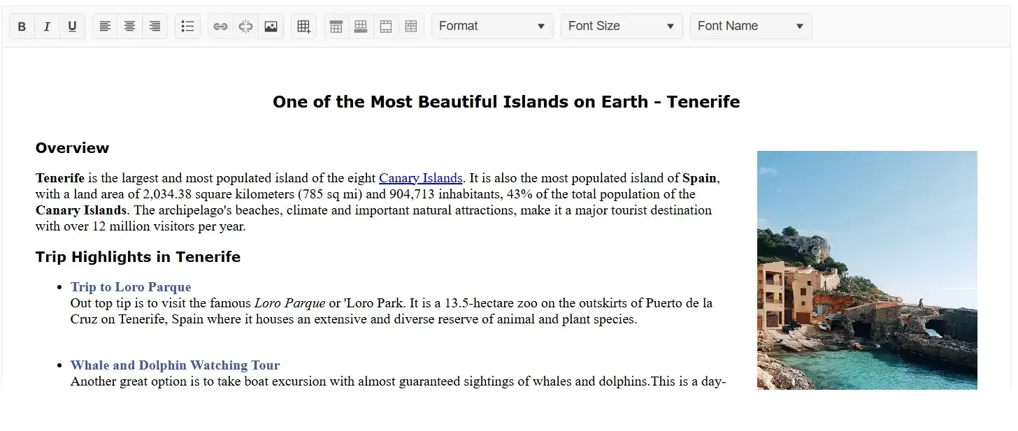
Have you worked with a design-friendly UI library before? Whether you have a designer on your project or not, Telerik UI for Blazor brings the tools you need to simplify the process and improve the quality of your app's UI and UX.
Use one of four professional themes:

Quickly spin off common page types using building blocks and page templates.

Use ThemeBuilder to style your app without dealing with complex CSS rules.

Get all your styling questions answered with the detailed design and front-end documentation.

Give the Figma UI kits to your designers and start speaking the same language.

Import the Figma design into ThemeBuilder to generate the CSS.

Map the Figma variables to your UI components in ThemeBuilder and automatically sync design updates.
Get all your styling questions answered with the detailed design and front-end documentation.
per developer,
per year
per developer,
per year
per developer,
per year
per developer,
per year

Check out these runnable sample apps built with Telerik UI for Blazor and get the source code.

An example of how to implement a PWA (Progressive Web Application) functionality into a Blazor WebAssembly app.

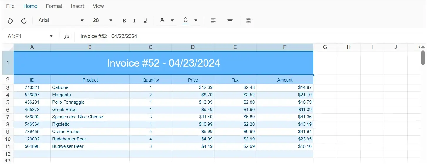
See how the powerful Blazor DataGrid and Chart UI components play together in a dashboard application.
The Blazing Coffee PWA showcases the capabilities of more Blazor controls, including Grid, Charts, TileLayout, and more.
Awards
Greatness—it’s one thing to say you have it, but it means more when others recognize it. Telerik is proud to hold the following industry awards.
Create, run, save and share code snippets and examples from the comfort of your browser, leveraging Telerik REPL for Blazor. This no-cost playground speeds up project creation by letting you work with pre-built components, editing demos on the spot and saving and sharing your work. Visit the following pages for more information:
Learn more about Telerik REPL for Blazor Explore the playground Start fast with pre-build Blazor code snippets Check out Telerik REPL for Blazor documentationVisual Studio Code Integration
Maximize your efficiency with the Telerik Extension for Visual Studio Code. It allows you to generate pre-configured projects for Telerik UI for Blazor components. Additionally, the extension supports code snippets for fast UI component reference and configuration.
Visit the following pages for more information:

Embedded Reporting
Transforming raw data into actionable insights is the core function of reporting. Simplify development workflow with an intuitive embedded reporting tool that helps developers enable business users to easily create, edit and view reports on their own. Embed Reporting into Blazor, Angular, ASP.NET Core, WinForms, WPF and more apps. You can buy Blazor and Reporting in Telerik DevCraft Complete and Ultimate bundles.
Learn more about Telerik Reporting Explore Embedded Reporting for business users Check out Report Designers Check out Report Viewers

30-day FREE trail. Free technical support and training during your trail. No credit card required.
Blazor UI components are also included in DevCraft bundles. Learn more.


