
UI for Blazor
Blazor Buttons
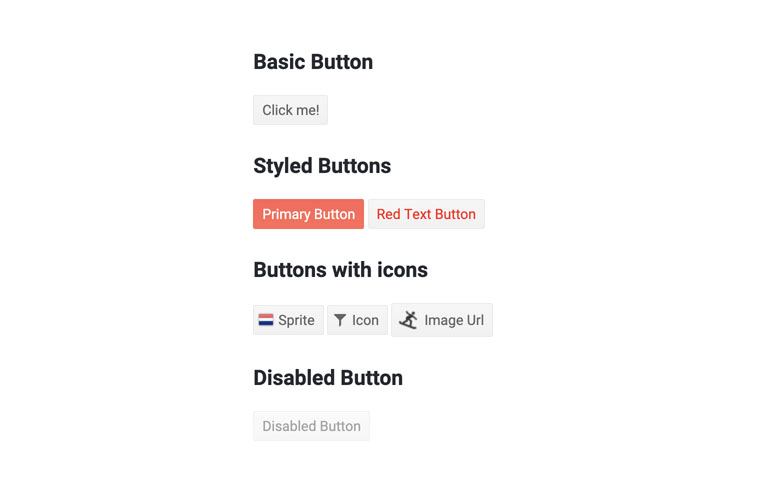
- The Blazor Button component features three button types and styling capabilities for theme, click event and icons.
- Part of the Telerik UI for Blazor library along with 120+ professionally-designed UI components.
- Includes support, documentation, demos, virtual classrooms, Visual Studio Code Extensions and more!
-
Full Set of Functionalities with Blazor Buttons
The Telerik UI for Blazor Button is a component that provides full control over its visual appearance based on the chosen theme, click event and icon in both Blazor WebAssembly (WASM) and server-side Blazor apps.
The Blazor button can be rendered as Submit, Button and Reset type of button and provides the option to apply image, sprite or a font icon in it, so that you can illustrate its purpose to end users. It has built-in keyboard navigation and gives flexibility to developers through its OnClick event.
-
Styling Blazor Buttons
The Button component offer s multiple options for styling: through its Class attribute, by using image, sprite or a font icon. To customize the Button in your Blazor apps, all you have to do is set the Icon, SpriteClass or ImageURL attributes, or simple reuse one of the available built-in font icons from the Telerik UI for Blazor suite.
Another way to customize the Button component is to apply the predefined Primary button styling. Through its Primary property, the button receives strong color and stands out in the Blazor app. This way the component becomes more visible and attracts user attention for clicking.
Of course, you can also set the Class of a component instance and tweak it as needed with your own CSS rules.

-
Form Parameter
A button can be turned into a form submission button by setting the button’s Form property to point to the Id of the form you want to assign the button to.
-
Blazor Button OnClick Event
The Button component exposes OnClick event to enable you handle user click actions in Blazor applications code.

-
Blazor Button Keyboard Navigation and Accessibility
Semantic HTML and support for the accessibility standards (including WCAG, Section 508 and WAI-ARIA attributes for screen readers) let users with disabilities use the Telerik Blazor Button with ease.
The Button component has built-in keyboard navigation allowing end users to easily navigate, focus and click on buttons using their keyboard.

-
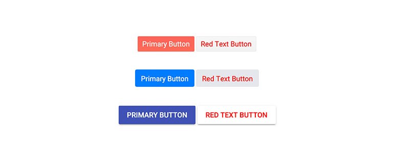
Blazor Button Themes
The Telerik Blazor Button component has several built-in themes such as Default (our own styling), Material (based on the Material Design guidelines), Bootstrap (which looks like the Bootstrap styling to integrate better) and Fluent (based on Microsoft Fluent UI). You can easily customize any of out-of-the-box themes with a few lines of CSS, or create new theme to match your colors and branding by using the Telerik SASS ThemeBuilder application.
-
Blazor Button Types
The ButtonType property of the Button component allows you to configure the type of element you want to be rendered. The available button types you can set in Blazor applications are as follows:
Submit - Renders a type="submit" attribute. Can submit the form and trigger validation. The default value.
Button - Renders a type="button" attribute. Does not invoke form validation and submission.
Reset - Renders a type="reset" attribute. Can reset the current form.
-
Right-to-Left (RTL) Support
The Telerik UI for Blazor Buttons component supports right-to-left configuration. The RTL functionality is supported by most of our components to accommodate users who communicate in a right-to-left language script, such as Arabic and Hebrew.
Learn more in our Blazor Right-to-Left Support documentation

