
UI for Blazor
Blazor DropZone
- Empower users to drag and drop files to a designated area on the web application or page leveraging Blazor DropZone.
- Part of the Telerik UI for Blazor library along with 120+ professionally-designed UI components.
- Includes support, documentation, demos, virtual classrooms, Visual Studio Code Extensions and more!
-
Dragging and Dropping Made Simple with Blazor DropZone
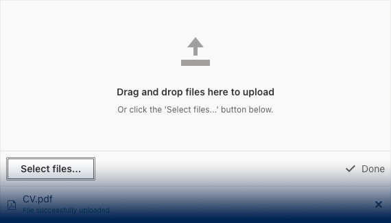
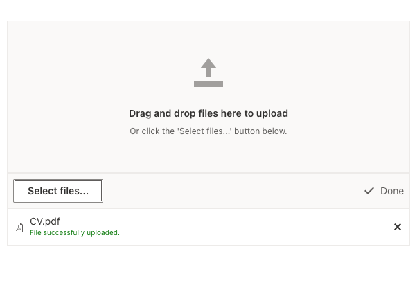
The Telerik UI for Blazor DropZone component allows users to effortlessly drag and drop files to a specific area within a web application or page. This UI control elevates the overall user experience by automatically transferring the selected file or image from the designated zone.
-
Seamless FileSelect and Upload Integration
Leveraging the Telerik UI for Blazor DropZone component, users can declare an external drop zone for an existing FileSelect or Upload component thanks to the native integration between the components. Simply match the value of the DropZone Id parameter with the DropZoneId parameter of the FileSelect or Upload components.
Learn more in the Telerik UI for Blazor DropZone documentation
-
DropZone Template
The Telerik UI for Blazor DropZone component enables you to render the arbitrary content inside the component leveraging the Template parameter. The Template is a RenderFragment and allows you to add any custom content required, such as simple text, HTML elements or other components.
-
Appearance
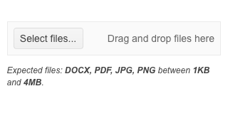
Apply custom CSS styles to the Blazor DropZone component when the user is dragging over it by leveraging the DragOverClass parameter. You can also customize the width and height of the DropZone component to align it with your design requirements or personal preferences.
The DropZone component also features customizable and localizable hint and note parameters:
- HintText outlines the text for the DropZone hint. when such text is not provided, the DropZone will render a default value—"Drag and drop files here to upload."
- NoteText is an optional content placeholder inside the DropZone. You can use it to render any additional information below the hint.

-
Right-to-Left (RTL) Support
The Telerik UI for Blazor Drop Zone component supports right-to-left configuration. The RTL functionality is supported by most of our components to accommodate users who communicate in a right-to-left language script, such as Arabic and Hebrew.
Learn more in our Blazor Right-to-Left Support documentation

