
UI for Blazor
Blazor Data Grid
- Visualize data and let users edit it with features like sorting, filtering and 100+ more with the Telerik UI for Blazor Grid.
- Part of the Telerik UI for Blazor library along with 120+ professionally-designed UI components.
- Includes support, documentation, demos, virtual classrooms, Visual Studio Code Extensions and more!
-
Enterprise-Ready Blazor Data Grid
Deliver fast, flexible, and accessible data experiences in your Telerik UI for Blazor apps with the Data Grid. Bind to millions of records, shape data on the fly, edit with confidence, export with one click, and meet modern accessibility and keyboard standards. Why choosing the Telerik UI for Blazor Grid?
- Native Blazor Grid, built for performance
- All the fundamentals, already done, including sorting, filtering, paging, grouping, aggregates, selection, column menus, and more
- Editing that fits your UX
- Designed for real-world, enterprise-ready apps
- Built-in smart features for modern, AI-ready apps
- Accessible and keyboard‑friendly
-
Smart Features
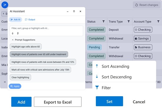
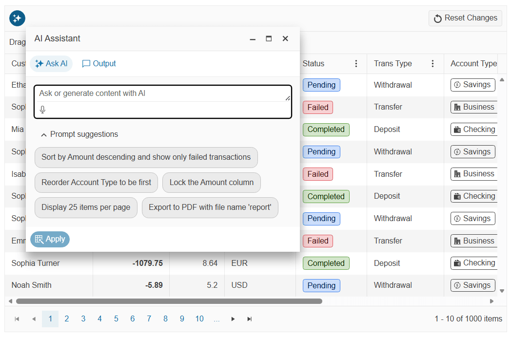
The Telerik UI for Blazor Data Grid smart AI features let users drive complex data operations with natural‑language prompts, enabling filtering, multi‑column sorting, grouping, highlights, column show/hide and reordering, pagination, selection, and even data export.
- Smart Box: A single, streamlined place to run Semantic Search and ask AI‑assisted questions
- AI Chat Assistant: Give users a conversational way to explore and interact with Grid data
- AI Toolbar Assistant: A built-in toolbar tool that integrates an AI prompt interface directly into the Grid toolbar so users can type prompts referring to data operations like fitlering, sorting, etc.
- AI Column Assistant: Add an AI-powered column where users can ask questions about row data, generate summaries, or perform quick transformations.
- AI Row Highlight: Enables intelligent highlighting of rows and cells
-
Data Binding and Loading
Bind the Telerik UI for Blazor Data Grid to any IEnumerable<T>
for simplicity or use the OnRead event to page, filter, sort, and group on the server. OnRead is ideal for big data scenarios, reduces memory pressure, and works seamlessly with virtualization and export. At a glance: Two binding modes: Data (in‑memory) for quick start; OnRead for server/API‑driven apps. Manual operations: Full control over paging, filtering, sorting, grouping and load‑on‑demand through OnRead.
-
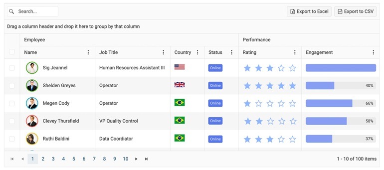
Data Operations
Empower users to shape data the way they work:
- Paging: Enable with a single parameter, customize page size, react to page changes, or load pages on demand.
- Sorting: Multi‑column sorting with intuitive header actions and events for custom logic.
- Filtering: Choose Filter Row for instant inline filtering or Filter Menu for richer criteria. Support for distinct‑value checkbox lists, search box in the toolbar, and custom filter editors.
- Grouping and aggregates: Drag headers to group, nest groups and compute aggregates.
- Selection: Single or multiple selection, including keyboard shortcuts.
-
Editing and Validation
Pick the editing UX that matches your scenario, wire it to your data service, and leverage built‑in validation.
- Edit modes: In‑Cell for spreadsheet‑like changes, Inline for row edits, Popup for form‑style editing, and more.
- CRUD events: Handle OnCreate, OnUpdate, OnDelete and refresh data with a straightforward pattern.
- Model requirements: Parameterless constructor (or OnModelInit), unique key, and public settable properties ensure smooth editing.
- Validation: Ensures users can’t save invalid data, showing inline tooltips or popup summaries depending on the edit mode, with full support for custom validators when needed.
-
Virtualization and Performance
Keep the scrolling smooth and your UI responsive, even with wide tables and long lists.
- Row virtualization: Reuses DOM rows and loads data when the user scrolls, ideal as an alternative to paging. Configure Height, RowHeight and PageSize to nail the feel.
- Column virtualization: Render only the columns within the viewport for ultra‑wide schemas; combine with frozen columns and paging.
-
Templates and Customization
Build the UI you need from simple formatting to fully custom cells, rows, headers and toolbars. The Telerik UI for Blazor Data Grid lets you customize the content rendered in its cells, editors and various headers and footers so you can tweak it according to your needs and to also show extra data.
See the Telerik UI for Blazor Data Grid templates documentation

-
Data Export
Enable one‑click export to Excel, CSV or PDF with a click of a button that respects the user’s current data shape (sort, filter, group, order, column widths). Configure file names, page orientation/sizes for PDF, and programmatically tweak column formats and widths during export events.
See the Telerik UI for Blazor Data Grid export demo -
Built‑in “Quality of Life” Features
- Column UX: Resize, reorder, show/hide, freeze (pin) columns, auto generate columns, etc.
- State management: Save/restore user state (sorts, filters, groups, columns) via events or your preferred storage.
- Hierarchy: Nest detail templates for related records.
- Drag and drop: Supports drag between two grids and more.
-
Accessibility and Keyboard Navigation
Meet modern accessibility requirements and deliver a great keyboard‑only experience.
- WCAG 2.2 AA and Section 508 compliant with explicit ARIA roles for toolbar, group header, grid body and pager.
- Full keyboard control: Navigate cells with arrows, select with Space/Ctrl+Space, use F2/Enter for edit, PageUp/PageDown for paging, and Tab to move across Grid regions. Customize shortcuts as needed.
