UI for Blazor
Blazor ListView
- The Blazor ListView component lets you define the layout and functionality of your items, while iterating over the data.
- Part of the Telerik UI for Blazor library along with 120+ professionally-designed UI components.
- Includes support, documentation, demos, virtual classrooms, Visual Studio Code Extensions and more!
-
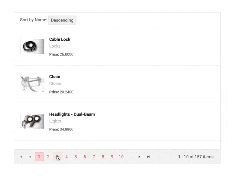
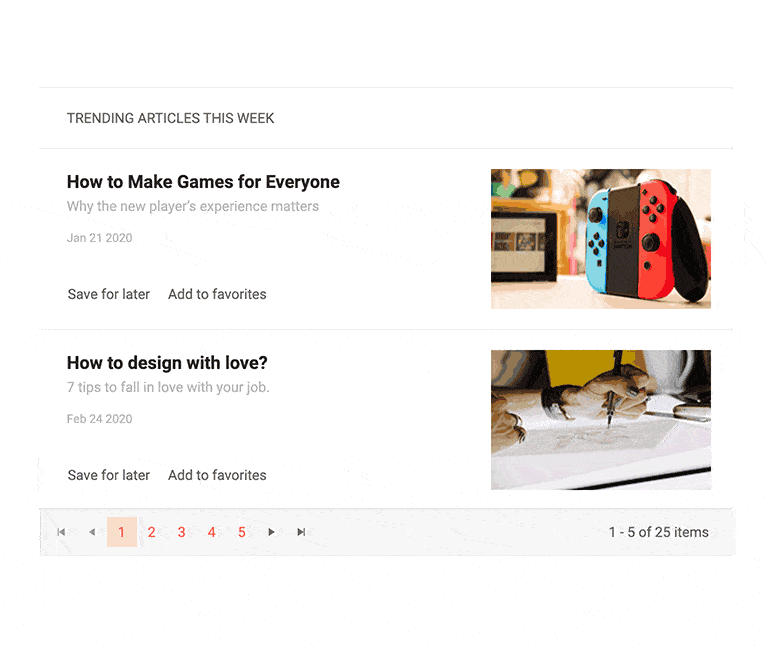
ListView Paging
The ListView component has built-in paging you can enable by setting the Pageable parameter to true and defining the number of rendered items per page (defaults to 10) via the PageSize parameter.
You can further configure the paging feature in four different ways:
- Specify the number of page buttons displayed
- Control the page size and what is shown so users can alter it
- Select a preferred input type:
- Buttons display numbers linked to the respective page
- Input field renders a numeric textbox, allowing users to type the page number they want to see.
- Dropdown field allows the user to select the page from a list
- Define the pager position to be bottom or top
-
ListView Custom Paging and Load Data on Demand
The ListView component allows you to fetch all the data at once, or load data on demand. For cases when you need to load large volumes of data, you can boost the performance by using custom paging and loading only fixed subset of items while the user browses through the ListView pages.
Example of ListView custom paging and loading data on demand.

-
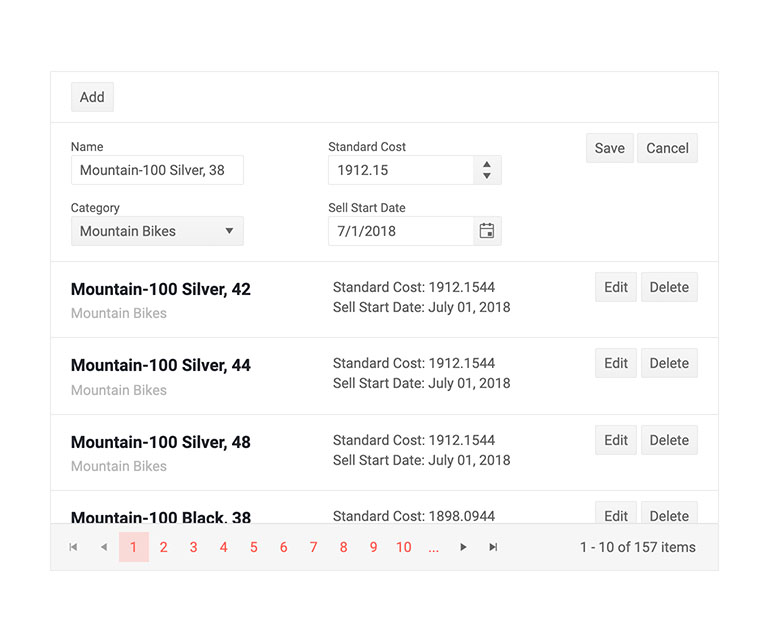
ListView Editing
The ListView component can easily handle create, update and delete (CUD) operations in your Blazor apps thought its EditTemplate and using CommandButtons. The ListViewCommandButton component provides the following built-in Command values: Add, Edit, Save, Delete, Cancel.
-
ListView Events
The ListView component exposes multiple events to let you handle data in Blazor apps. Below is a summary of the available events and their triggers:
- OnRead – fires when data needs to be fetched
- OnUpdate - fires when an existing item is saved
- OnEdit - fires when the user clicks the Edit command
- OnCreate - fires when a new item is saved
- OnDelete - fires when an item is deleted
- OnCancel - fires when the Cancel button is clicked
- PageChanged - fires when the user pages though the ListView

-
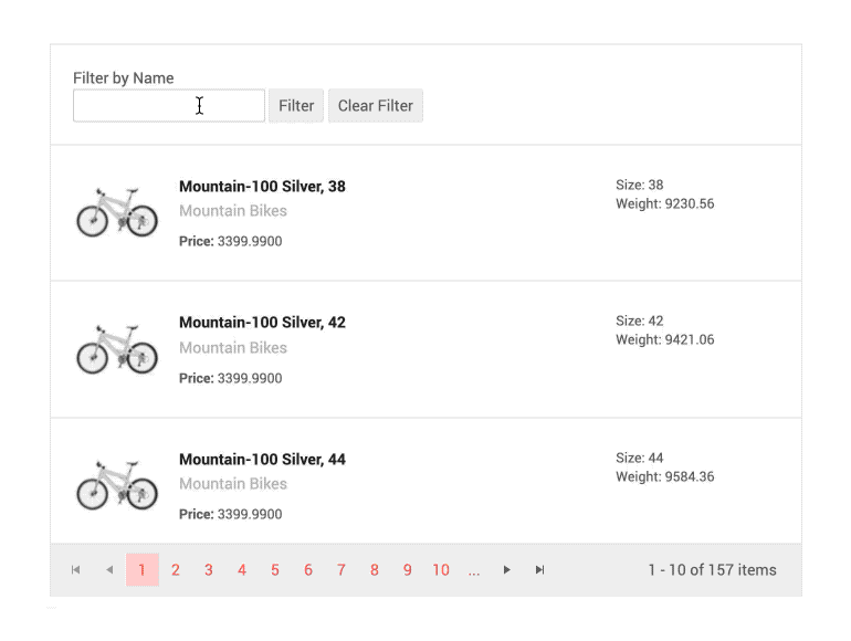
ListView Custom Data Source Operations
The ListView component provides options for implementing your custom data source operations. Just add a button (or other UI component) and invoke the corresponding action – whether it is calculation, loading data on demand or any other update to the data source.
-
ListView Theming
The Telerik Blazor ListView has several built-in themes such as Default (our own styling), Material (based on the Material Design guidelines), Bootstrap (which looks like the Bootstrap styling to integrate better) and Fluent (based on Microsoft Fluent UI). You can easily customize any of out-of-the-box themes with a few lines of CSS, or create new theme to match your colors and branding by using the Telerik SASS ThemeBuilder application.
-
Right-to-Left (RTL) Support
The Telerik UI for Blazor ListView component
supports right-to-left configuration. The RTL functionality is supported by most of our components to accommodate users who communicate in a right-to-left language script, such as Arabic and Hebrew. Learn more in our Blazor Right-to-Left Support documentation 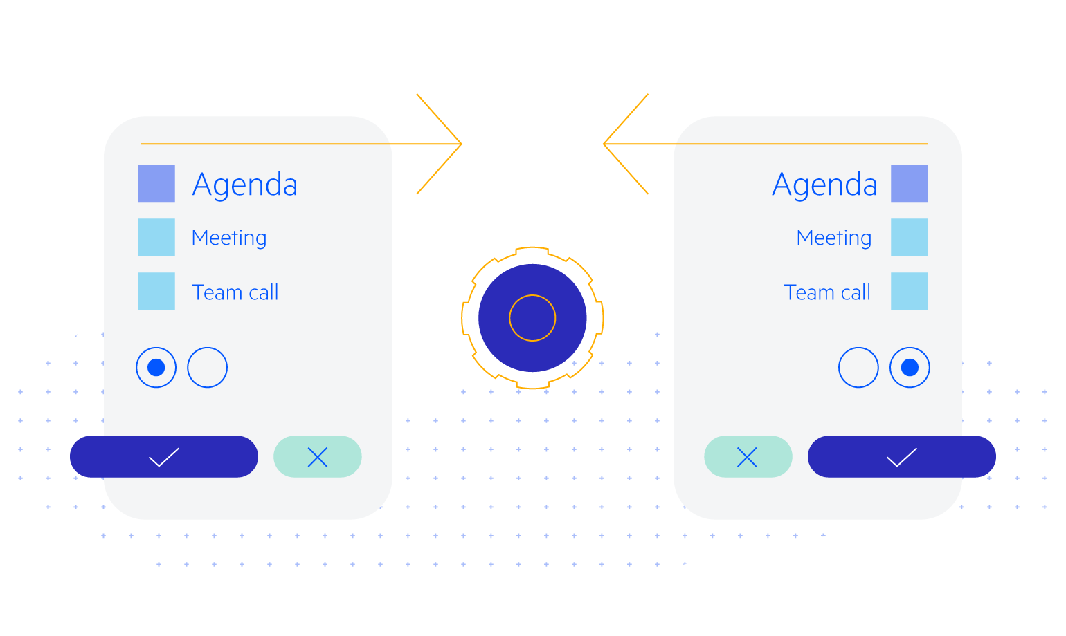
-
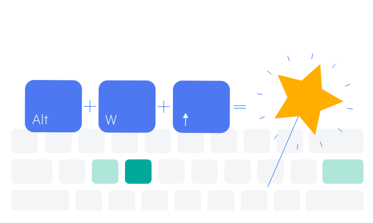
Keyboard Navigation
Enhance accessibility and productivity with keyboard-only navigation. Telerik UI for Blazor ListView includes keyboard navigation support, enabling users to navigate and interact with its items efficiently using only the keyboard.
See Telerik UI for Blazor ListView keyboard navigation demo
Learn more about Telerik and Kendo UI accessibility standards
-
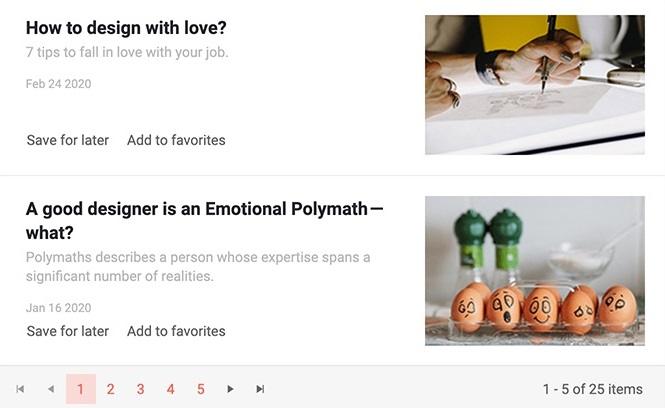
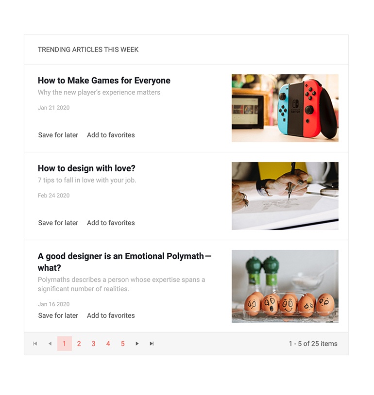
Display Items in Lists with Blazor ListView
The ListView component allows you to display items from data source in a fully customizable, stylish templated list in both Blazor WebAssembly (WASM) and Server-side Blazor apps. The ListView provides out-of-the box paging, multiple templates (item, header, footer and edit templates) allowing you design the UI of component anyway it fits. Furthermore, the component exposes multiple events such as: OnRead, OnUpdate, OnEdit, OnCreate, OnDelete, OnCancel, PageChanged and allows you to define custom data source operations.
Overview example of Blazor ListView component.
-
ListView Templates
You can fully customize the Telerik UI for Blazor ListView appearance through the various templates it offers:
- Template – defines how all ListView items are displayed (mandatory)
- Edit Template - the rendering of a ListView item in edit or insert mode
- Header Template - the content rendered above the list of items
- Footer Template - the content rendered after the list of items and before the pager
Example of Blazor ListView customization with templates.