
UI for Blazor
Blazor Form
- The Blazor Form component gives you creative freedom to easily set up your next registration, contact or other form.
- Part of the Telerik UI for Blazor library along with 120+ professionally-designed UI components.
- Includes support, documentation, demos, virtual classrooms, Visual Studio Code Extensions and more!
-
Display and Edit Data in User Friendly Manner with Blazor Form
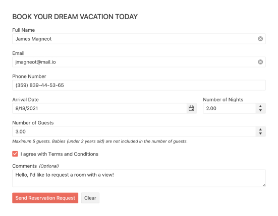
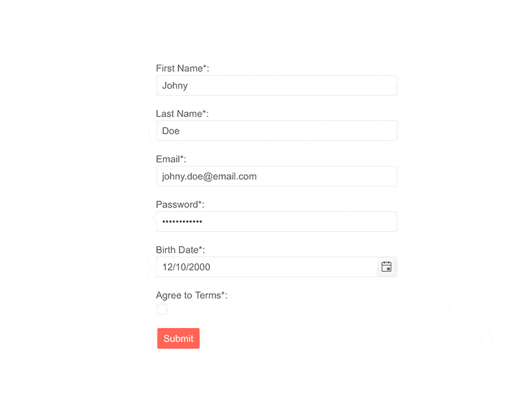
Creating all sorts of forms is easy with the Telerik UI for Blazor Form component. As with other Blazor components, it gives you creative freedom in how you want to build your next application’s registration page or contact form while also keeping it simple – it can even be autogenerated from your data model!
-
Data Binding
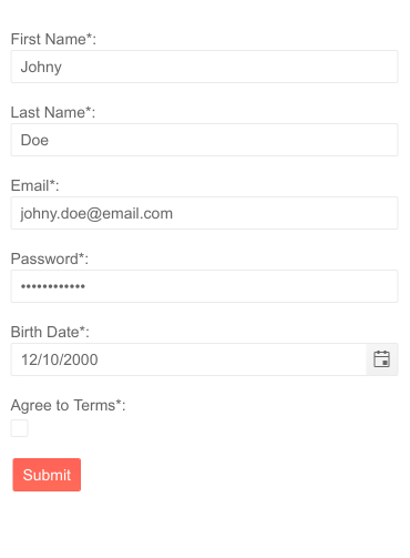
As mentioned, data can be bound to the Form component which will autogenerate all fields according your model, with different input elements used for different properties in the model (e.g. numbers will use a <NumericTextBox>.) This will both make sure set you the values of your model directly with what the user entered but also save you time. When the form is provided with a data model, it will automatically generate an input field for every property in your model, depending on its type!

-
Combined AutoGenerated and Custom Fields
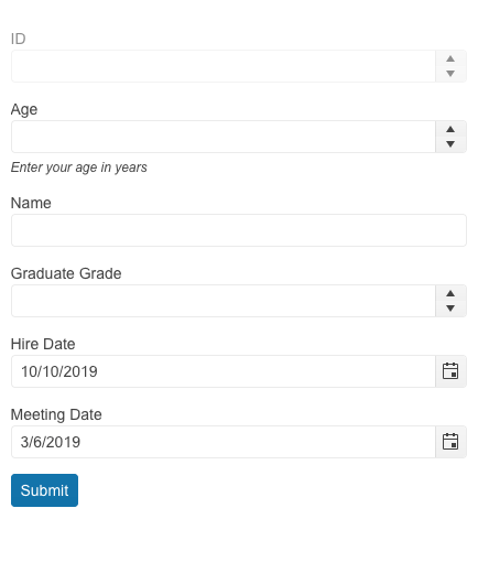
Leverage the AutoGenerated feature in the Telerik UI for Blazor Form component to automatically generate fields based on the field type it finds in the model. Benefit from the AutoGeneratedFormItems parameter to use both autogenerated form items along with manually declared ones. This will enable you to cover any use case scenario, e.g., when most of the fields should be autogenerated but a few of them would require customization or vice versa.
See the Telerik UI for Blazor Form AutoGenerated Fields demo
-
Orientation and Layout
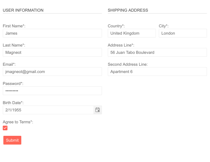
The Form can be fit anywhere on the page because it can be oriented both horizontally and vertically. It can render separate columns if you want it to. Configure it so it makes the most sense in your use case!
-
Custom From Editors
The Blazor Form UI component has an EditorType parameter that provides a simple way to change the default field editors based on the supplied data type. You have the flexibility to choose between a DatePicker, DateTimePicker or TimePicker for the DateTime type, and a TextBox or TextArea for the string fields.
See example of custom editors in Blazor Form component.a4ab449298ab4a80b82623dd4240d59e.jpg?sfvrsn=1f000e8c_0)
-
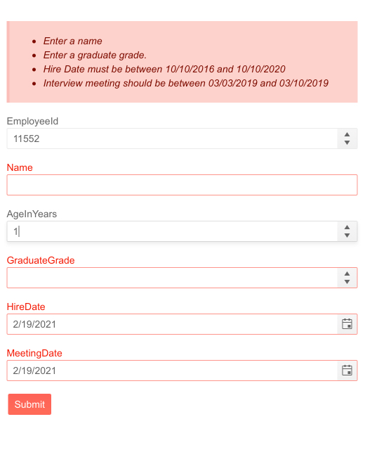
Form Validation
The Form can be validated in its entirety through the built-in Blazor validation. This means you can provide validation rules directly on your model using attributes like Required, Range or MaxLength but any field the form contains can also be validated on its own. If you take this approach you wouldn’t even have to write any special logic.
More than that, Telerik UI for Blazor also provides 3 separate components to display validation errors. Read more about the ValidationSummary, ValidationMessage & ValidationTooltip
-
Field Configuration
If you don’t want to autogenerate the form from your data model, you can add a list of <FormItem>s. They can be customized in several ways like changing their appearance, data binding model values, adding hints and so on.
-
Form Templates
The Telerik Blazor Form component can easily customize the label, form editor component and validation message of your app.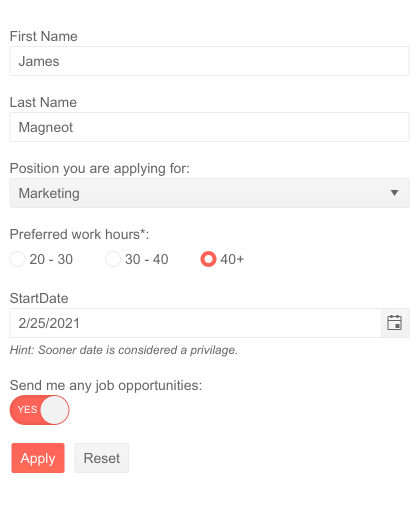
-
Blazor Form Events
The Form supports four events: OnSubmit, OnValidSubmit, OnInvalidSubmit and OnUpdate
- OnSubmit – triggered on every submit
- OnValidSubmit – triggered only on submits with valid input data
- OnInvalidSubmit – triggered only on submits with invalid input data
- OnUpdate – triggered upon a change in any of the editors

-
ID Parameter
Use the Form component Id property to reference the component where necessary, for example to mark a button to serve as the “Submit” button for that form.
-
Theming
The Telerik Blazor Form component has several built-in themes such as Default (our own styling), Material (based on the Material Design guidelines), Bootstrap (which looks like the Bootstrap styling to integrate better) and Fluent (based on Microsoft Fluent UI). You can easily customize any of out-of-the-box themes, style a specific component instance or create new theme to match your colors and branding by using the Telerik SASS ThemeBuilder application.
-
Also Available...
The Form component is also available for these popular Web frameworks:
-
Right-to-Left (RTL) Support
The Telerik UI for Blazor Form component supports right-to-left configuration. The RTL functionality is supported by most of our components to accommodate users who communicate in a right-to-left language script, such as Arabic and Hebrew.
Learn more in our Blazor Right-to-Left Support documentation

