UI for Blazor
Blazor MultiColumn ComboBox
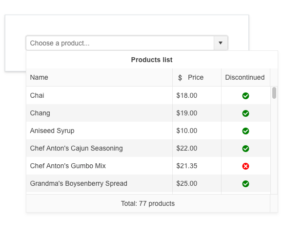
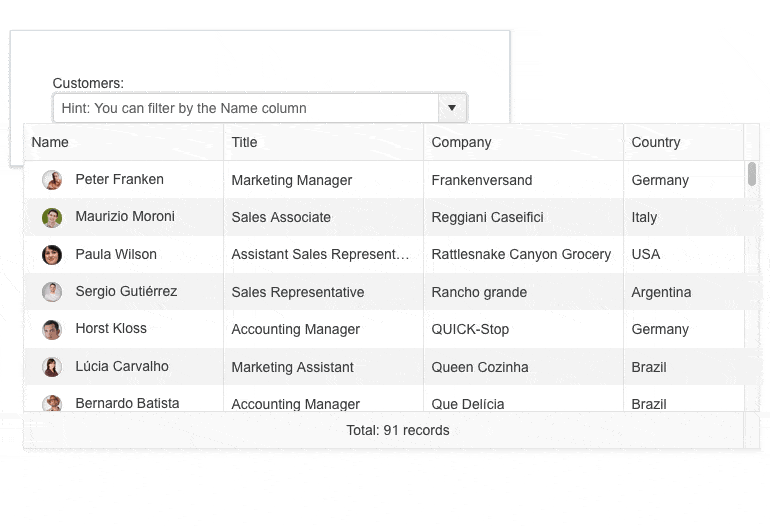
- The Blazor MultiColumnComboBox UI component lets users choose values from a predefined list in a table-like structure.
- Part of the Telerik UI for Blazor library along with 120+ professionally-designed UI components.
- Includes support, documentation, demos, virtual classrooms, Visual Studio Code Extensions and more!
-
Utilize Advanced Data Selection and Processing with Blazor MultiColumnComboBox
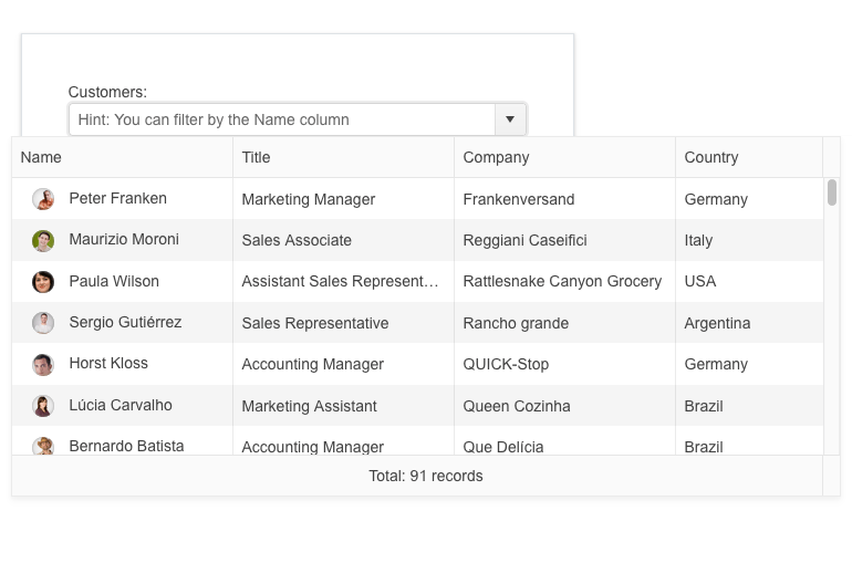
The Telerik MultiColumnComboBox for Blazor is an editor UI component that lets you choose values from a predefined list in a table-like structure. In its essence, it is an advanced select element with rich functionality, including data binding, filtering, grouping, rendering of custom content through templates, multiple options to configure its appearance, input of custom values, validation, built-in localization of messages, accessibility and keyboard navigation.
See the Blazor MultiColumnComboBox UI component demo or try out the component in the Telerik Blazor REPL browser-based code runner.
-
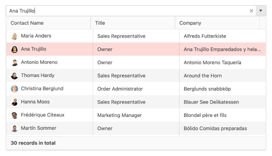
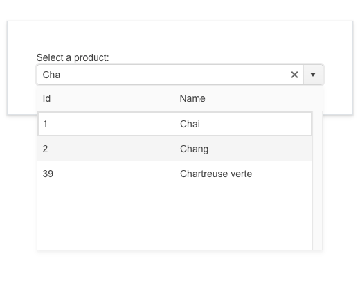
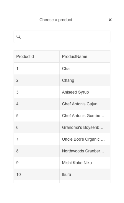
MultiColumnComboBox Filtering
The Telerik Blazor MultiColumnComboBox provides an easy way for users to find items in its list of predefined values. When the multi-column combo box component is focused, users can start typing part of the text they are looking for, and the list of items will be populated with a suggested sub-list of items that match the given criteria. The component also provides configuration for the default filter operator via the FilterOperator parameter.
See how to apply filtering in the Blazor MultiColumnComboBox UI component.
-
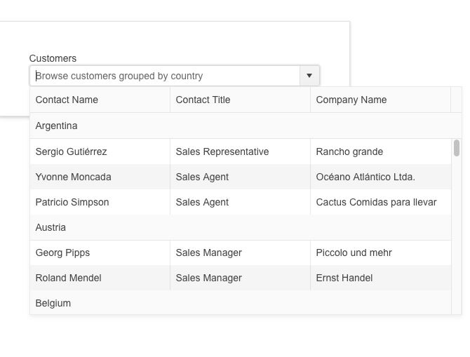
MultiColumnComboBox Grouping
You can organize the Blazor MultiColumnComboBox list items into groups and make searching and browsing values easier and more intuitive. To enable grouping of items, all you have to do is provide a value to the GroupField parameter which matches a field in the dataset.
See how to group items in Blazor MultiColumnComboBox UI component.
-
Rendering Custom Content
Using the multiple template options available for the Telerik UI for Blazor MultiColumnComboBox, you can render custom content in every part of the component: above or below the list of items (Header and Footer Templates), inside each row (RowTemplate), as well as within separate cells via the HeaderTemplate and Template for each column. The component also provides a NoData template, enabling customization of the dropdown content when there are no items to display.
Additionally, you can use the Class and HeaderClass parameters that let you apply CSS class on the columns’ cells and headers.
See how to customize the Blazor MultiColumnComboBox UI component using templates.
-
MultiColumnComboBox Appearance
The built-in parameters FillMode, Rounded and Size parameters provide additional customizations of the Blazor MultiColumnComboBox appearance and let you easily shape it in any way you need.
Try out the appearance settings for the Blazor MultiColumnComboBox component.
-
Prefix and Suffix Adornments
Elevate user interactivity leveraging the option for adding prefix and suffix adornments. These are custom items, usually an icon or button, inside the field before or after the input area. Typical prefix adornments are currency symbols or unit indicators, while suffix adornments are often used for password visibility toggles, formatting or clearing the input.
See Telerik UI for Blazor MultiColumnComboBox adornments demo
-
MultiColumnComboBox Custom Input
Along with the list of predefined items, the MultiColumnComboBox for Blazor can be configured to allow app users to input custom values. In this scenario, the component behaves like a combination of a dropdown list and a textbox. In order to accept the entered item, users just need to press Enter or blur the input.
See how to add new items to the Blazor MultiColumnComboBox.
-
MultiColumnComboBox Validation
The Telerik UI for Blazor MultiColumnComboBox supports validation through data annotations in the model. This means that required and invalid values will be easily validated and а corresponding validation message can be displayed to app users.
Try out the Blazor MultiColumnComboBox validation using data annotations.
-
MultiColumnComboBox Virtualization
When you deal with large datasets, you can take advantage of the Blazor MultiColumnComboBox virtualization feature. By enabling it, you can fetch items on demand rather than loading all data at once. You can control the number of items that need to be loaded each time a user scrolls through the component. To enable the virtualization feature, you need to set the ScrollMode, ListHeight, ItemHeight and PageSize parameters and let all the work and calculations be done automatically by the MultiColumnComboBox.
-
MultiColumnComboBox Adaptive Rendering
The MultiColumnComboBox adaptive mode enables a mobile-friendly rendering of its suggestion list popup. Simply set the AdaptiveMode parameter to AdaptiveMode.Auto and this will trigger the component to automatically adapt to the current screen size and will change its rendering accordingly. In auto adaptive mode, the MultiColumnComboBox component also allows you to define the title text rendered in the header of the popup.
-
MultiColumnComboBox Accessibility
The Telerik UI for Blazor MultiColumnComboBox UI component is built with accessibility in mind and is compliant with the international web accessibility standards, including WCAG 2.1, Section 508 and WAI-ARIA attributes for screen readers.

-
MultiColumnComboBox Keyboard Navigation
Like the rest of the Telerik UI for Blazor components, the MultiColumnComboBox comes with built-in keyboard navigation, meaning that users can perform all actions in it with a keyboard only.
Try out the built-in keyboard navigation of the Blazor MultiColumnComboBox.
-
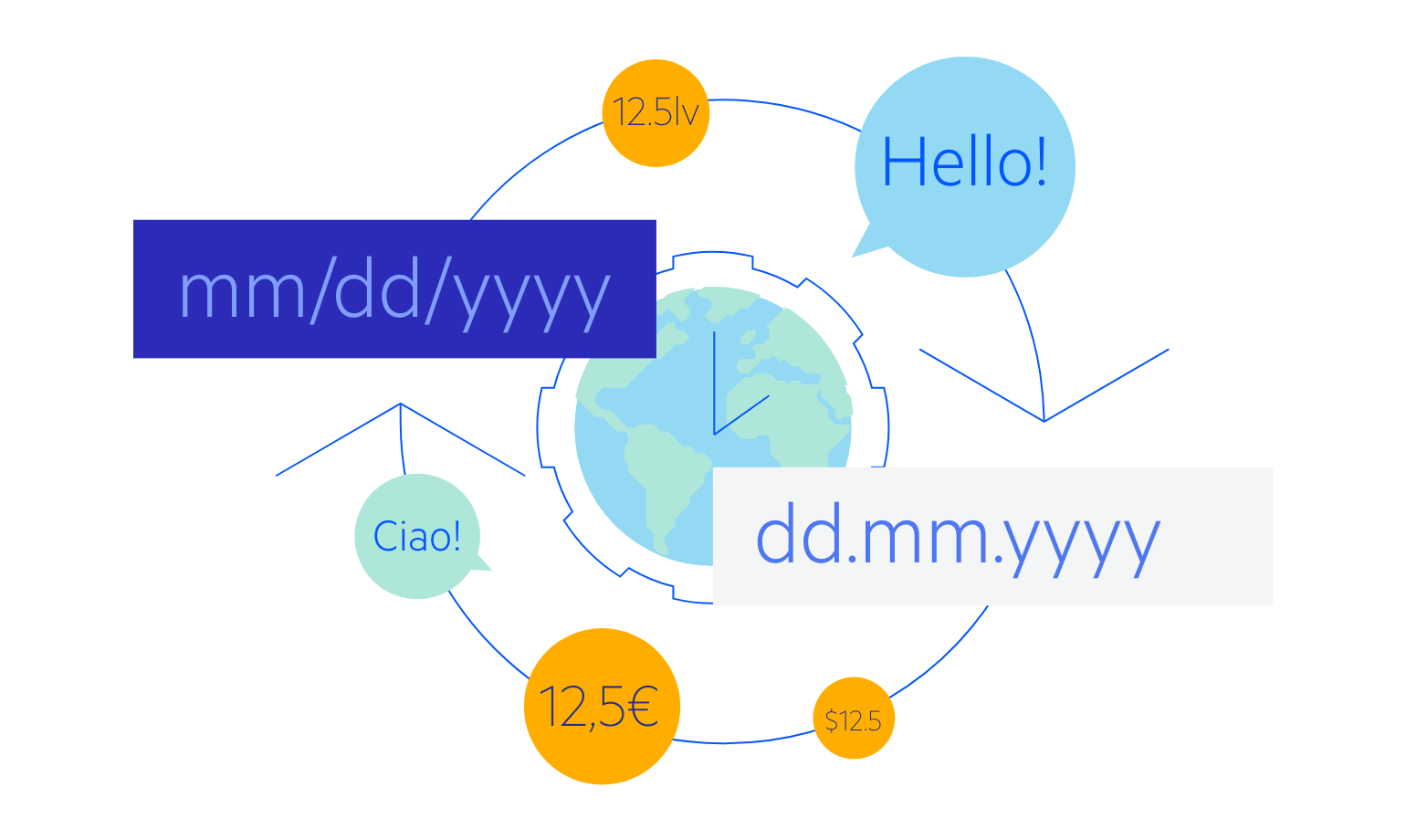
MultiColumnComboBox Localization
The MultiColumnComboBox has built-in localization support, which makes it easy to translate texts to any language that your Blazor app may require. The UI component contains localized strings (such as Clear, Open, No Data, etc.) that are available for customization through the resource files.
See how to translate messages in the Blazor MultiColumnComboBox UI component.
-
MultiColumnComboBox Theming
The Telerik UI for Blazor MultiColumnComboBox component comes with several built-in themes and color swatches, including Default (our own styling), Material (based on the Material Design guidelines), Bootstrap and Fluent (based on Microsoft Fluent UI).
-
Right-to-Left (RTL) Support
The Telerik UI for Blazor MultiColumn ComboBox component supports right-to-left configuration. The RTL functionality is supported by most of our components to accommodate users who communicate in a right-to-left language script, such as Arabic and Hebrew.
Learn more in our Blazor Right-to-Left Support documentation