UI for Blazor
Blazor Line Chart
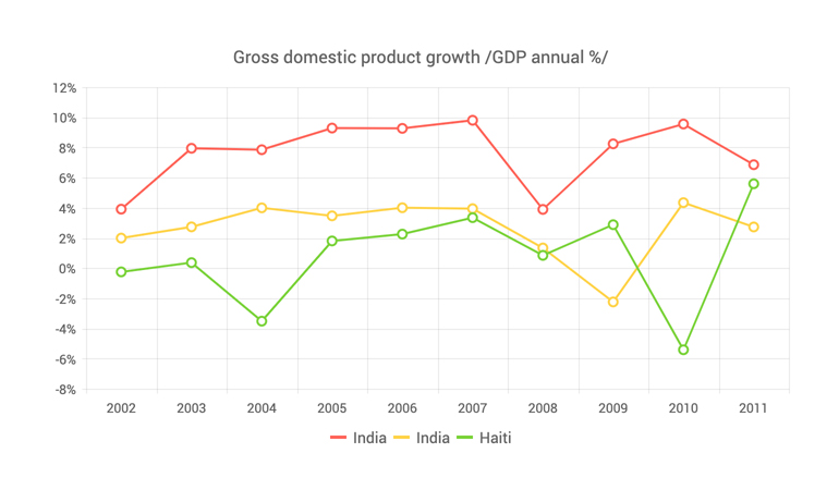
- The Blazor Line Chart displays data as continuous lines, rendering a trend over time and comparing several datasets.
- Part of the Telerik UI for Blazor library along with 120+ professionally-designed UI components.
- Includes support, documentation, demos, virtual classrooms, Visual Studio Code Extensions and more!

-
Line Chart Data Binding
The Line chart is a data bound component which also provides the flexibility to bind axes and series to various data sources separately or together.
More about chart data binding in Blazor.

-
Customizing Line Chart Elements
You can customize all aspects of the Line chart—from the markers, area background color, opacity, line width, dash types and series color to its labels content, font, size, position, line styles and even missing values.
-
Line Chart Line Type
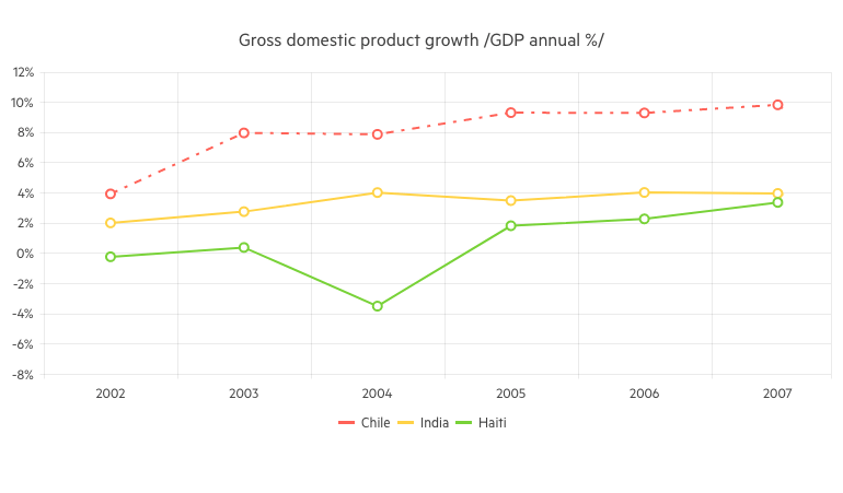
The Line chart supports different styles for the lines connecting its data points – Normal (straight line), Step (horizontal and vertical lines) and Smooth (fitted curve).
-
Line Chart Date Axis
If you want to show trend over time, the Line chart can let you provide DateTime values for its x-axis and it will aggregate the data points falling in the intervals you choose.
-
Line Chart Multiple Axes
The Line Chart can render more than one axis in each dimension and you can associate each series with its own axes. This lets you show data that varies on orders of magnitude in the same chart without loss of detail.
-
Combining Line Chart with Other Chart Types
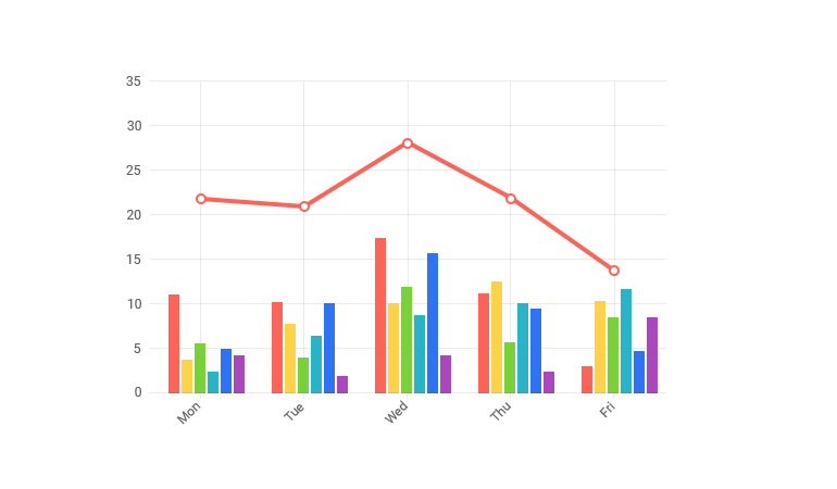
You can also mix different types of series in a single chart to create more compelling visuals – such as line charts and column charts, or area charts.
-
Line Chart Markers
Each data item in the Line chart component is denoted by a marker. You have full control over the marker visibility, size (in pixels) and type: circle (default), cross, square and triangle.
-
Line Chart Missing Values
If some values are missing from the Line series data, you have options to configure how those missing values to be visualized by the component:
- Zero (the line goes to 0 value mark)
- Interpolate - the line will go through the interpolated value of the missing data points and connect to the next data point with a value.
- Gap - behaves the same way as Zero because a line chart cannot have a gap in its filled area.
-
Line Chart Rendering Modes - Canvas/SVG
The Line Chart renders in the browser to preserve server resources. It has SVG markup and <canvas> rendering modes to improve performance further, and it can even animate during rendering for a smoother user experience.
-
Line Chart Globalization
The Label Format Strings in UI for Blazor Line chart, are culture aware so your users see, for example, the expected number formats with the decimal and thousands separators they are used to.
-
Line Chart Theming
The Telerik Blazor Line component has several built-in themes such as Default (our own styling), Material (based on the Material Design guidelines), Bootstrap (which looks like the Bootstrap styling to integrate better) and Fluent (based on Microsoft Fluent UI). Each theme predefines several series colors, so your data is visualized according to your design guidelines. You can further customize any of the out-of-the box themes, style a specific chart component or create new theme to match your colors and branding by using the Telerik SASS ThemeBuilder application
-
Right-to-Left (RTL) Support
The Telerik UI for Blazor Line Chart component supports right-to-left configuration. The RTL functionality is supported by most of our components to accommodate users who communicate in a right-to-left language script, such as Arabic and Hebrew.
Learn more in our Blazor Right-to-Left Support documentation

-
Visualize Data with Blazor Line Chart
A Line chart component displays data as continuous lines that connect points defined by the values of their items. It is useful for displaying a trend over time or comparing several sets of similar data in both Blazor WebAssembly (WASM) and Server-side dashboard applications.