UI for Blazor
Blazor Calendar
- With the Blazor Calendar component you can navigate, display and select from different time periods.
- Part of the Telerik UI for Blazor library along with 120+ professionally-designed UI components.
- Includes support, documentation, demos, virtual classrooms, Visual Studio Code Extensions and more!
-
Blazor Calendar Disabled Dates
The calendar can also prevent users from selecting certain dates that you want to disable—for example, because your shop or service is closed during certain times, or a person is unavailable.
See how to prevent dates from being selected.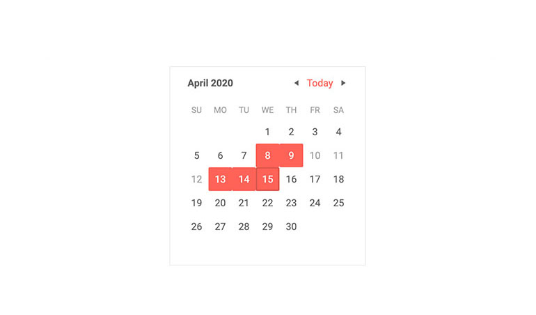
-
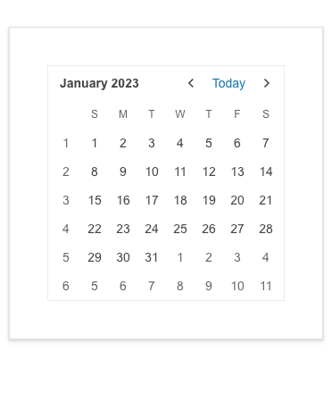
Week Number Column
Leveraging the Week Number Column feature in the Telerik UI for Blazor Calendar component, you can effortlessly add the corresponding week number (one through 52) to any date or date range.
See the Telerik UI for Blazor Calendar Week Number Column demo
-
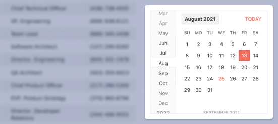
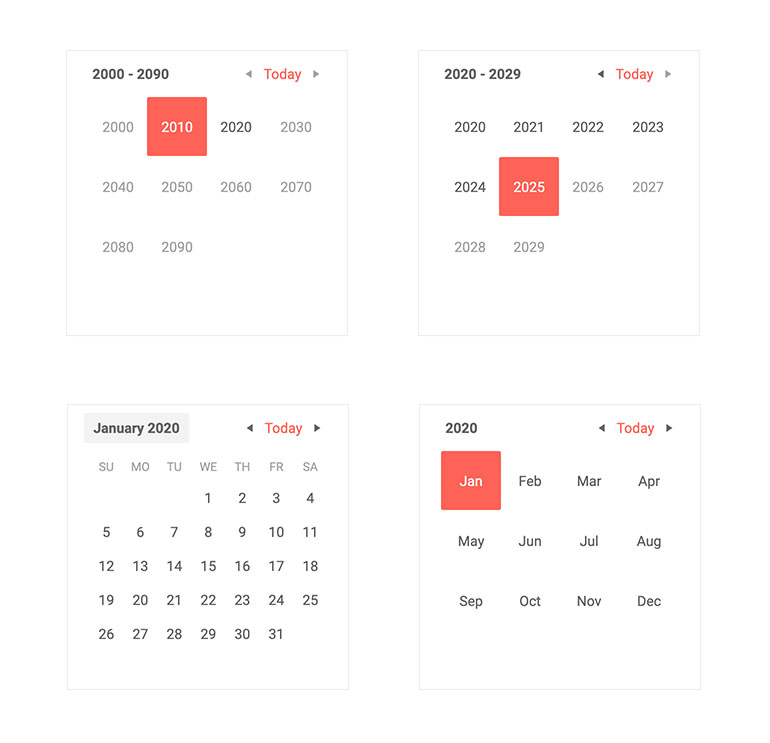
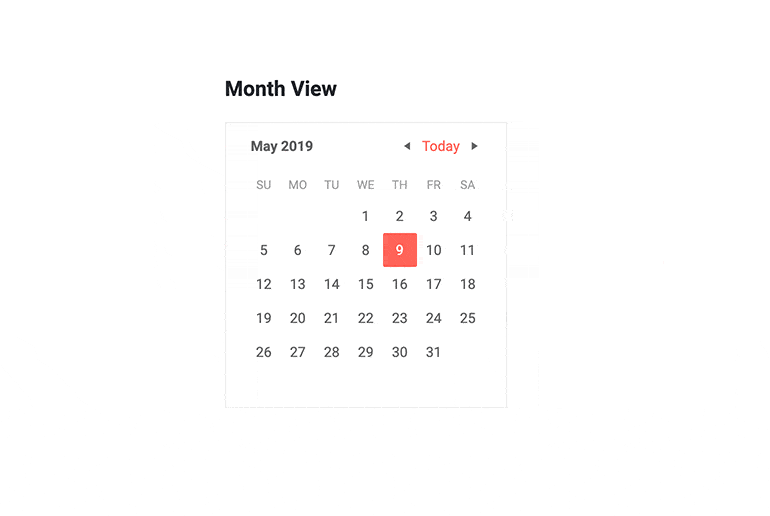
Calendar View
You can choose what the user sees in the Blazor Calendar—from the days in a single month, to months in a year, to the years in a decade. This enables you to define their starting point, how quickly they will navigate through the time.
You can even change the view they see programmatically or know when they changed it to navigate. Moreover, you can set the earliest and latest dates they can navigate to in order to limit them in a min-max range dictated by your business logic.
-
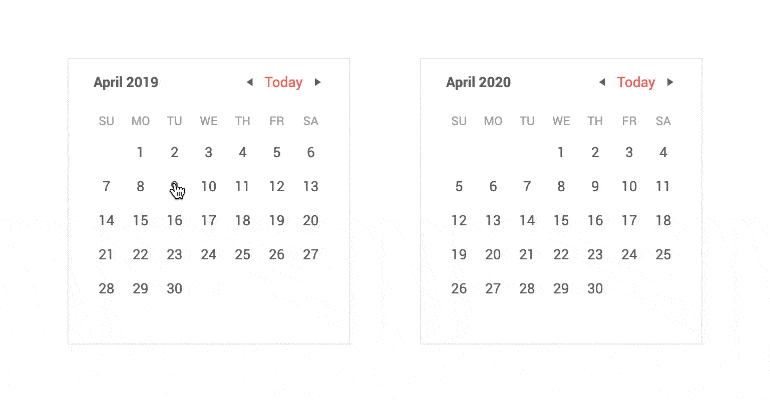
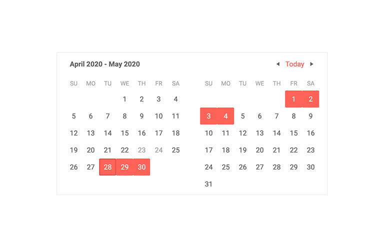
Blazor Calendar Multiview
A regular calendar shows a single month, or a single year. With the Telerik Blazor Calendar, you can show several months to your user so they can have awareness of the bigger picture.
-
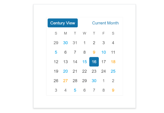
Blazor Calendar Navigation
The user can easily browse between days in a month, to decades and centuries at a time so they can select the date they are looking for quickly.
-
Calendar CellRender
The Telerik UI for Blazor Calendar notifies you when users change the selected date, when they browse the previous and next interval and when they go up or down the views to see a bigger or smaller time range.
To apply further conditional styling to the calendar cells, you can now use the CellRender event and apply additional logic.
-
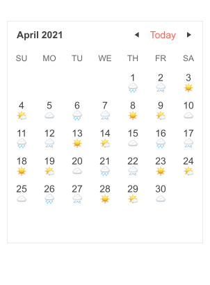
Calendar Templates
Templates allow you to customize the day view of the Calendar component. They give you the flexibility to render custom content for each day or group of days differently, like for example weekdays and weekends, national holidays or another application-specific category.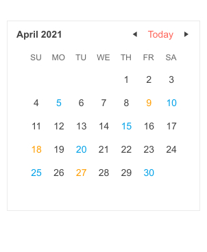
-
Blazor Calendar Header Template
Using the Blazor Calendar <HeaderTemplate> you can customize the content rendered in the component’s header. You can render images or other components or apply custom styling.
See an example of custom content rendered in Blazor Calendar header.
-
Calendar Accessibility and Keyboard Navigation
Built-in keyboard navigation means that users can perform all actions in a calendar with the keyboard only. The Telerik Blazor Calendar is also compliant with the web accessibility standards (including WCAG, Section 508 and WAI-ARIA attributes for screen readers).

-
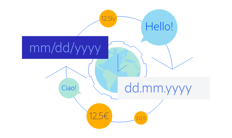
Blazor Calendar Globalization and Localization
The Telerik Blazor Calendar component reacts to the current culture automatically. It takes the names of the months, the days of the week and the first day of the week from it without you having to set a single property. You can also translate UI elements such as the “Today” button and the navigation buttons tooltips.
-
Calendar Theming
The Telerik Blazor Calendar has several built-in themes such as Default (our own styling), Material (based on the Material Design guidelines), Bootstrap (which looks like the Bootstrap styling to integrate better) and Fluent (based on Microsoft Fluent UI). You can easily customize any of out-of-the-box themes with a few lines of CSS, or create new theme to match your colors and branding by using the Telerik SASS ThemeBuilder application.
-
Right-to-Left (RTL) Support
The Telerik UI for Blazor Calendar component supports right-to-left configuration. The RTL functionality is supported by most of our components to accommodate users who communicate in a right-to-left language script, such as Arabic and Hebrew.
Learn more in our Blazor Right-to-Left Support documentation

-
Full Set of Calendar Options with Blazor Calendar
The Telerik Blazor Calendar is a component that works in both Blazor WebAssembly (WASM) and server-side Blazor apps and shows the days in a month, months in a year or even the years in a decade. It provides various calendar view options—month, year, and decade view—to help you quickly navigate to the desired date. The Calendar supports minimum dates, maximum dates, and disabled dates to restrict specific date selection. You can browse through the time, select dates and see all of that in your own culture settings and language.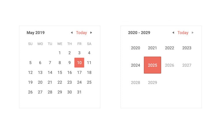
-
Calendar Dates Selection
You can select one or more dates in the Blazor Calendar component. You can use this to denote desired days for an event, book appointments in an interface much more minimal than a scheduler, and show pre-selected dates to your user.
The Telerik Calendar offers two selection modes:
Single day selection mode where the user can choose only one date (that you can interpret as a day, a month or a year, depending on the view you let your user see).
Multiple Selection – you can choose a range of dates, cherry-pick specific dates, or even exclude certain dates from an existing range (can be useful when showing availability of a service or resource, for example).
- Range selection - choose a range of dates (can be useful when booking a service or resource, for example, or when searching within a time range).