
UI for Blazor
Blazor Drawer
- The Blazor Drawer component provides templates, data binding, navigation and events.
- Part of the Telerik UI for Blazor library along with 120+ professionally-designed UI components.
- Includes support, documentation, demos, virtual classrooms, Visual Studio Code Extensions and more!
-
Navigate Easily with Blazor Drawer
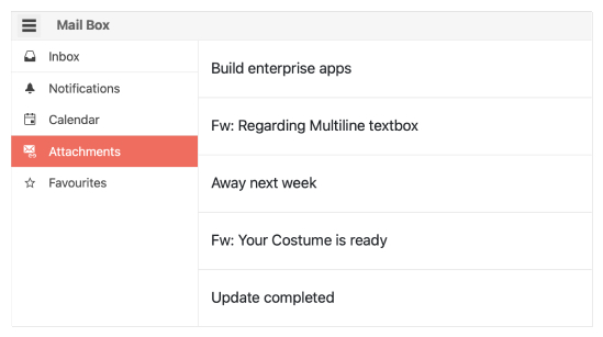
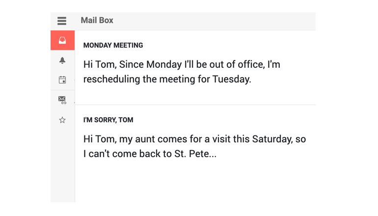
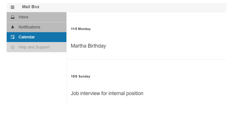
The Drawer component is a dismissible or permanently visible panel for navigating in WebAssembly (WASM) and Server-side Blazor apps applications. It allows switching the content of different sections of the page and comes with multiple configuration options for setting its display mode, position, customization via templates, built-in keyboard support.
-
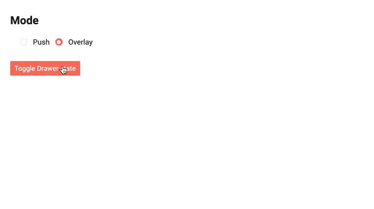
Blazor Drawer Display Modes
The Drawer component comes with two options for displaying its content: Overlay in which the Drawer expands on top of the container content and displays a grayed overlay over it; Push- the Drawer expands side by side to the container content by shrinking its width.
-
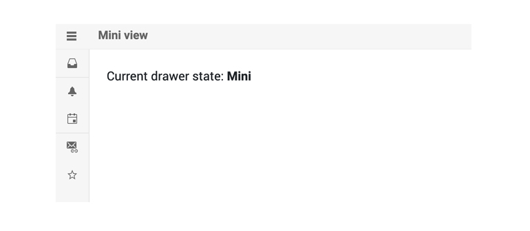
Blazor Drawer Mini Mode
When the Drawer is in a collapsed state, you can enable its “mini mode” or “mini view” which means that when the Drawer is minimized, it will elegantly display only the item icon.
-
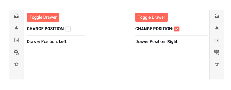
Blazor Drawer Positions
Depending on the Blazor app requirements you may need to position the Drawer left or right in relation to the page content
-
Appearance
Customize the appearance of the Telerik UI for Blazor Drawer, using the OnItemRender event. It enables you to apply conditional styling on its items based on specific criteria. The OnItemRender event fires when each node is about to render and allows you to set a Class for each li element based on your business logic.
-
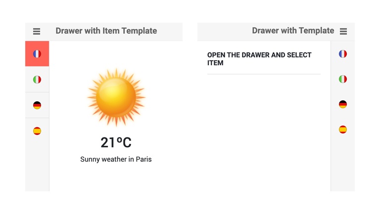
Customizing Blazor Drawer with Templates
The Drawer component templates allow full customization of its appearance. Using the Drawer item template, you can control the rendering of each individual list item, and with the Drawer full template you can choose what the Drawer renders on your own without a data source the component uses. The full Template will let you add login components, user profile picture, and any other content and functionality you need - from headers/footers to hierarchical structures for navigation (such as a TreeView).
-
Blazor Drawer Events
The Drawer component exposes SelecteditemChanged and ExpandedChanged events to let you handle user interactions and component state changes:
- SelecteditemChanged - fires every time the user clicks on a new Drawer item
- ExpandedChanged - fires every time the component's state is changed.

-
Blazor Drawer Keyboard Navigation
The Drawer component has built-in keyboard navigation allowing end users to easily navigate, focus and click on Drawer items using their keyboard.

-
Blazor Drawer Theming
The Telerik Blazor Drawer component has several built-in themes such as Default (our own styling), Material (based on the Material Design guidelines), Bootstrap (which looks like the Bootstrap styling to integrate better) and Fluent (based on Microsoft Fluent UI). You can easily customize any of out-of-the-box themes with a few lines of CSS, or create new theme to match your colors and branding by using the Telerik SASS ThemeBuilder application.
-
Right-to-Left (RTL) Support
The Telerik UI for Blazor Drawer component supports right-to-left configuration. The RTL functionality is supported by most of our components to accommodate users who communicate in a right-to-left language script, such as Arabic and Hebrew.
Learn more in our Blazor Right-to-Left Support documentation

