UI for Blazor
Blazor Switch
- Toggle between checked and unchecked states with the Blazor Switch component.
- Part of the Telerik UI for Blazor library along with 120+ professionally-designed UI components.
- Includes support, documentation, demos, virtual classrooms, Visual Studio Code Extensions and more!
-
Labels and Features
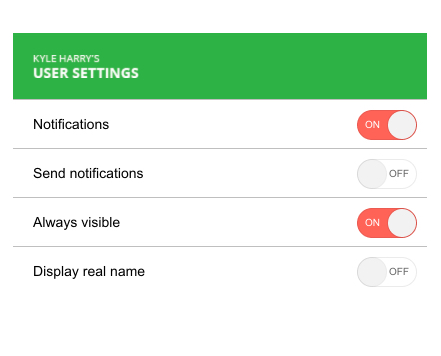
The Switch component offers customization on its on and off labels so you can personalize each switch. Additionally, you can easily customize it via some of the standard attributes available to the rest of the Telerik UI for Blazor suite, such as its TabIndex, Width, CSS class, etc. This makes the control feel like a native input element.

-
Events
The Event fires two events to help you handle your business logic:
- ValueChanged is fired every time the value of the input changes and is triggered by both directions of the two-way binding
- OnChange is fired after the value has changed but is only triggered by the changes from the UI (one-way binding)

-
Localization
Thanks to the built-in localization support, the component’s labels are automatically translated to any language your app supports.
Check out the Switch component Localization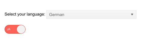
-
TabIndex
The Blazor Switch component, just like all other Telerik UI for Blazor input components, supports keyboard navigation to switch between components thanks to the HTML TabIndex property. Pressing Tab will normally focus the next available input component, the same way your users are accustomed to when standard HTML inputs are used. Having the TabIndex setting lets you customize that order. -
Keyboard Navigation
Thanks to the built-in keyboard navigation, end users can interact with the Switch without lifting a finger off the keyboard.

-
Right-to-Left (RTL) Support
The Telerik UI for Blazor Switch component supports right-to-left configuration. The RTL functionality is supported by most of our components to accommodate users who communicate in a right-to-left language script, such as Arabic and Hebrew.
Learn more in our Blazor Right-to-Left Support documentation

-
Turn a Boolean State On and Off with Blazor Switch
The Telerik UI for Blazor Switch component is an input control for switching a Boolean state on and off. This type of input originated in mobile apps but has been gradually replacing the standard checkbox control in all sorts of applications. The component’s value can be two-way data bound to a Boolean variable. It comes with the ability to configure the labels for its on and off states, events and built-in localization and keyboard navigation.
Check out the Blazor Switch demo