UI for Blazor
Blazor Stepper
- Use the Blazor Stepper component to breakdown complex processes into smaller steps and easily track your progress.
- Part of the Telerik UI for Blazor library along with 120+ professionally-designed UI components.
- Includes support, documentation, demos, virtual classrooms, Visual Studio Code Extensions and more!

-
Organize Complicated Actions into Smaller Steps with Blazor Stepper
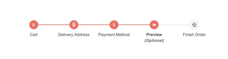
The Stepper control for Telerik UI for Blazor is designed to help you divide complicated actions in your web application into smaller steps. It enables you to create a sequence that visualizes progress and makes it easier to keep track of your advancement. The Stepper can also be used for navigation purposes, for example filling an online form with multiple categories, such as shopping cart, billing address and payment via a third-party service.
Check out the Blazor Stepper demo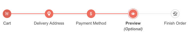
-
Orientation and layout
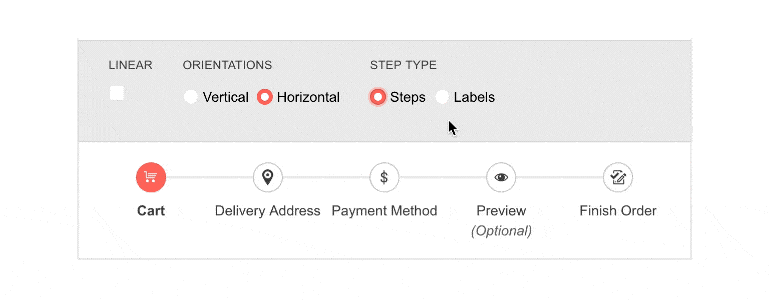
You can choose from vertical or horizontal orientation of the Stepper and further customize the way it looks. Depending on the selected orientation the label position and the indicator changes accordingly. For example, the label can be aligned with the number of the step or positioned next to it. The flow of the steps can be restricted to linear, meaning completion of a previous step would be required to proceed to the next one, or users can go back and forth only one step at a time.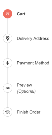
-
Validation
The built-in Blazor Validation will be triggered whenever the Valid parameter is set. Based on it being either true or false, a success (check) or error icon will be rendered either in the step indicator or as a part of the label below each step. If the step validity is not specified, no icons will be shown. This makes it easier for users to track which step they have completed, and which requires more action from their side.
Learn more about the Blazor Stepper Validation -
Steps State
Set a stage of the process(step) as Optional or Disabled to let the users decide if they want to skip optional steps and clear confusion by disabling unnecessary ones.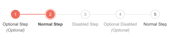
-
Events
The Stepper component enables you to custom code after a step is selected. For example, depending on your selection – you can change the validity or enable/disable the step. The component currently executes only the ValueChange event which triggers when CurrentStepIndex has changed.
Check out the Documentation on Stepper Events
-
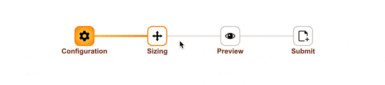
Icons
Use various icons to fit your needs by changing the step indicators in the Stepper component with Icon, IconClass, ImageUrl and SpriteClass parameters.
-
Theming
The Stepper component has several built-in themes such as Default (our own styling), Material (based on the Material Design guidelines), Bootstrap (which looks like the Bootstrap styling to integrate better) and Fluent (based on Microsoft Fluent UI). Each theme predefines several series colors, so your data is visualized according to your design guidelines. You can further customize any of the out-of-the box themes, style a specific chart component or create new theme to match your colors and branding by using the Telerik SASS ThemeBuilder application.
-
Keyboard Navigation
Users can easily navigate the Stepper control using the arrow keys to move between the steps. Home and End buttons naturally focus the first and last steps and to select the focused step the users can either use Space or Enter.
-
Right-to-Left (RTL) Support
The Telerik UI for Blazor Stepper component supports right-to-left configuration. The RTL functionality is supported by most of our components to accommodate users who communicate in a right-to-left language script, such as Arabic and Hebrew.
Learn more in our Blazor Right-to-Left Support documentation

-
Configuration
The Blazor UI Stepper can be configured in various ways. You can choose the step type you prefer, either steps with indicators and labels or just labels, which will alter the way steps are displayed in the component.
-
Template customization
The Template parameter of the Telerik UI Blazor Stepper component allows you to add your own content and customize the step indicators and labels to match your application’s theme and needs.