UI for Blazor
Blazor SVGIcon
- Displaying built-in SVG icons or visualizing custom ones is easy with the Telerik UI for Blazor SVGIcon component.
- Part of the Telerik UI for Blazor library along with 120+ professionally-designed UI components.
- Includes support, documentation, demos, virtual classrooms, Visual Studio Code Extensions and more!
-
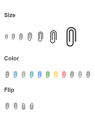
Appearance
Effortlessly customize the component to match your style guidelines or personal preferences by leveraging the available appearance options listed below:
- Size parameter which defines the size—from XS to XXXL—of the SVG icon
- ThemeColor parameter, allowing you to play with the color of the icon
- Flip parameter that defines the flip direction of the icon, enabling you to mirror the image horizontally, vertically, or in both directions

-
Display One or Several of the Built-in Blazor SVG Icons
Displaying one or several of the built-in Blazor SVG icons or choosing to visualize a custom one is a breeze with the Telerik UI for Blazor SVGIcon component. The component’s configuration parameters allow you to either implement a predefined Blazor icon by assigning a property of the SVGIcon static class or to display a custom SVG Icon class. You can also effortlessly customize the component by defining the icon size, color and flip direction.