UI for Blazor
Blazor Donut Chart
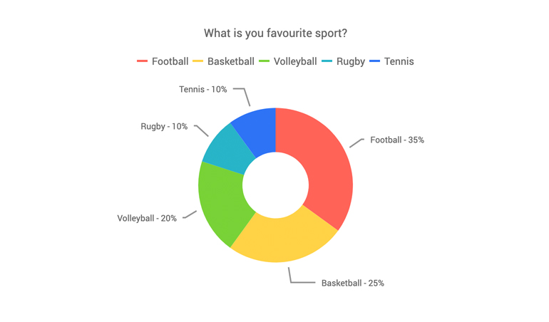
- The Blazor Donut chart displays the data as sectors within a two-dimensional circle, including multiple series.
- Part of the Telerik UI for Blazor library along with 120+ professionally-designed UI components.
- Includes support, documentation, demos, virtual classrooms, Visual Studio Code Extensions and more!

-
Donut Chart Data Binding
The Donut chart component can be bound to various data sources.
More about chart data binding in Blazor.
-
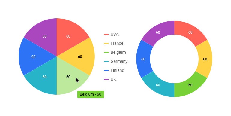
Donut Multiple Series
Unlike a pie chart, a donut chart can have multiple series in a single chart. Each series is nested in the next - the first declared series is in the center, and the last series is at the outer edge. You can use multiple series to showcase relationships within a data set, or several similar sets of data.
Learn more about Blazor Donut chart in our documentation -
Customizing Donut Chart Elements
You can customize all aspects of the Donut chart – from the hole size, series color, to its labels content, font, size, position and formatting.
-
Donut Chart Rendering Modes - Canvas/SVG
The Donut Chart renders in the browser to preserve server resources. It has SVG markup and <canvas> rendering modes to improve performance further, and it can even animate during rendering for a smoother user experience.
-
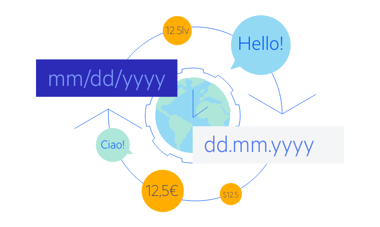
Donut Chart Globalization
The Label Format Strings in UI for Blazor Donut Charts, are culture aware so your users see, for example, the expected number formats with the decimal and thousands separators they are used to.
-
Donut Chart Theming
The Telerik Blazor Donut Chart component has several built-in themes such as Default (our own styling), Material (based on the Material Design guidelines), Bootstrap (which looks like the Bootstrap styling to integrate better) and Fluent (based on Microsoft Fluent UI). Each theme predefines several series colors, so your data is visualized according to your design guidelines. You can further customize any of the out-of-the box themes, style a specific chart component or create new theme to match your colors and branding by using the Telerik SASS ThemeBuilder application.
-
Right-to-Left (RTL) Support
The Telerik UI for Blazor Donut Chart component supports right-to-left configuration. The RTL functionality is supported by most of our components to accommodate users who communicate in a right-to-left language script, such as Arabic and Hebrew.
Learn more in our Blazor Right-to-Left Support documentation

-
Visualize Data with Blazor Donut Chart
A Donut chart is a variant of the pie chart and is suitable for displaying data as parts of a whole. It has a hole in its center and displays categories as arcs rather than slices. While a Pie chart is suitable for displaying single series of data, the Donut chart is perfect for displaying multiple data series in both Blazor WebAssembly (WASM) and Server-side dashboard applications.