UI for Blazor
Blazor Bubble Chart
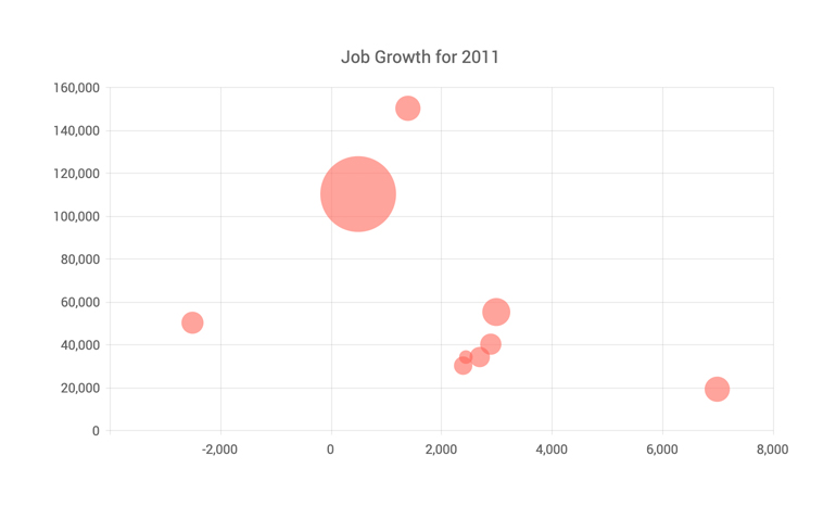
- The Blazor Bubble Chart component shows the data as points with coordinates and size defined by their items' values.
- Part of the Telerik UI for Blazor library along with 120+ professionally-designed UI components.
- Includes support, documentation, demos, virtual classrooms, Visual Studio Code Extensions and more!

-
Bubble Chart Data Binding
The Bubble chart component can be bound to various data sources.
More about chart data binding in Blazor.

-
Customizing Bubble Chart Elements
You have full control over all aspects of the Bubble chart – from the series color and opacity, to its labels content, font, size, position, and even negative values.
-
Bubble Chart Multiple Axes
The Bubble Chart can render more than one axis in each dimension and you can associate each series with its own axes. This lets you show data that varies on orders of magnitude in the same chart without loss of detail.
-
Bubble Chart Rendering Modes - Canvas/SVG
The Bubble Chart renders in the browser to preserve server resources. It has SVG markup and <canvas> rendering modes to improve performance further, and it can even animate during rendering for a smoother user experience.
-
Bubble Chart Globalization
The Label Format Strings in UI for Blazor Bubble chart, are culture aware so your users see, for example, the expected number formats with the decimal and thousands separators they are used to.

-
Bubble Chart Theming
The UI for Blazor Bubble chart component has several built-in themes such as Default (our own styling), Material (based on the Material Design guidelines), Bootstrap (which looks like the Bootstrap styling to integrate better) and Fluent (based on Microsoft Fluent UI). Each theme predefines several series colors, so your data is visualized according to your design guidelines.
-
Right-to-Left (RTL) Support
The Telerik UI for Blazor Bubble Chart component supports right-to-left configuration. The RTL functionality is supported by most of our components to accommodate users who communicate in a right-to-left language script, such as Arabic and Hebrew.
Learn more in our Blazor Right-to-Left Support documentation

-
Visualize Data with Blazor Bubble Chart
A Bubble chart displays data points as bubbles and can be used to visualize a data set with three dimensions - the first two dimensions are visualized as coordinates, the third as size. It is an ideal addition to your Blazor WebAssembly (WASM) and Server-side dashboard applications, as it is commonly used for demographic data.

All Blazor Components
Data Management
Scheduling
File Upload & Management
Editors
- AutoComplete
- CheckBox
- ColorGradient
- ColorPalette
- ColorPicker
- ComboBox
- DateInput
- DatePicker
- DateRange Picker
- DateTimePicker
- DropDownList
- DropDownTree New
- FlatColorPicker
- ListBox
- MaskedTextBox
- MultiColumn ComboBox
- MultiSelect
- Numeric TextBox
- RadioGroup
- Rating
- Rich Text Editor
- Signature
- TextArea
- TextBox
- TimePicker
Data Visualization
- Area Chart
- Bar Chart
- Barcode
- Bubble Chart
- Candlestick Chart
- Chart
- Column Chart
- Donut Chart
- Heatmap
- Line Chart
- OHLC Chart
- Pie Chart
- QR Code
- Radar Area Chart
- Radar Column Chart
- Radar Line Chart
- Range Area Chart
- Range Bar Chart
- Range Column Chart
- Sankey Chart
- Scatter Chart
- Scatter Line Chart
- Stock Chart
- Trendline Chart
- Waterfall Chart
Interactivity & UX
- Chat
- ChunkProgressBar
- Dialog
- Loader
- Loader Container
- Notification
- Popover
- Popup
- ProgressBar
- RangeSlider
- Skeleton
- Slider
- ValidationMessage
- ValidationSummary
- ValidationTooltip
Navigation
Layout
- Animation Container
- Avatar
- Card
- Carousel
- DockManager
- Form
- GridLayout
- MediaQuery
- PanelBar
- Splitter
- StackLayout
- TileLayout
- Tooltip
- Window
- Wizard
Geo Visualization
Document Processing
Productivity Tools
Gauges
Labels
Icons
