UI for Blazor
Blazor Popup
- Effortlessly display a customizable popup for a target element with Telerik UI for Blazor Popup control.
- Part of the Telerik UI for Blazor library along with 120+ professionally-designed UI components.
- Includes support, documentation, demos, virtual classrooms, Visual Studio Code Extensions and more!
-
Position and Collision
Effortlessly control the position of the Telerik UI for Blazor Popup and modify its behavior to insufficient screen space. You can customize how the popup and its anchor align with each other, leveraging the available parameters. To define how it reacts to insufficient screen space, simply set the Collision parameter to fit where the popup shifts until fully visible on the screen or flip where the popup renders on the other side of the anchor.
See Telerik UI for Blazor Popup position and collision documentation

-
Animation
Telerik UI for Blazor Popup enables you to customize the animations when the additional content displays and hides. Simply set the AnimationType parameter to one of the available options and see how the Popup flows in and out of the screen. To control the duration of the selected animation, play with the AnimationDuration parameter.

-
Appearance
The UI for Blazor Popup equips you with an extensive API to configure its animation, position, alignment and offset with regards to the triggering anchor. It also exhibits different behaviors when it's too close to the viewport boundaries.
-
Show Relevant Content Upon User Interaction
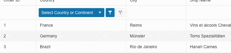
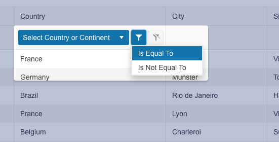
The Telerik UI for Blazor Popup component can be used to showcase content next to an HTML (anchor) element. Typically, it appears over other content or outside the boundaries of scrollable containers to display critical information or provide users with choices.
The Blazor Popup can be used as a standalone UI control, but it also comes integrated into several other Telerik UI for Blazor components.