UI for Blazor
Blazor ValidationTooltip
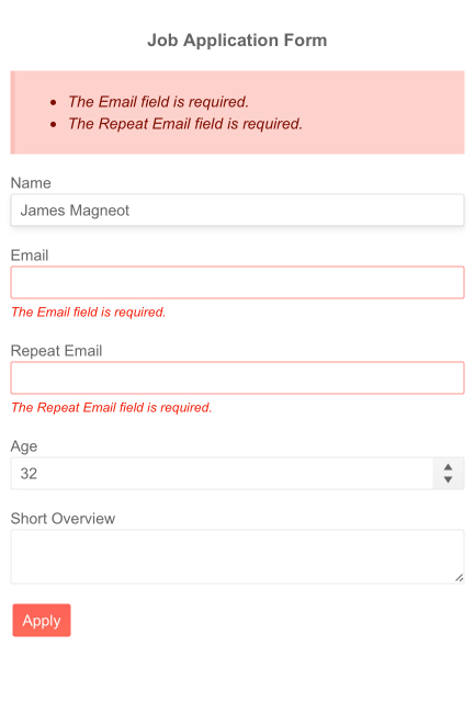
- The Blazor Validation Tooltip serves to point the exact spot of the error so it can be easily resolved.
- Part of the Telerik UI for Blazor library along with 120+ professionally-designed UI components.
- Includes support, documentation, demos, virtual classrooms, Visual Studio Code Extensions and more!

-
Validation Tooltip
The Validation Tooltip component shares the same philosophy as the Validation Message – pinpoint the spot where the error happened. The difference being the tooltip is the more flexible of the two – it is rendered as popup, you can control its position relative to the target input and it takes less space.
Check out the Blazor ValidationTooltip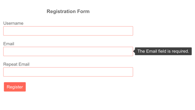
-
Templates
Control the appearance of your error messages by providing a template to the component. Modify the visual style to match the rest of the application and make sure the errors are easily noticeable and focus the user's attention.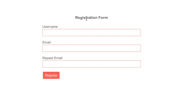
-
Localization
The Telerik ValidationTooltip component can easily pick the correct error message to display depending on the active app language so your app is available to everyone in the world.
Blazor ValidationTooltip Localization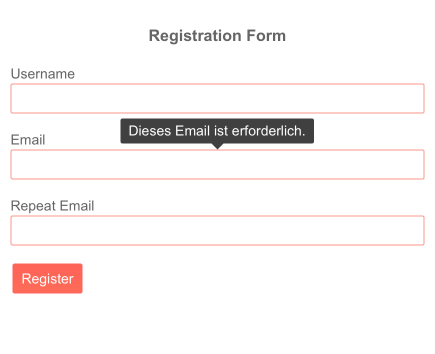
-
Right-to-Left (RTL) Support
The Telerik UI for Blazor Validation Tooltip component supports right-to-left configuration. The RTL functionality is supported my most of our components to accommodate users who communicate in a right-to-left language script, such as Arabic and Hebrew.
Learn more in our Blazor Right-to-Left Support documentation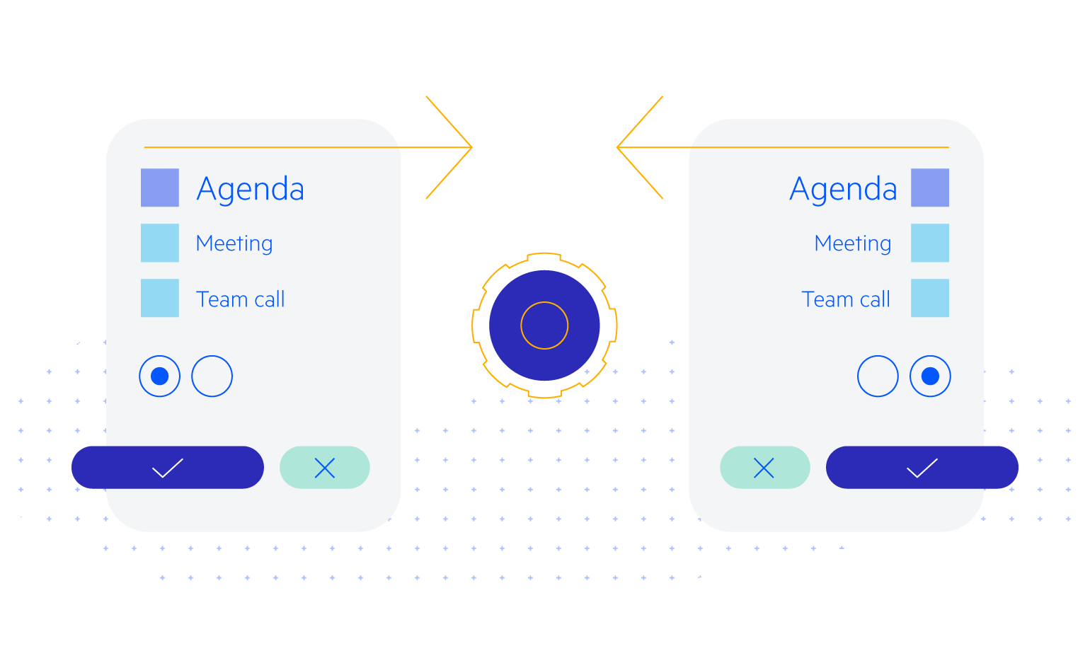
-
Full Set of Validation Tools to Use with Form Component with Blazor ValidationTooltip
Telerik UI for Blazor provides a set of validation tools to use with our Form component and the standard Microsoft EditForm). The validation tools consist of 3 components, each providing a different way to report issues with user input validation. The components follow the modern Telerik UI for Blazor design principles – they deliver many features out of the box, while being flexible to be placed in a variety of situations – like the ability to completely alter their visual by specifying a template or a CSS class.