
UI for Blazor
Blazor TileLayout
- Drag and resize your dashboard to fit your preferences with the Blazor TileLayout component.
- Part of the Telerik UI for Blazor library along with 120+ professionally-designed UI components.
- Includes support, documentation, demos, virtual classrooms, Visual Studio Code Extensions and more!
-
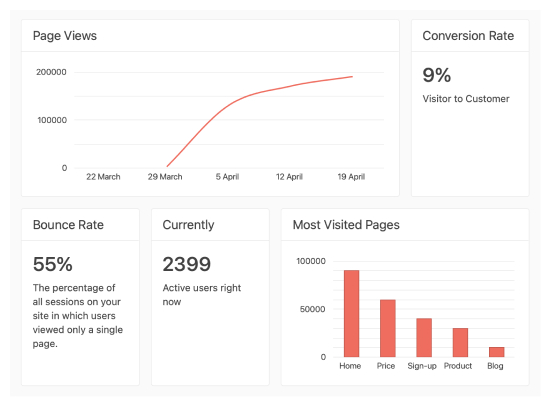
Build Dashboards with Blazor TileLayout
The Telerik UI for Blazor TileLayout component is a flexible container ideal for building dashboards. It stores Tiles of various sizes, each Tile usually displaying targeted information. Tiles can be reordered by the end user to best match their style of work. The content of each Tile can be as simple as plain text or as complex as a combination of multiple other controls like a Grid and a TreeList.
Check out the Blazor TileLayout demo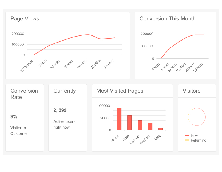
-
Items
Each Tile can be configured with several properties:
- Size (column and row span)
- Header text and header template
- The body containing the actual content of the Tile item
-
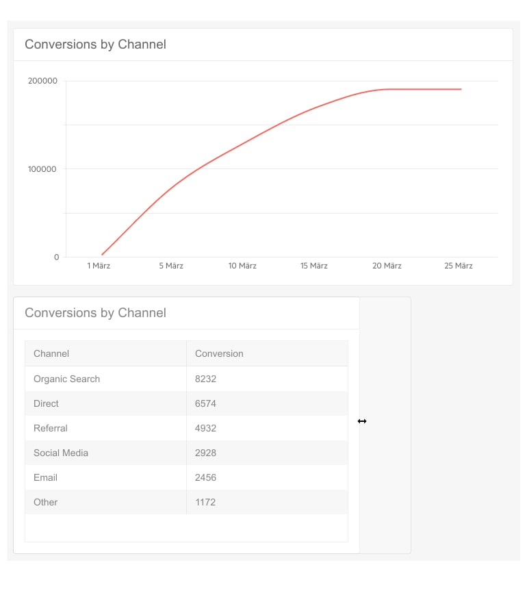
Resizing Items
Tile items can be resized as long as their Resizable parameter is set to true. End users can then effortlessly resize each item by dragging its bottom border, right border or bottom-right corner.
-
Reordering Items
Tiles can also be reordered as long as their Reorderable parameter is set to true. Reordering items can then be done by dragging each tile header to the place where it should go.
-
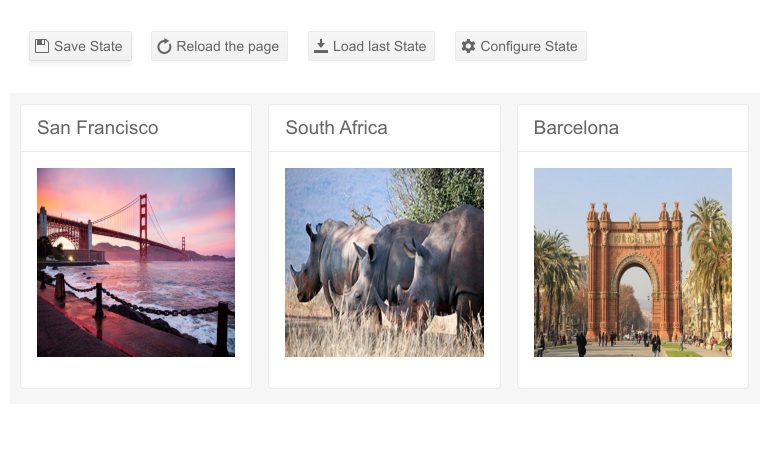
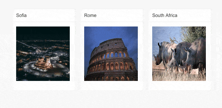
State Management
As users can spend plenty of time organizing their dashboard, it’s important to save their preferences and reuse them whenever the control is shown again. The Telerik UI for Blazor TileLayout implements this via the pair of methods GetState() and SetState(). The entire control’s state contains each tile’s RowSpawn, ColSpawn and Order to be able to perfectly restore the layout as it used to be.
-
Item Visibility
Give users even more flexibility while working with the Telerik UI for Blazor TileLayout component. Benefit from the Visible parameter to control whether an individual item should be displayed or hidden without mixing up the already established order.
See the Telerik UI for Blazor TileLayout Item Visibility demo
-
Events
Two events are exposed by the TileLayout component: OnResize and OnReorder. Both events aim to help mainly with state management and are triggered whenever a tile is resized/reordered, giving you an easy way to save the current state or execute other logic dependent on the item’s position and size.
Learn more about the TileLayout events in our documentation
-
Right-to-Left (RTL) Support
The Telerik UI for Blazor Tile Layout component supports right-to-left configuration. The RTL functionality is supported by most of our components to accommodate users who communicate in a right-to-left language script, such as Arabic and Hebrew.
Learn more in our Blazor Right-to-Left Support documentation

