UI for Blazor
Blazor FloatingLabel
- The Blazor Floating Label component lets developers take advantage of floating labels in focusable input components.
- Part of the Telerik UI for Blazor library along with 120+ professionally-designed UI components.
- Includes support, documentation, demos, virtual classrooms, Visual Studio Code Extensions and more!

-
Take Advantage of Blazor Floating Labels
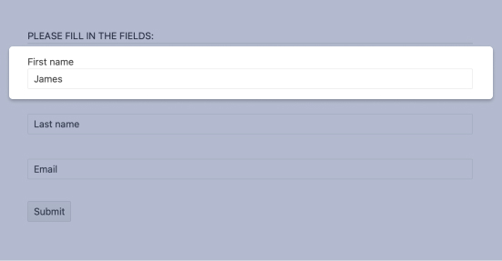
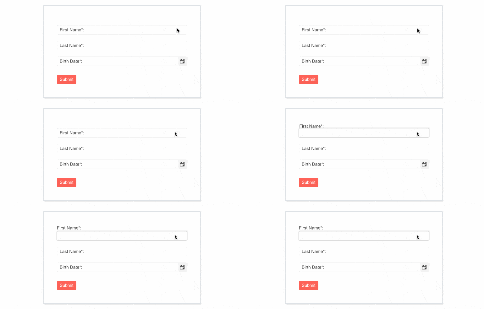
A floating label is a text that originates inside an element and then animates outside of it to “float” above the element when focused. The Telerik UI for Blazor Floating Label component lets developers take advantage of floating labels in focusable Telerik input components. The component behaves similarly to the HTML <label> element and extends its functionality with features, such as animation, association with non-form elements, and combination with the input’s placeholder.

-
Integration with Other Components
The Telerik UI for Blazor Floating Label component enables you to provide a floating label functionality to the focusable Telerik input components for Blazor: NumericTextBox, TextBox, TextArea, DateTime Inputs and Pickers, DropDownList, ComboBox, AutoComplete, MultiSelect and MaskedTextBox.
-
Theming
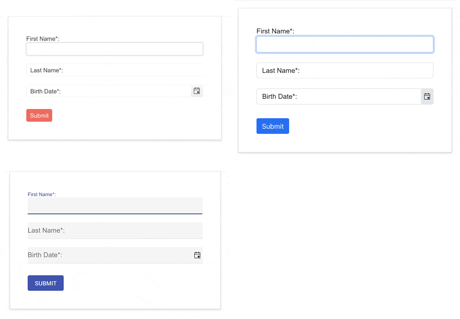
The Telerik Blazor FloatingLabel component has several built-in themes such as Default (our own styling), Material (based on the Material Design guidelines), Bootstrap and Fluent (based on Microsoft Fluent UI). You can easily customize any of out-of-the-box themes with a few lines of CSS, or create a new theme to match your colors and branding by using the Telerik SASS ThemeBuilder application.

-
Right-to-Left (RTL) Support
The Telerik UI for Blazor Floating Label component supports right-to-left configuration. The RTL functionality is supported by most of our components to accommodate users who communicate in a right-to-left language script, such as Arabic and Hebrew.
Learn more in our Blazor Right-to-Left Support documentation

All Blazor Components
Data Management
Scheduling
File Upload & Management
Editors
- AutoComplete
- CheckBox
- ColorGradient
- ColorPalette
- ColorPicker
- ComboBox
- DateInput
- DatePicker
- DateRange Picker
- DateTimePicker
- DropDownList
- DropDownTree New
- FlatColorPicker
- ListBox
- MaskedTextBox
- MultiColumn ComboBox
- MultiSelect
- Numeric TextBox
- RadioGroup
- Rating
- Rich Text Editor
- Signature
- TextArea
- TextBox
- TimePicker
Data Visualization
- Area Chart
- Bar Chart
- Barcode
- Bubble Chart
- Candlestick Chart
- Chart
- Column Chart
- Donut Chart
- Heatmap
- Line Chart
- OHLC Chart
- Pie Chart
- QR Code
- Radar Area Chart
- Radar Column Chart
- Radar Line Chart
- Range Area Chart
- Range Bar Chart
- Range Column Chart
- Sankey Chart
- Scatter Chart
- Scatter Line Chart
- Stock Chart
- Trendline Chart
- Waterfall Chart
Interactivity & UX
- Chat
- ChunkProgressBar
- Dialog
- Loader
- Loader Container
- Notification
- Popover
- Popup
- ProgressBar
- RangeSlider
- Skeleton
- Slider
- ValidationMessage
- ValidationSummary
- ValidationTooltip
Navigation
Layout
- Animation Container
- Avatar
- Card
- Carousel
- DockManager
- Form
- GridLayout
- MediaQuery
- PanelBar
- Splitter
- StackLayout
- TileLayout
- Tooltip
- Window
- Wizard
Geo Visualization
Document Processing
Productivity Tools
Gauges
Labels
Icons
