UI for Blazor
Blazor Dialog
- Display information to the user and provide multiple options for customization with the Blazor Dialog component.
- Part of the Telerik UI for Blazor library along with 120+ professionally-designed UI components.
- Includes support, documentation, demos, virtual classrooms, Visual Studio Code Extensions and more!
-
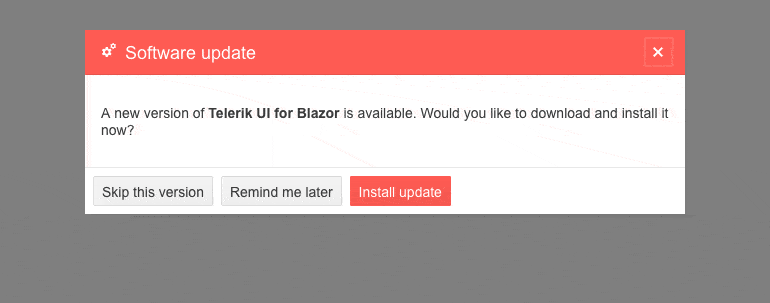
Build Simple and Complex UI Popups with Blazor Dialog
To add to the already large list of interactivity controls, the standalone Telerik Blazor Dialog UI component is an out-of-the-box solution for building both simple and complex UI popups. The Dialog is great for displaying information to the user and provides multiple options for customization such as width, height, title, visibility, content and action buttons templates, close on overlay click and more.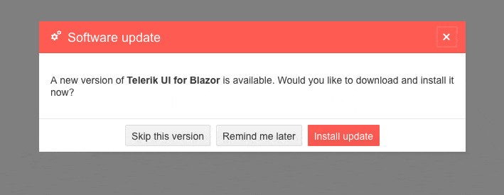
-
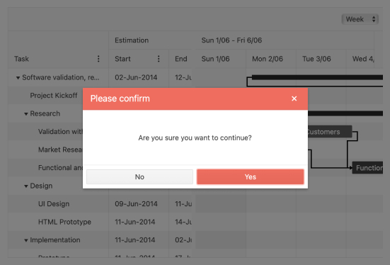
Predefined dialogs
Enjoy the quick and direct user interaction that alert, confirm and prompt provide while keeping your code short and sweet to the point. With the Telerik UI for Blazor Dialog component you get all of these 3 to match your web app style and further enhance the standard versions of these favorite functions.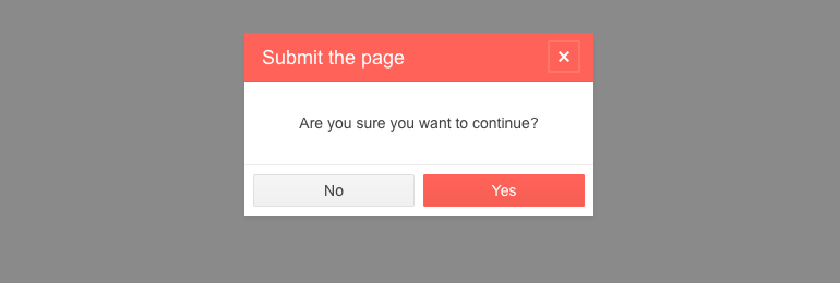
-
Theming
The Telerik Blazor Dialog has several built-in themes such as Default (our own styling), Material (based on the Material Design guidelines), Bootstrap (which looks like the Bootstrap styling to integrate better) and Fluent (based on Microsoft Fluent UI). You can easily customize any of out-of-the-box themes with a few lines of CSS, or create new theme to match your colors and branding by using the Telerik SASS ThemeBuilder application.
-
Right-to-Left (RTL) Support
The Telerik UI for Blazor Dialog component supports right-to-left configuration. The RTL functionality is supported my most of our components to accommodate users who communicate in a right-to-left language script, such as Arabic and Hebrew.
Learn more in our Blazor Right-to-Left Support documentation
-
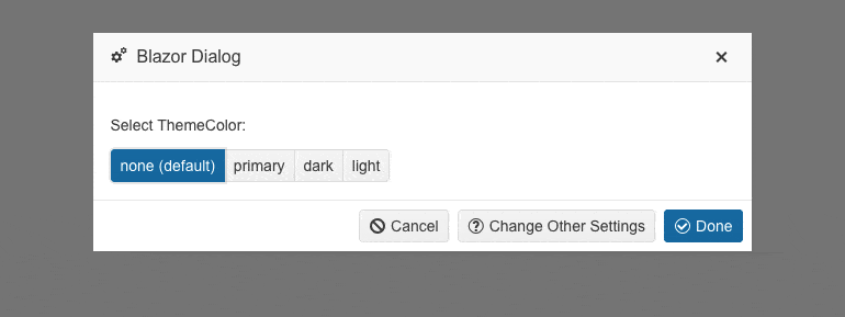
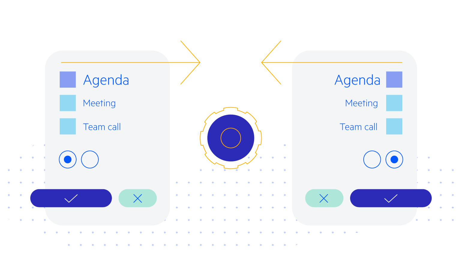
Dialog Customization
Benefit from the numerous configuration options in the Telerik UI for Blazor Dialog component to customize its title, content, buttons and overall styling. The component offers parameters for the title bar color (including primary, dark, light and none), title close action and close action on overlay click. Additionally, the Blazor Dialog comes with a default layout for the dialog buttons at the bottom.