UI for Blazor
Blazor DateRange Picker
- Select and edit date ranges from start- and end-date inputs in a calendar popup.
- Part of the Telerik UI for Blazor library along with 120+ professionally-designed UI components.
- Includes support, documentation, demos, virtual classrooms, Visual Studio Code Extensions and more!
-
DateRangePicker Disabled Dates
The component allows setting certain dates as disabled, i.e. preventing users from selecting them as start and end date of the interval.
-
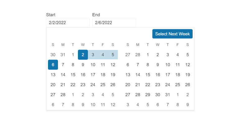
DateRangePicker Popup Settings
The DateRangePicker allows you to simply configure popups from a single tag. In addition to that, the Open and Close methods allow you to toggle the popup visibility without triggering the OnOpen/OnClose events.
-
Blazor DateRangePicker Header Template
Using the <HeaderTemplate> you can render images, other components or custom content in the Blazor DateRangePicker header.
See an example of custom header in Blazor DateRangePicker UI component.
-
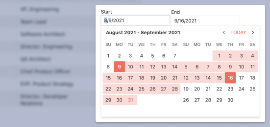
DateRangePicker Configuration
Two auto-tabbing properties, AutoSwitchParts and AutoSwitchKeys, are available in the Telerik UI for Blazor DateRangePicker component, empowering you with more flexibility while editing the year, month and date range values. A handy copy-paste functionality is also supported, eliminating the need to manually type a date format.
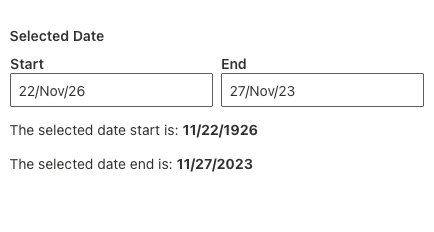
You can benefit from a TwoDigitYearMax property that allows users to type dates in two-digit year format, an AutoCorrectParts property, which autocorrects a misspelled date, and an AllowCaretMode property that enables users to input date values, using a caret to move through separate date segments.
-
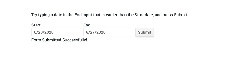
DateRangePicker Validation
Form validation through DataAnnotation attributes comes out-of-the-box with the Telerik Blazor DateRange Picker.
-
DateRangePicker Validation Modes
The DateRangePicker component includes validation modes that enable you to define whether to activate validation on change, blur, or while typing, allowing you to choose the best one for a given use case.
-
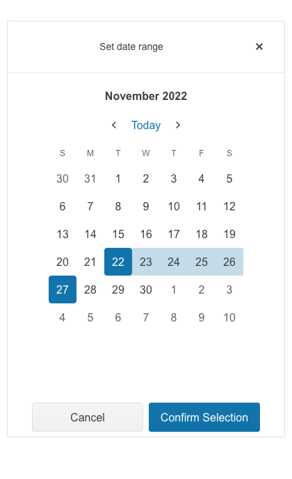
DateRangePicker Adaptive Rendering
The DateRangePicker adaptive mode enables a mobile-friendly rendering of its calendar popup. Simply set the AdaptiveMode parameter to AdaptiveMode.Auto and this will trigger the picker component to automatically adapt to the current screen size and will change its rendering accordingly. In auto adaptive mode, the DateRangePicker component also allows you to define the title text rendered in the header of the popup.
-
DateRangePicker Events
The DateRangePicker exposes several events for capturing and handling changes to the date range values and Calendar views such as OnChange, ViewChanged, StartValueChanged and EndValueChanged.
Examples with DateRangePicker Events in Blazor applications

-
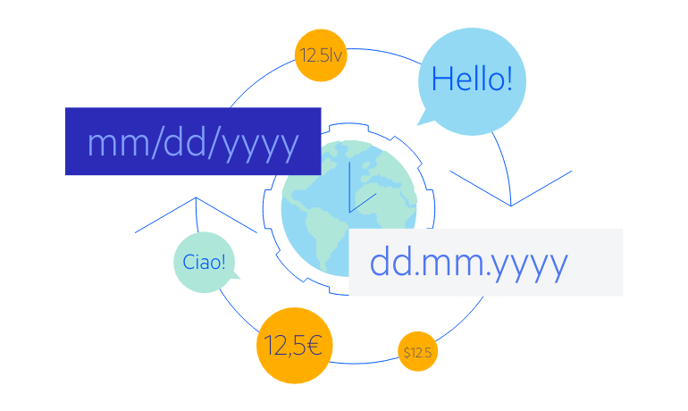
DateRangePicker Globalization and Localization
The UI for Blazor DateRangePicker has built-in localization and globalization which allows automatic culture-aware formats of the client, so users see the dates that are standard for their country/region. For example, by setting format to “d”, people in different locations will see different formats: MM/dd/yyyy (for US) or dd/MM/yyyy (for UK). Month names and button texts are easily translatable to any language.
Example of DateRangePicker with Globalization and Localization
-
DateRangePicker Keyboard Navigation
The built-in keyboard navigation in the DateRange Picker component brings flexibility to users to perform interaction with the component with keyboard only.

-
DateRangePicker Theming
The Telerik Blazor DateRangePicker has several built-in themes such as Default (our own styling), Material (based on the Material Design guidelines), Bootstrap and Fluent (based on Microsoft Fluent UI). You can easily customize any of out-of-the-box themes with a few lines of CSS, or create new theme to match your colors and branding by using the Telerik SASS ThemeBuilder application.
-
Right-to-Left (RTL) Support
The Telerik UI for Blazor DateRange Picker component supports right-to-left configuration. The RTL functionality is supported by most of our components to accommodate users who communicate in a right-to-left language script, such as Arabic and Hebrew.
Learn more in our Blazor Right-to-Left Support documentation
-
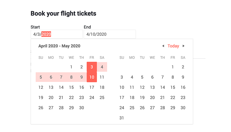
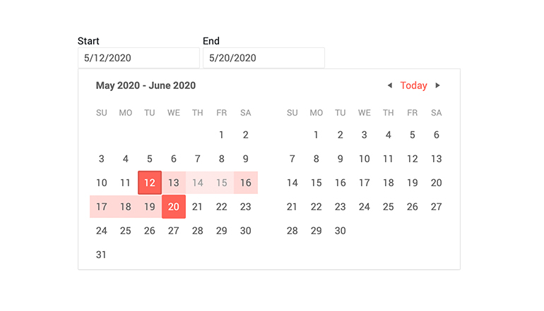
Operate with Date Periods Seamlessly with DateRangePicker
The Blazor DateRangePicker component allows users to select date periods directly from a calendar popup or edit date ranges from start and end date inputs. The date interval is visualized in real time in an animated dropdown. The Date Range Picker works in both WebAssembly (WASM) and Server-side Blazor apps, and supports forms validation, globalization, localization, keyboard navigation and provides events and two-way data binding.