UI for Blazor
Blazor TreeList
- Visualize hierarchical data through deep nesting and let users edit it with the powerful Blazor TreeList component.
- Part of the Telerik UI for Blazor library along with 120+ professionally-designed UI components.
- Includes support, documentation, demos, virtual classrooms, Visual Studio Code Extensions and more!

-
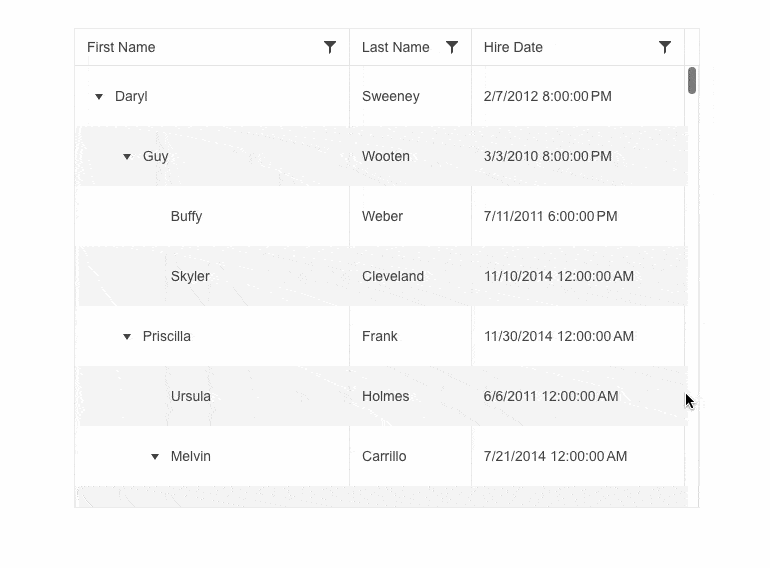
Visualize Hierarchical Data Through Deep Nesting with Blazor TreeList
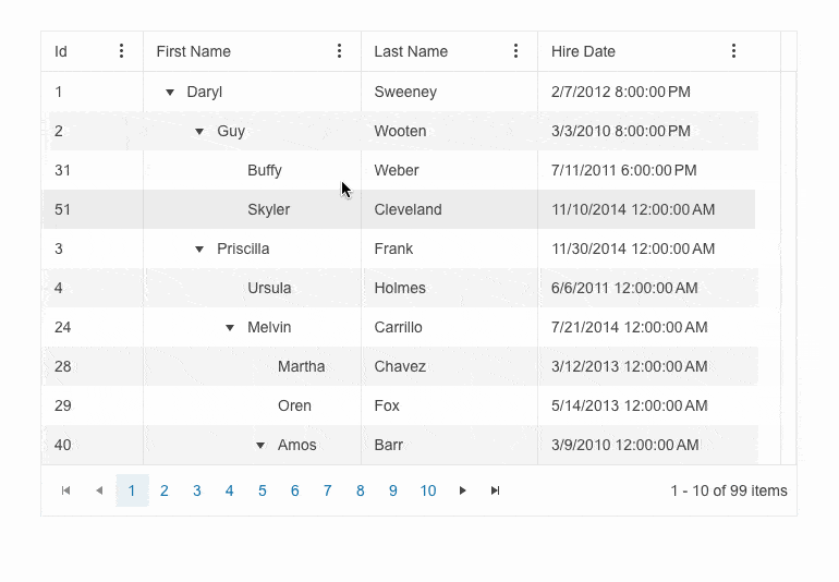
The Telerik UI for Blazor TreeList component is a data container element, similar in many ways to the Grid. Unlike the Grid, it stores and displays a list of items in a hierarchy. It is designed to be used for when you want to combine the clean and accessible UI of a Grid but also add a tad of extra information – namely some relationship between the items in the list. Examples include:
- Listing all employees of the same organizational hierarchy – each of them has a name, title, location, salary, etc. but you can conveniently show the managers by having their rows contain their team’s members.
- Listing all locations of a large brand – locations might be grouped by their country of origin
-
Data Binding
Providing the data for the TreeList component can be done either by:
- a tree-like structure which contains all nested items as children of the parent item (e.g. your Employee class would have a Children array) OR
- passing a flat list of all the items that need to be displayed and marking the items that need to be nested with additional identifiers (e.g. your Employee class would have a ParentId)
Data binding the entire list data makes usage trivial and allows you to focus on other more important things – like if you want your data to be loaded on demand which we also support.
Learn more about Blazor TreeList Data Binding in our documentation.
-
Column Resizing
The Blazor TreeList enables users to resize columns manually by dragging between their headers. It also allows you to resize its columns programmatically. This ensures your content is displayed properly and nothing important is hidden. You can use three different methods to resize the TreeList columns:
-
AutoFitColumn adjusts the width of a single column
-
AutoFitColumns adjusts the width of multiple columns
-
AutoFitAllColumns adjusts the width of all columns
-
-
Columns
Making good use of this component requires it to be very flexible to be useful in all situations. For this reason, the columns of the Telerik UI for Blazor TreeList can be:
- reordered and resized
- frozen so they always stay in sight
- virtualized so the component doesn’t render columns which are not currently visible on screen
- generated automatically from your model so you don’t even have to specify them
- can show commands instead of data (e.g. buttons to initiate editing, submitting or other operations on the data)
-
Column Menu and Custom Column Menu
The Telerik UI for Blazor TreeList enables you to display a menu with quick actions for its columns. The Column Menu enables you to effortlessly perform high-level customization like sorting, filtering, showing or hiding columns and freezing or unfreezing them.
The Telerik UI for Blazor TreeList also provides a column menu chooser template that enables quick and easy customization of the column list.
See Telerik UI for Blazor TreeList column menu and custom column menu demos
-
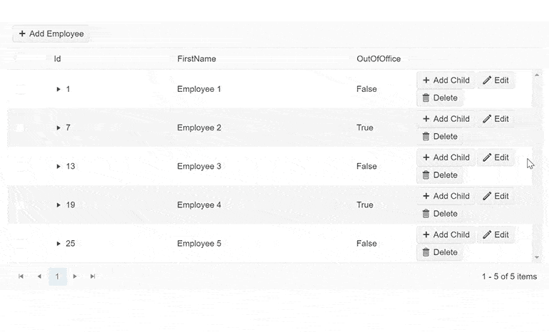
Editing
The TreeList implements dedicated CRUD events to make editing easy. Excel-like editing is also supported in which the number of keystrokes is greatly reduced – hitting Enter will store the current cell value, move on to the next cell in the column, and automatically select its content so that the next keystroke will override it. The full list of events is too large to be listed but suffice it to say we have everything covered in the docs. There are 3 distinct editing modes:
-
Inline editing lets the user directly modify any given entry and all of
its columns. This editing mode is a good mix between being fast to access and letting the user change everything. The mode allows editing, saving and deleting an item, in case the user clicks the delete button, a Delete Confirmation popup will be displayed which would require the user to confirm or cancel the action. - PopUp editing has the component display a pop up with all values of the current entry displayed like a form. This is editing mode provides users with the most control and visibility over what’s being changed.
- InCell editing lets the user click the cell and immediately type the new value. This is the simplest editing mode for users.
All 3 editing modes support built-in integration with Telerik UI for Blazor’s Form Validation.
Edited cells are always visible and selected so that users can always look see what they are modifying.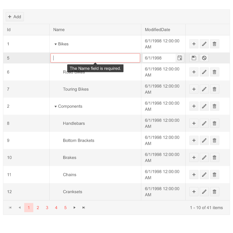
-
-
Custom Filtering
You can customize the built-in filtering of the Blazor TreeList using the DefaultFilterOperator and ShowFilterCellButtons parameters. They allow you to set the default filter operator and control whether the filter dropdown and clear buttons are visible.
-
Virtual Scrolling
Effortlessly cover different preferences by allowing users to scroll through TreeList data instead of using a pager. The Telerik UI for Blazor TreeList can easily handle large datasets thanks to built-in row virtualization, a.k.a. virtual scrolling. No matter the size of the underlying dataset, users can scroll vertically through the dataset.
See the Telerik UI for Blazor TreeList virtual scrolling demo
-
Search Box
Let your users find the data they are looking for with the TreeList Search Box. Enabling this feature adds a text box in which text can be typed and the TreeList will filter out records which do not match the text. The Search Box also features a small X button to easily clear its contents which can also be triggered programmatically.
Try out the TreeList SearchBox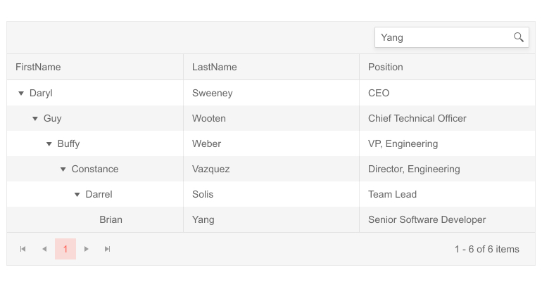
-
Custom Popup Editing Window
The Blazor TreeList component exposes multiple settings for its popup editor in the dedicated TreeListPopupEditSettings tag. You can set the (max) width, (max) height, CSS . In addition, we provided TreeListPopupEditFormSettings tag that allows you to configure the orientation of the form (either horizontal, or vertical), the columns, and column spacing layout parameters of the form, and the horizontal alignment of the Buttons in the form through ButtonsLayout.
-
Custom Filter Editor
You can customize the filter editor rendered within the Blazor TreeList FilterRow, FilterMenu and ColumnMenu. Using the FilterEditorType parameter within the TreeListColumn tag, you can easily set it and render a DateTime picker rather than the default Date picker or use the TextArea instead of the default Textbox.
See how to change the default row filter editors in the Blazor TreeList.
-
Custom Editors via EditorType Parameter
The Blazor TreeList component exposes an EditorType parameter that provides a simple way to change the default field editors without using templates. To do that, simply provide your preferred editor in the TreeListColumn tag. You have the flexibility to choose between a DatePicker or DateTimePicker for the DateTime type, TextBox or TextArea for the string fields, and Checkbox or Switch for the Booleans.
See how to change the default field editors in the Blazor TreeList.
-
Column Visible Property
Use the TreeList column Visible property to programmatically control which Grid columns are visible. When a column needs to stay hidden at all times, you can directly set the column property Visible to false. However, you can also dynamically manage the column’s visibility in other cases when you need to provide conditional visibility (e.g. to hide currently uninteresting data).
-
Multi-Column Sorting
By default, the TreeList only allows a single criteria to be used when sorting. When this option is enabled, users can choose to do better—sorting on a column and then sorting another one applies both sorting criteria to the data (in the order specified).
Check out the Blazor TreeList Sorting demo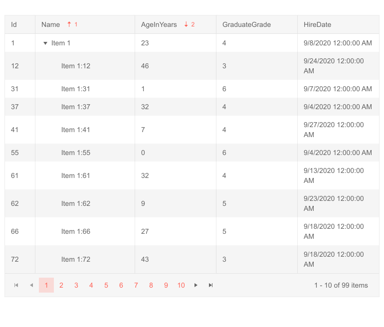
-
Row(s) Drag and Drop
Reordering rows in the TreeList can now be easily done through dragging and dropping. You only need to enable the designated attribute and the TreeList will do everything else automatically.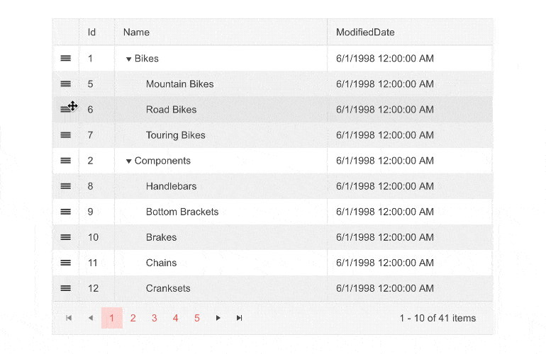
-
Customization Based on Screen Space
The TreeList can be combined with the Telerik UI for Blazor MediaQuery component to make it even more flexible. Depending on the device’s properties like resolution, orientation and color system, you can hide unnecessary columns..gif?sfvrsn=4bf143e4_0)
-
Customization of the Format Used within the Filters
The FilterEditorFormat parameter of the Blazor TreeList components allows control over the format of the default filter. That way you can align the formatting of values in the column display and filter editor.
-
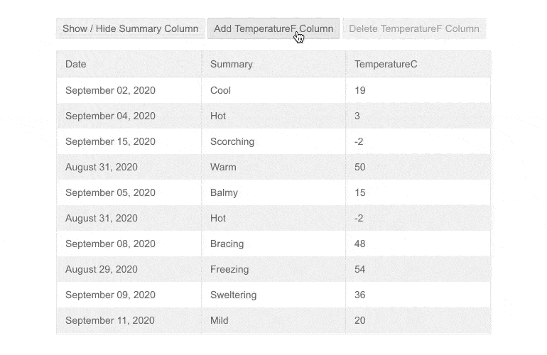
Fit Column Width To Content
Columns can be automatically resized so that their width equals width of the widest cell in the column, similar to how MS Excel and other spreadsheets operate.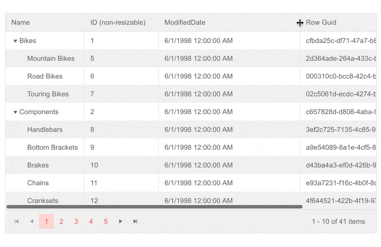
-
Multi-Column Headers
In many scenarios, your tables will contain columns that represent several parts of a whole. For example, you might have a First and Last name columns, both of which store information about the person’s name. In these cases, the TreeList component provides multi-column headers to help you visually represent the relationship between these columns. -
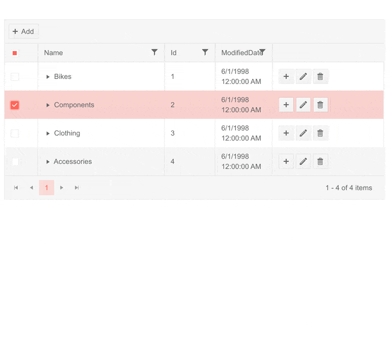
Toolbar
The TreeList also provides a toolbar to which you can add actions not tied to a given row. There is one built-in command – Add. Custom commands can be added declaratively – you only need to specify name, an optional icon and a function to be called when the corresponding button is pressed.
-
TreeList No Data Template
The Blazor TreeList features a No Data Template which allows you to define custom content that will be rendered in case the component has no data to display. The template will override the “No Data” text and display the content you provided.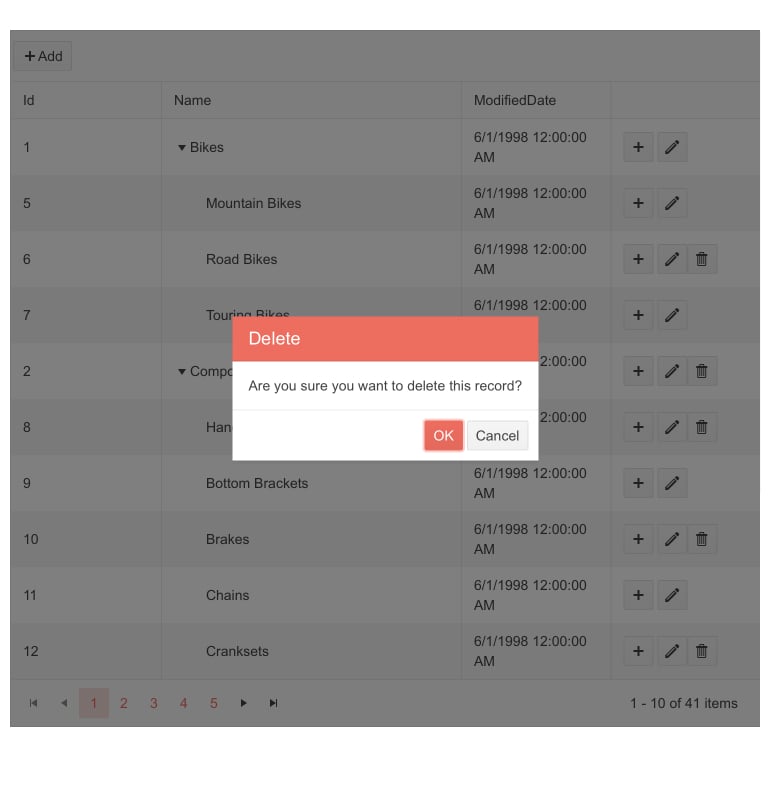
-
Templates
The Telerik UI for Blazor TreeList control works with templates to let you override the visuals of all of its components – from the looks of cells, columns and rows, to column headers, and even specifying custom editors for edit mode or custom UI for filtering!
-
Popup Edit Form Template
The Blazor TreeList features Popup Edit Form template which allows you to modify the appearance and content of the create/edit Popup window of the TreeList component. This content can include personalized form fields, required fields, validation rules, and automatic responses.
-
Popup Buttons Template
The Blazor TreeList Popup Buttons template allows personalizing the appearance and behavior of the buttons in the create/edit Popup window of the TreeList component.
-
Blazor TreeList Multi-checkbox filter
Through the Multi-checkbox Filters, users can easily filter data by a chosen value with the Blazor TreeList Multi-checkbox filter. This type of filter functions similarly to Microsoft Excel filtering and has many applications—from finding all sales made by an employee to finding all inventory items in a given category. -
Custom FilterOperators in Blazor TreeList
You can customize the filter operators list of the Blazor TreeList components using the FilterOperators parameter within each <TreeListColumn> tag. The feature works seamlessly for both filter menu and filter row modes. -
Conditional Formatting of TreeList Cells
The Telerik UI for Blazor TreeList’s OnCellRender event is triggered whenever a TreeList columns is rendered. Called for every cell in the column, the event handler receives data about the items for which the given cell is used. This is the best place to modify the CSS class of the cell depending on some condition in the data.
Check out the demo on Blazor TreeList Formatting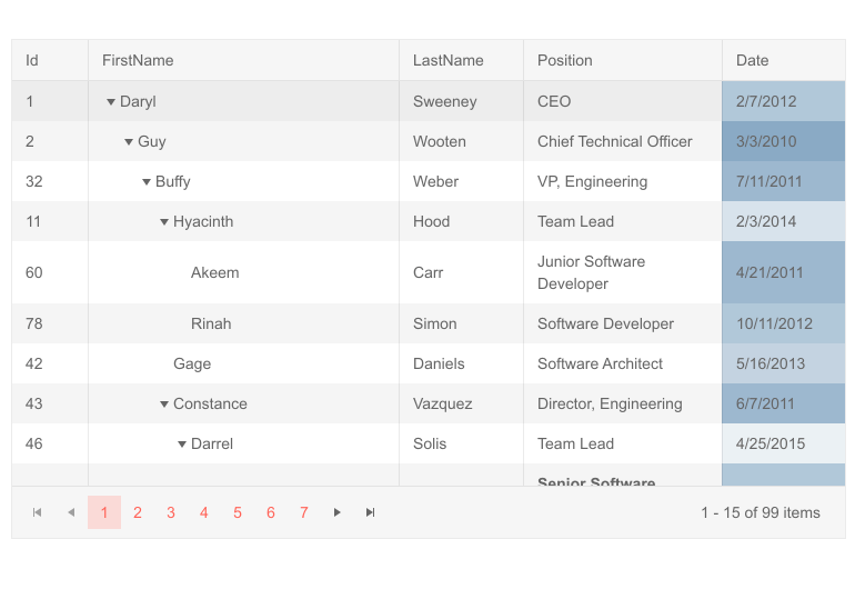
-
Conditional Formatting of TreeList Rows
The OnRowRender event is triggered when some row of the Grid is rendered. It is called once for each item in the collection. The item itself is passed to the event handler. This method is to be used to conditionally format the different rows (e.g. put a background on every row containing a certain substring in one of its columns).
-
TreeList Column Display Format
Improve the readability of all values in your TreeList by specifying a display format. Display formats control how the data should be displayed – for example, whether to print dates as dd-mm-yy or YYYY—MMM-dd. To specify the display format, set directly in UI on the TreeListColumn tag or add it via an attribute on the data member of your model. -
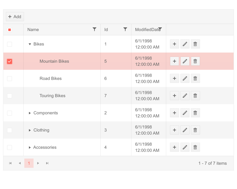
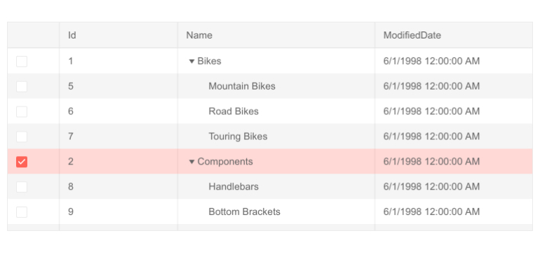
Selection
By default, the data in the TreeList is not selectable but you can change it to allow either single-row or multi-row selection. Selection works as you expect it - use Ctrl or Shift to extend or reduce the selection. Selected rows are accessible programmatically through a property so that you can execute commands only on them. With multiple selection, you can also have the Treelist select children of selected rows automatically. Select rows by clicking them or add a checkbox for selection to preserve the click interaction for cell editing.
-
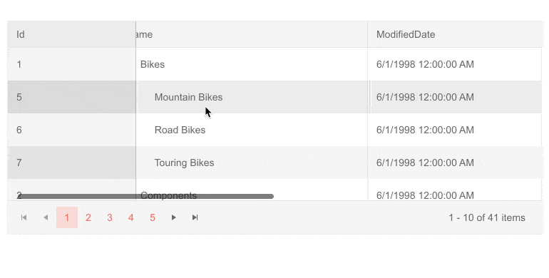
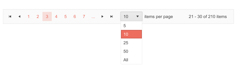
TreeList Paging
Large datasets are hard to read and understand without some structure. That’s why functionality like paging is crucial for enabling users to make sense of the patterns and underlying information the list contains.
The TreeList pager can be customized in four different ways:
- Specifying the number of page buttons displayed
- Choosing whether the page size is shown or not and modifying its value
- Selecting a preferred input type:
- Buttons – numbers linked to the respective page
- Input field – numeric textbox allowing users to type the page number they want to see
- Dropdown – the user can pick the page directly from a list
- Defining the pager position – bottom or top
- Completely customizing the appearance of the pager with a custom markup via the Pager Template.
-
Sorting
The third pillar of user interactions for large amounts of data is sorting. Similarly to filtering, the UI interactions for sorting are built in the component – clicking on a column’s header will sort all entries depending on the values in it. Sorting can be optionally disabled on columns for which it doesn’t make sense.
-
Filtering
Filtering is another key feature for users to understand the structure in the data. Filtering is supported on any column in the TreeList and comes out of the box. The component will check the type of the data in the column in order to make a decision on what type of filtering is required. For example, if the values are numbers, the filter will suggest predicates like “Is Equal To” or “Is Greater Than”.
Two modes of filtering UI are supported:
- Filter Row displays the filtering options in between the column headers and the column values.
- Filter Menu adds a button on each column. When clicked, that button displays many filtering options for the current column.
Filter row is easier and faster to use whereas Filter Menu has more powerful options. It’s up to you to decide which one should the user be presented with.
Check out the Telerik UI for Blazor TreeList Filter Menu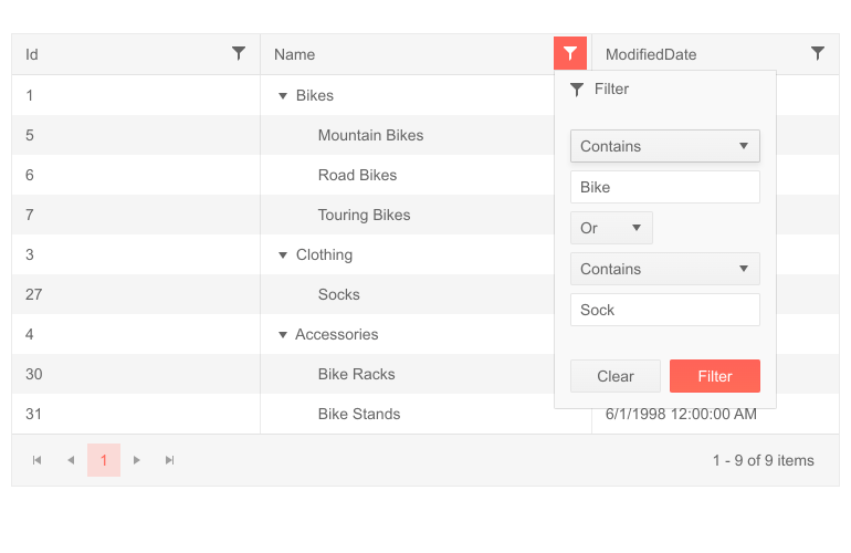
-
State Management
The TreeList presents end-users with many configurable elements – e.g. the currently applied filtering and sorting rules. The set of configurable elements is the TreeList’s state. The component allows developers to programmatically save, load and change the current state. This means you can make sure the end-user always starts from the same place they were at the last time they used your application.
Learn more about the TreeList Persist State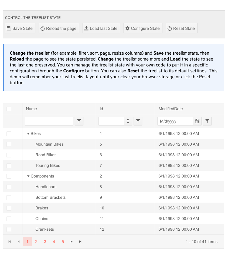
-
Blazor TreeList Header Cell CSS Class
To apply customizations to the Blazor TreeList header cells, you can take advantage of the exposed HeaderClass parameter in the TreeListColumn tag and define custom CSS classes for the header cells of the columns.
-
Events
The Blazor TreeList component exposes multiple events that let you handle programmatic logic. These include data management events like OnCreate, OnUpdate and OnDelete, visibility events like OnExpand and OnCollapse, action events like OnRowClick, OnRowDoubleClick, OnRowContextMenu
,and more.The full list of events and details about the condition under which they are triggered is available in the Blazor TreeList documentation.

-
Alignment of Cell Values
The TreeList columns provide a way to specify horizontal alignment for the content through the TextAlign parameter. You can easily align numbers to the right and text to the left to implement the classic alignment standards within your project. Or if you prefer you can center the text within the cells.
Explore the Different Formatting Options -
TreeList Theming
he Telerik Blazor TreeList component has several built-in themes such as Default (our own styling), Material (based on the Material Design guidelines), Bootstrap (which looks like the Bootstrap styling to integrate better) and Fluent (based on Microsoft Fluent UI). You can easily customize any of out-of-the-box themes, style a specific component instance or create new theme to match your colors and branding by using the Telerik SASS ThemeBuilder application.
-
Pass Context to Command Buttons
With the TreeList component you can have conditional command buttons depending on the properties of the row item. This is achieved by adding the current row item as a context (of type object) to the current ChildContent parameter. -
Keyboard Navigation
The TreeList component supports a ton of keyboard shortcuts, allowing users to do everything they would normally do using a mouse, including navigating the items of the TreeList, selecting and editing them.

-
Keyboard Navigation with Column Virtualization
Keyboard navigation can now be used with virtual columns in the TreeList component. There are several differences in the shortcuts that can be used in virtualized and non-virtualized scenarios. For example, the Home and End buttons would move focus to the first or last cell in the virtual column range for a cell not in edit mode. Pressing Alt + Home/End button would result in moving focus to first/last cell in a row, also not in edit mode. Pressing F2 will put the row in edit mode, if inline edit mode is enabled and Tab will focus the next focusable element in the virtual column range. -
Right-to-Left (RTL) Support
The Telerik UI for Blazor TreeList component supports right-to-left configuration. The RTL functionality is supported by most of our components to accommodate users who communicate in a right-to-left language script, such as Arabic and Hebrew.
Learn more in our Blazor Right-to-Left Support documentation