UI for Blazor
Blazor Slider
- The Blazor Slider component lets you increase, decrease and select a predefined value.
- Part of the Telerik UI for Blazor library along with 120+ professionally-designed UI components.
- Includes support, documentation, demos, virtual classrooms, Visual Studio Code Extensions and more!
-
Configure Numeric Values with Blazor Slider
The Telerik UI for Blazor Slider component is a beautiful input control for selecting a numeric value. You can configure the value to increment in steps or match a certain set of criteria, such as being divisible by or greater than a number. With many customization options, you can be sure the component will match any scenario with little work.
See the Blazor Slider demo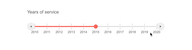
-
Customization
As customization is an essential feature across our entire UI suite, t he Telerik UI for Blazor Slider control has a number of elements that can be flexible modified to fit your style, including:
-
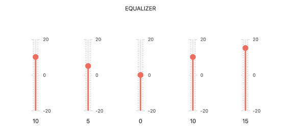
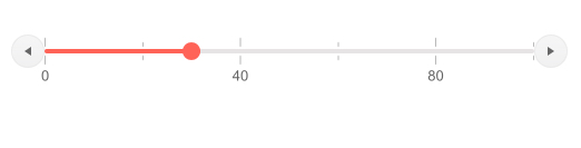
Control the step, min and max values
-
Enable or disable the buttons for increasing and decreasing the value at both ends
-
Define the distance between two tick marks
-
Choose between horizontal or vertical orientation
-
A setting controlling how values are rounded off
-
-
Label Templates
All the labels in the control can be redone if you need to change them for your application. Simply pass the new HTML into the template slot and you are good to go.
Telerik UI for Blazor Slider label templates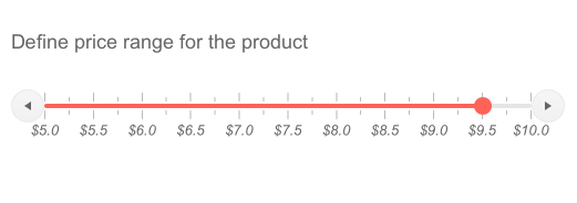
-
Events
The single event ValueChanged is fired exactly as you expect it to—when the Slider value changes to a new number, be it lower or higher than the previous one.
-
Theming
The Slider component has 20+ built-in themes such as Default (our own styling), Material (based on the Material Design guidelines), Bootstrap (which looks like the Bootstrap styling to integrate better) and Fluent (based on Microsoft Fluent UI). You can easily customize any of out-of-the-box themes with a few lines of CSS, or create new theme to match your colors and branding by using the Telerik SASS ThemeBuilder application.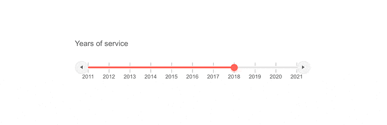
-
Keyboard Navigation
Several standard key bindings for the Blazor Slider component are available out of the box:
-
Arrows move the value in the corresponding direction
-
PageUp/PageDown move the value using a larger step
-
Home/End immediately maximizes/minimizes the given value with its defaults

-
-
Blazor Slider Globalization
The Telerik UI for Blazor Slider component will automatically display the numbers in the correct format according to the user’s locale.
Slider Globalization scenarios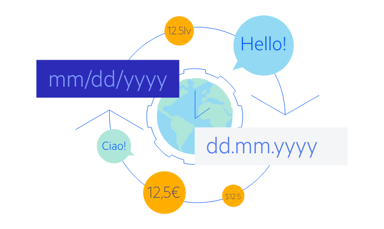
-
Right-to-Left (RTL) Support
The Telerik UI for Blazor Slider component supports right-to-left configuration. The RTL functionality is supported my most of our components to accommodate users who communicate in a right-to-left language script, such as Arabic and Hebrew.
Learn more in our Blazor Right-to-Left Support documentation