UI for Blazor
Blazor RadioGroup
- The Blazor RadioGroup control shows a data bound collection of options displayed as radio buttons.
- Part of the Telerik UI for Blazor library along with 120+ professionally-designed UI components.
- Includes support, documentation, demos, virtual classrooms, Visual Studio Code Extensions and more!

-
Easy Selection from a Predefined List with Blazor RadioGroup
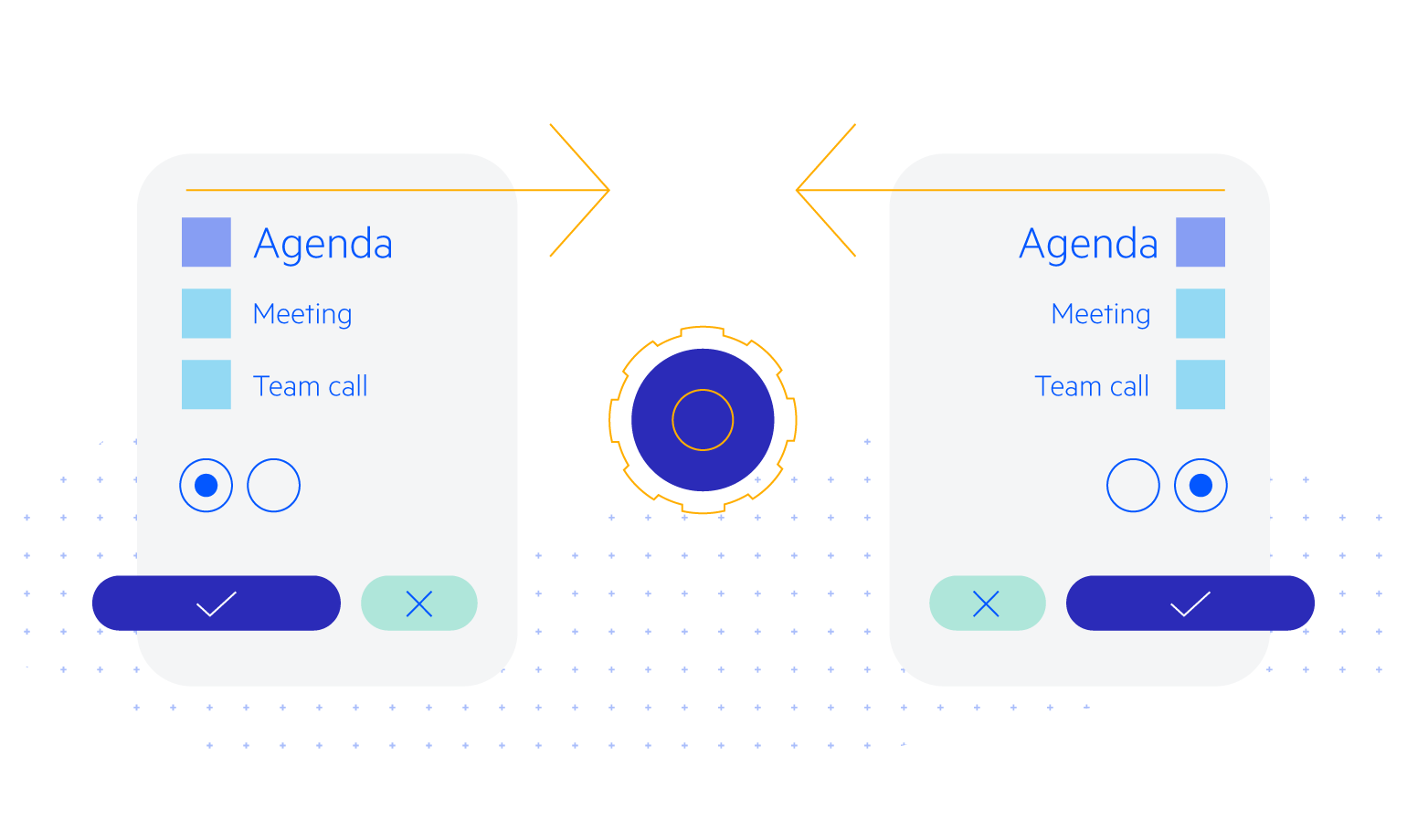
There are many ways to select a single option from a predefined list of options, but none is as classic as the Telerik UI for Blazor RadioGroup component. Bind this control directly to the list of choices and it will automatically render all of them while allowing for complete customization and keyboard navigation.
Check out the Blazor Radio Button Group demo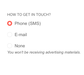
-
Data Binding
Similarly, to the rest of our suite, the component can be bound to both primitive types and to models. This mean setup is really simple – you only need to pass an IEnumerable<T> of your type to get things going and the component will do the rest. On the other hand, should you need to have different values for each item’s value and display text, you can bind the RadioGroup to a model in your application. Examples of both are given in our RadioGroup documentation page.

-
Labels & Orientation
The RadioGroup’s button can be laid out vertically (the default) or horizontally. Further, the labels on each item can be positioned before or after (the default) each button. These options help you fit the control in whatever input form you are building.
Blazor RadioGroup customization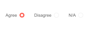
-
TabIndex
The Blazor RadioGroup component, just like all other Telerik UI for Blazor input components, supports keyboard navigation to switch between components thanks to the HTML TabIndex property. Pressing Tab will normally focus the next available input component, the same way your users are accustomed to when standard HTML inputs are used. Having the TabIndex setting lets you customize that order. -
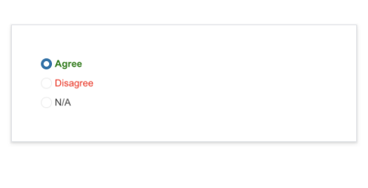
RadioGroup Templates
The Telerik UI for Blazor RadioGroup component exposes an ItemTemplate, which enables customization of the radio item content, rendering and appearance. The template can host HTML markup or nested Razor components. You can add icons, styles and special formatting in the radio buttons of your Blazor apps.
-
Events
Similarly, to the rest of the input selection components in the suite, the events ValueChanged and OnChange are triggered when a selection is made.
Learn more about the Blazor RadioGroup events -
Theming
The Telerik UI for Blazor RadioGroup has several built-in themes such as Default (our own styling), Material (based on the Material Design guidelines), Bootstrap (which looks like the Bootstrap styling to integrate better) and Fluent (based on Microsoft Fluent UI). You can easily customize any of out-of-the-box themes with a few lines of CSS, or create new theme to match your colors and branding by using the Telerik SASS ThemeBuilder application.

-
Keyboard Navigation
The Telerik UI for Blazor RadioGroup component can be navigated through keyboard alone and the active selection can be chosen by keyboard too.
-
Right-to-Left (RTL) Support
The Telerik UI for Blazor RadioGroup component supports right-to-left configuration. The RTL functionality is supported by most of our components to accommodate users who communicate in a right-to-left language script, such as Arabic and Hebrew.
Learn more in our Blazor Right-to-Left Support documentation