UI for Blazor
Blazor Range Column Chart
- Showcase differences between data sets using vertical bars with Telerik UI for Blazor Range Column Chart.
- Part of the Telerik UI for Blazor library along with 120+ professionally-designed UI components.
- Includes support, documentation, demos, virtual classrooms, Visual Studio Code Extensions and more!
-
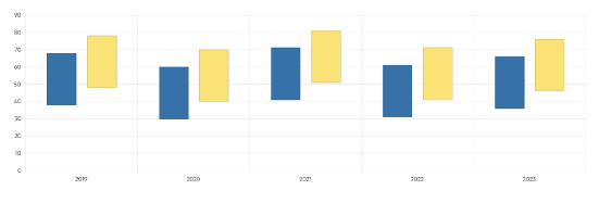
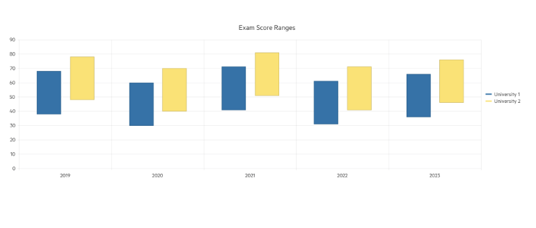
Compare Data Sets Using Vertical Bars with Blazor Range Column Chart
Leverage the Range Column Chart to showcase data as vertical bars whose heights and position vary according to their from and to values. Cover use cases where comparison between several sets of data need to be displayed – e.g., summaries of quantities or measurements for different time periods. The Range Column Chart supports multiple appearance options, so you can easily customize it to fit your brand, user or personal requirements.
-
Range Column Chart Data Binding
The Range Column Chart is a data bound component which also provides the flexibility to bind axes and series to various data sources separately or together.

-
Color Configuration
For elevated look and feel, each individual series is visualized with a different color that can be customized through the ColorField property of the Telerik UI for Blazor Range Column Chart. Simply define a valid CSS color and it will be applied to the selected series.
Check the Telerik UI for Blazor Range Column Chart Color documentation
-
Label Customization
All data items within the Telerik UI for Blazor Range Column Chart are supported with a text label that adds more explanation to the displayed values. You can easily control and modify the labels appearance to match your user requirements or personal preferences.
Check the Telerik UI for Blazor Range Column Chart Labels documentation
-
Gap and Spacing
Controlling the distance between the vertical bars of different series in the same category is a breeze with the Spacing property available in Blazor Range Column Chart. Moreover, the distance between different categories can be configured leveraging the Gap property.
Check the Telerik UI for Blazor Range Column Chart Gap and Spacing documentation
-
Customizable Chart Elements
Alongside the series appearance options, the Blazor Range Column Chart exposes several nested tags which enables you to customize the rest of the chart elements – Category Axis, Legend, Plot Area, Tooltip, etc.
Check the Telerik UI for Blazor Range Bar Chart Nested Tags documentation
-
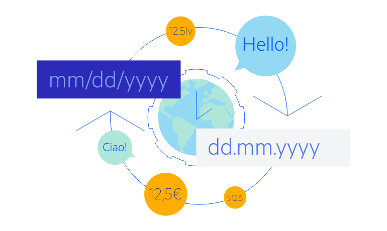
Globalization
The Label Format Strings in Blazor Range Column Chart are culture aware so your users see, for example, the expected number formats with the decimal and thousands separators they are used to.
-
Right-to-Left (RTL) Support
The Telerik UI for Blazor Range Column Chart supports right-to-left configuration. The RTL functionality is supported by most of our components to accommodate users who communicate in a right-to-left language script, such as Arabic and Hebrew.
Learn more in our Blazor Right-to-Left Support documentation