UI for Blazor
Blazor MultiSelect
- Provide suggestions based on the user input and let them select more than one option with the Blazor MultiSelect.
- Part of the Telerik UI for Blazor library along with 120+ professionally-designed UI components.
- Includes support, documentation, demos, virtual classrooms, Visual Studio Code Extensions and more!

-
MultiSelect Data Binding
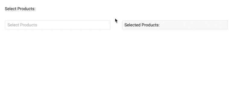
The Blazor MultiSelect component supports binding to primitive types (such as simple collection of int, string or other data types) or data models in Blazor applications.

-
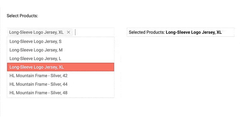
MultiSelect Filtering and Searching
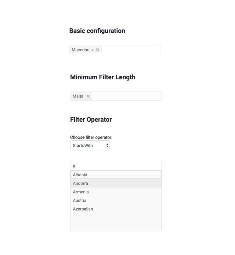
For faster and simplified search of values within the MultiSelect component, you can set the Filterable parameter of the component. This way the control will filter the available suggestions according to the current user input.
The MultiSelect offers additional parameters to fine-tune filtering and searching:
- MinLength – allows you to control when the filter list will appear;
- FilterOperator – lets you define filtering operator such as “startswith”, “contains”, “endswith” etc.;
-
MultiSelect Custom Filtering
The MultiSelect component allows you define custom filtering and setting a data source dynamically through the OnRead event.
MultiSelect custom filtering example.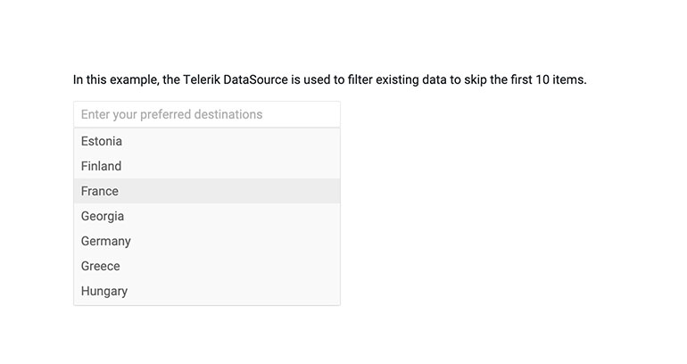
-
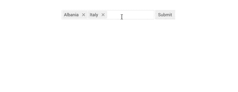
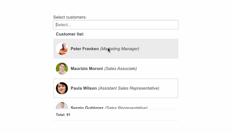
MultiSelect Tag Mode
Display the items within the Telerik UI for Blazor MultiSelect as individual or also referred to as multiple tags or as a single, summary tag. The desired mode is easily configured leveraging the TagMode parameter. If the case requires so, within the Multiple option you can additionally control the maximum number of individual tags that will be visualized in the input. If the selected items exceed this number, the Blazor MultiSelect will summarize the remaining selected items.
-
MultiSelect Validation
Built-in support for EditForm and DataAnnotation validation is available out-of-the box in all Telerik Blazor components, including MultiSelect.
-
Prefix and Suffix Adornments
Elevate user interactivity leveraging the option for adding prefix and suffix adornments. These are custom items, usually an icon or button, inside the field before or after the input area. Typical prefix adornments are currency symbols or unit indicators, while suffix adornments are often used for password visibility toggles, formatting or clearing the input.
-
MultiSelect Events
You have several events available for capturing and handling changes to the values in the MultiSelect component:
- OnRead – fires upon component initialization and user filtering
- ValueChanged - fires upon user selection change
- OnChange- fires only when the user presses Enter, or blurs the input (for example, clicks outside of the component)
- OnBlur - an event which is triggered when it loses focus

-
MultiSelect TabIndex
The Blazor MultiSelect component, just like all other Telerik UI for Blazor input components, supports keyboard navigation to switch between components thanks to the HTML TabIndex property. Pressing Tab will normally focus the next available input component, the same way your users are accustomed to when standard HTML inputs are used. Having the TabIndex setting lets you customize that order. -
MultiSelect Adaptive Rendering
Enable a mobile-friendly rendering of the MultiSelect suggestion list by simply setting the AdaptiveMode parameter to AdaptiveMode.Auto. This will allow automatic adaptation of the component to the current size of the screen. The rendering will be changed accordingly as well. In auto adaptive mode, the MultiSelect component also allows you to define the title text rendered in the header of the popup.
-
MultiSelect Keyboard Navigation and Accessibility
Like all other Telerik UI for Blazor components, the MultiSelect supports out of the box Keyboard Navigation that will allow easy navigation and interaction with the list values of the component using keyboard. Semantic HTML and support for the accessibility standards (WCAG, Section 508 and WAI-ARIA attributes for screen readers) let users with disabilities use the Telerik MultiSelect with ease.

-
MultiSelect Globalization and Localization
The MultiSelect control has built-in localization support, which makes it easy to translate texts to any language that your Blazor app may require.
Demo of MultiSelect component in various languages.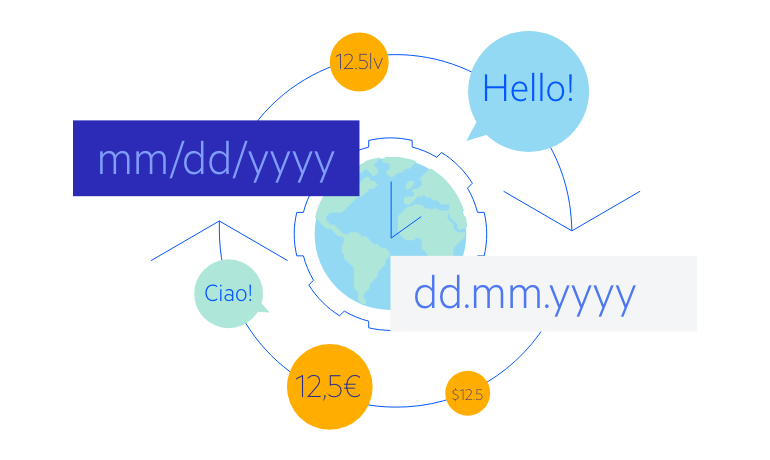
-
MultiSelect Popup Settings
The Blazor MultiSelect component allows you to simply popup configuration from a single tag. The popup settings allow you to configure minimum and maximum dimensions along with the already existing width, height and class parameters. Additionally, the MultiSelect Open and Close methods allow you to toggle the popup visibility of the UI for Blazor <ComponentName> components without triggering the OnOpen/OnClose events.
-
MultiSelect Grouping
The built-in grouping functionality in the MultiSelect component helps users navigate easily through the options in the list and choose best what they want from each category. The category label on top of the list makes it easier to locate the particular item you are looking for by first navigating to the appropriate category.
Check out the Telerik UI for Blazor MultiSelect Grouping functionality
-
Virtualization
Lazy loading the items of the MultiSelect can be a great way to improve the user experience by reducing loading and response times. The component, alongside all other <select>-like components, fully supports virtualization, which loads only the currently visible elements and saves your users precious CPU cycles. -
Right-to-Left (RTL) Support
The Telerik UI for Blazor MultiSelect component supports right-to-left configuration. The RTL functionality is supported by most of our components to accommodate users who communicate in a right-to-left language script, such as Arabic and Hebrew.
Learn more in our Blazor Right-to-Left Support documentation
-
MultiSelect Theming
The Telerik Blazor MultiSelect has several built-in themes such as Default (our own styling), Material (based on the Material Design guidelines), Bootstrap (which looks like the Bootstrap styling to integrate better) and Fluent (based on Microsoft Fluent UI). You can easily customize any of out-of-the-box themes with a few lines of CSS, or create new theme to match your colors and branding by using the Telerik SASS ThemeBuilder application.
-
Built-in Boundary Detection
Blazor MultiSelect enables you to set its boundary detection functionality by using the collision binding property. The property specifies the behavior of the component when it does not fit in the viewport. By default, the component fits horizontally and flips vertically.
-
Customizing MultiSelect with Templates
The Telerik UI for Blazor MultiSelect component and its items rendering can be easily customized using one of the built-in templating options:
- Header Template – defines custom pop-up header appearance of the MultiSelect
- Summarry Tag Template – controls the rendering of the summary tag
- Item Template – lets you customize the appearance of all list items
- Footer Template – helps you design your own pop-up MultiSelect footer
- No Data Template – enables customization of the dropdown content when there are no items to display
See how to customize the Blazor MultiSelect component using templates
-
Custom Values
By setting AllowCustom to true, users can type and select values that aren't part of the predefined list. These custom values are added to the bound collection through two-way binding, enabling more dynamic and user-driven scenarios.
See the Telerik UI for Blazor MultiSelect custom values documentation
-
Utilize Multiple Selection Options with Blazor MultiSelect
The Blazor MultiSelect Component displays to users a list of predefined options and allows typing or multiple selection of values from that list. The MultiSelect is a powerful full-featured UI control that can be bound to data and adapted to fulfill any project requirement by configuring its dimensions, templates and handling the available events. The Telerik MultiSelect works in both Blazor WebAssembly (WASM) and Server-side Blazor apps and provides convenience to users by providing suggestions as they type, has built-in keyboard navigation and can be translated to any language using its localization feature.