UI for Blazor
Blazor FontIcon
- Easily display built-in Blazor font icons or leverage custom ones with the Telerik UI for Blazor FontIcon component.
- Part of the Telerik UI for Blazor library along with 120+ professionally-designed UI components.
- Includes support, documentation, demos, virtual classrooms, Visual Studio Code Extensions and more!
-
Display Built-in Font Icons with Blazor FontIcon
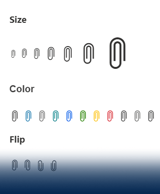
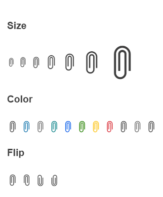
Display built-in Blazor font icons or leverage custom ones with the new Telerik UI for Blazor FontIcon component. Benefit from the available configuration parameters to render a predefined Blazor font icon or enable a custom CSS class to implement a third-party, custom icon. Effortlessly align the icon style with your brand or personal needs with the available appearance options, enabling you to change the FontIcon component size, color, or flip direction.
-
Appearance
Play with the available Telerik UI for Blazor FontIcon appearance options to customize the component based on your style guidelines or visual preferences. These appearance options include:
- Size, which defines the size of the font icon (from XS to XXXL)
- ThemeColor to match the icon color with your design needs
- Flip, which allows you to mirror the image horizontally, vertically, or in both directions