UI for Blazor
Blazor FlatColorPicker
- Use the Blazor FlatColorPicker to choose and edit colors through a palette with a predefined set of colors.
- Part of the Telerik UI for Blazor library along with 120+ professionally-designed UI components.
- Includes support, documentation, demos, virtual classrooms, Visual Studio Code Extensions and more!

-
Edit Color Seamlessly with Blazor FlatColorPicker
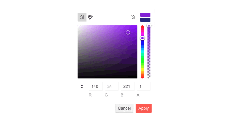
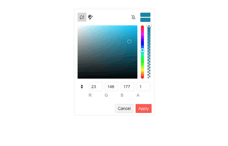
The Telerik UI for Blazor FlatColorPicker is used for color editing through gradient and palette views that fully integrate with the ColorGradient and ColorPalette components. The UI component supports value resetting, value reverting and Apply & Cancel buttons for committing to your choice.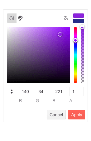
-
Views
The FlatColorPicker component has two views you can choose from:
- Single Palette – which shows a palette (grid of colors)
- Gradient View – which displays sliders and a gradient palette allowing more precise selection
-
Built-in Header and Footer
The component comes with a built-in header and footer, which can be easily customized through templates. The header shows a button group for switching between views, clear button, preview & revert color action buttons. The footer displays the action buttons for applying or cancelling changes. You can easily customize both by displaying or removing any of the buttons, depending on your project’s needs.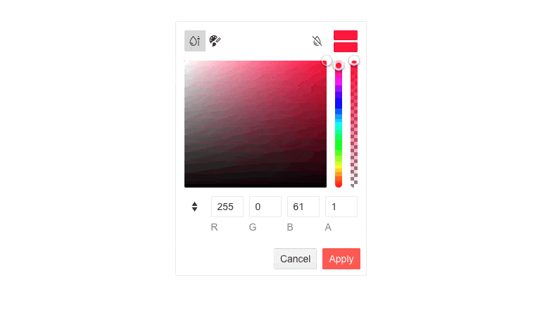
-
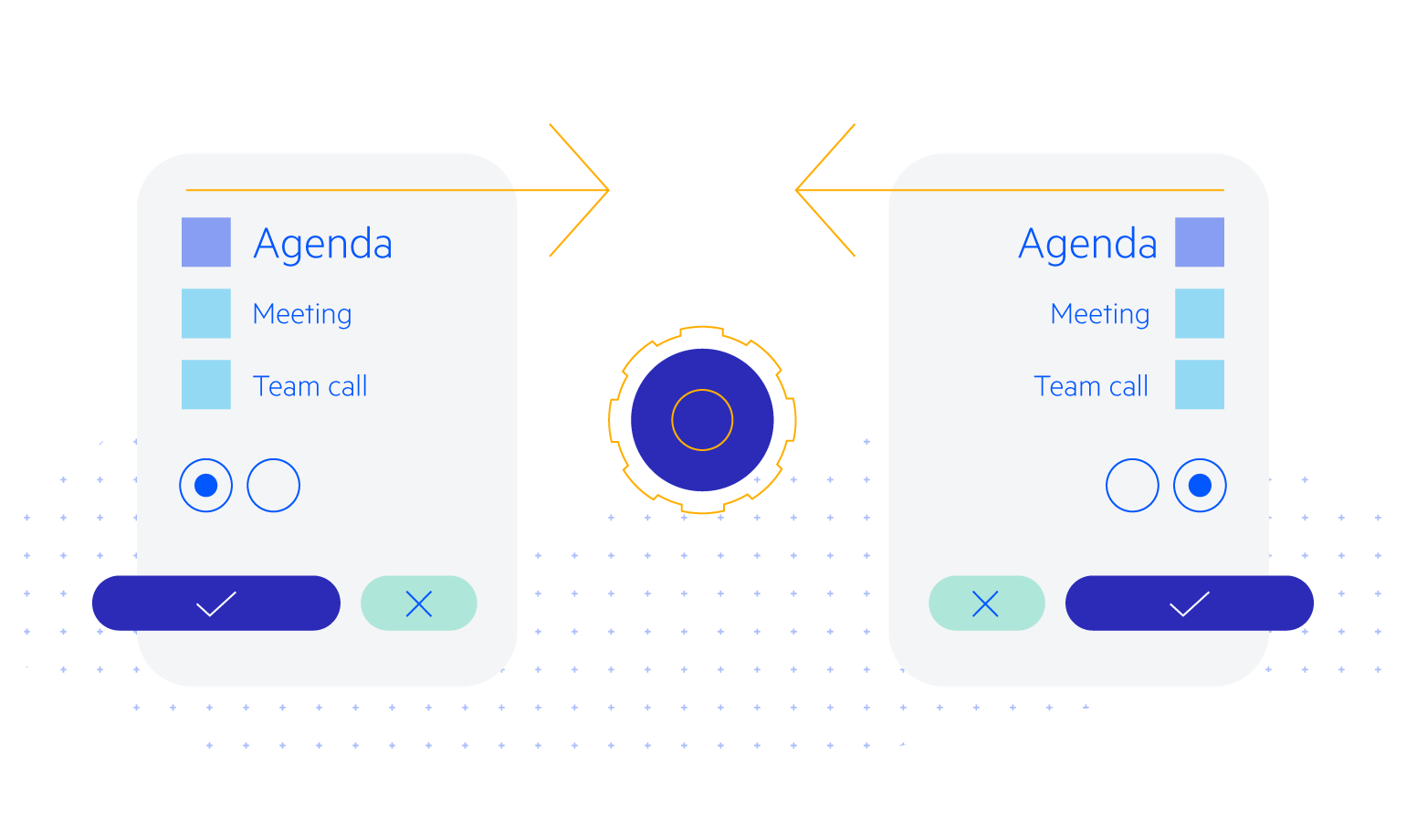
Action Buttons
The component features various action buttons in its header and footer. They can be enabled through the ShowButtons property and change how the value of the component will be updated.
For more details, visit our documentation article on FlatColorPicker Action Buttons
-
Theming
Style the FlatColorPicker using the four built-in themes and a variety of swatches, including Default (Main Dark, Nordic, Purple), Material (Arctic, Lime Dark, Nova), Bootstrap (Urban, Vintage, etc.) and Fluent. You can easily customize the available themes with a few lines of CSS or create a new one with the Progress Sass ThemeBuilder application.
-
Right-to-Left (RTL) Support
The Telerik UI for Blazor FlatColorPicker component supports right-to-left configuration. The RTL functionality is supported by most of our components to accommodate users who communicate in a right-to-left language script, such as Arabic and Hebrew.
Learn more in our Blazor Right-to-Left Support documentation