UI for Blazor
Blazor ProgressBar
- The Blazor ProgressBar component lets you visualize the progress of a lengthy operation or its execution.
- Part of the Telerik UI for Blazor library along with 120+ professionally-designed UI components.
- Includes support, documentation, demos, virtual classrooms, Visual Studio Code Extensions and more!

-
Stay Informed About the Progress of Long-Running Operations with Blazor ProgressBar
The Telerik UI for Blazor ProgressBar component is a visual indicator for any long-running operations in your application. Use it when loading data from a server, doing a heavy computation or anything in between. The control can be configured to fit in a variety of scenarios – use it to display what percentage of the work has been done or put it an indeterminate state if that information is not available. Visit the full demo page for the ProgressBar for examples on how to use all of its features.

-
Labels
Labels are a way to augment the visual representation of the component with textual description. Their usage may differ in certain scenarios, so we have included multiple customization options. You are able to choose the label’s position, visibility and custom content.
Configure the Blazor ProgressBar labels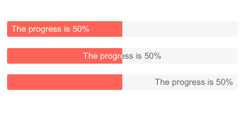
-
Orientation
Aside from labels, the component’s orientation is similarly modifiable – it can stand horizontal and vertical with a switch of an attribute value.

-
Indeterminate State
Putting the ProgressBar into indeterminate state turns off the progress indicator. Use this option to let users know that the application has no information about how long the current operation will take to complete but still present them with an indication that the program is running.
Learn more about the ProgressBar Indeterminate state -
Theming
The Telerik UI for Blazor ProgressBar has several built-in themes such as Default (our own styling), Material (based on the Material Design guidelines), Bootstrap (which looks like the Bootstrap styling to integrate better) and Fluent (based on Microsoft Fluent UI). You can easily customize any of out-of-the-box themes with a few lines of CSS, or create new theme to match your colors and branding by using the Telerik SASS ThemeBuilder application.

-
Right-to-Left (RTL) Support
The Telerik UI for Blazor ProgressBar component supports right-to-left configuration. The RTL functionality is supported my most of our components to accommodate users who communicate in a right-to-left language script, such as Arabic and Hebrew.
Learn more in our Blazor Right-to-Left Support documentation