
UI for Blazor
Blazor Arc Gauge
- Use the Blazor ArcGauge component for representing value ranges across an arc.
- Part of the Telerik UI for Blazor library along with 120+ professionally-designed UI components.
- Includes support, documentation, demos, virtual classrooms, Visual Studio Code Extensions and more!
-
Represent Value Ranges with Blazor Arc Gauge
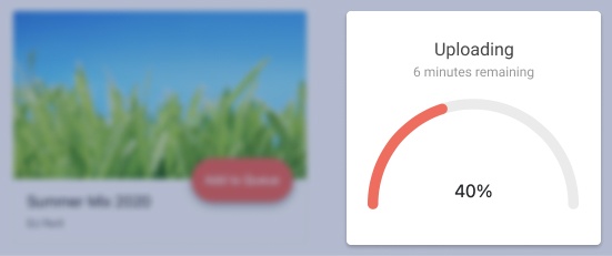
Being the Circular Gauge’s little sister, the Telerik UI for Blazor’s Arc Gauge is sometimes overlooked but just as useful to showing progress towards a goal. There aren’t any strict reasons to prefer one over another but consider the Arc when you have less space for the gauge or the visual would fit better.
Check out the Blazor ArcGauge demo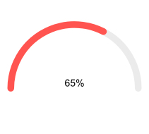
-
Scale Customization
As with all other Gauge types, the Arc Gauge’s scale can be customized by controlling if labels and ticks are displayed, what they colors are, whether the scale grows clockwise or counterclockwise, and the respective start and end angles of the arc.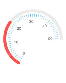
-
Center Template
Add a descriptive label of what the ArcGauge is showing at its center by specifying a center template that allows you render custom content.
See the Blazor ArcGauge Central Template demo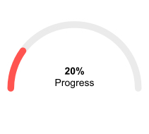
-
Right-to-Left (RTL) Support
The Telerik UI for Blazor Arc Gauge component supports right-to-left configuration. The RTL functionality is supported by most of our components to accommodate users who communicate in a right-to-left language script, such as Arabic and Hebrew.
Learn more in our Blazor Right-to-Left Support documentation

