
UI for Blazor
Blazor ToolBar
- The Blazor ToolBar component allows your users to control the screen form.
- Part of the Telerik UI for Blazor library along with 120+ professionally-designed UI components.
- Includes support, documentation, demos, virtual classrooms, Visual Studio Code Extensions and more!

-
Organize Commands in the Form of Buttons with Blazor Toolbar
The Telerik UI for Blazor ToolBar Component represents a container for various types of buttons and template items. It lets you organize commands in the form of buttons by adding or removing elements. This way, the user can easily access and execute those commands in different scenarios. The component also integrates with other controls and supports keyboard navigation.
-
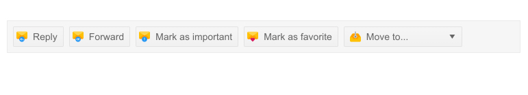
ToolBar Available Tools
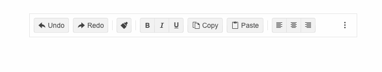
The ToolBar component supports the following button-type controls: Buttons, ToggleButtons and ButtonGroups. In addition to that, you can add other custom content or controls in the toolbar thanks to the TemplateItems.
The component also supports ToolBarSpacer, which renders a small separator between the items and ToolBarSeparator that specifies empty space in the toolbar. The space between the items is automatically calculated to fit the width of the toolbar.
Check out the Blazor ToolBar tools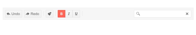
-
Responsiveness and Adaptability
The Telerik UI for Blazor Toolbar is designed to preserve its look regardless of what device and screen the user is currently enjoying your app on. You can also control which items should move to the overflow popup and which should never hide.
-
Component Integration
The ToolBar is useful because it can be integrated in other components such as the Telerik UI for Blazor Editor which will simplify the structure and make your work with the components more convenient.
-
ToolBar Keyboard Navigation
The ToolBar component supports Keyboard Navigation which enables easy navigation through it by using just the keyboard, as well as access to the component content through assistive technologies.
-
Right-to-Left (RTL) Support
The Telerik UI for Blazor ToolBar component supports right-to-left configuration. The RTL functionality is supported by most of our components to accommodate users who communicate in a right-to-left language script, such as Arabic and Hebrew.
Learn more in our Blazor Right-to-Left Support documentation

