
UI for Blazor
Blazor Split Button
- Telerik UI for Blazor SplitButton allows users to choose one action to be executed among a several from the same button.
- Part of the Telerik UI for Blazor library along with 120+ professionally-designed UI components.
- Includes support, documentation, demos, virtual classrooms, Visual Studio Code Extensions and more!
-
Prioritize Actions with Blazor SplitButton
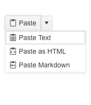
The Telerik UI for Blazor SplitButton allows users to choose one action to be executed among a several from the same button with the help of a dropdown list. It is a lightweight version of having multiple buttons doing all of different work – it saves screen real estate and makes for a simpler UI. Why have “Paste values only” and “Paste with formatting” be different button when you can let the user pick the one they want without overflowing the screen with UI.
-
Icons
All of the actions in the SplitButton can have icons added to them to make it stand out and help users instantly recognize them.

-
Appearance
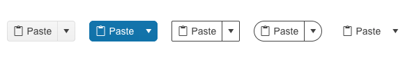
You don’t need to use custom CSS to customize the appearance of the SplitButton – the component already has relevant properties exposed that you can use to make it looks the way you want – colors, fonts, shape, size, border, etc.
-
Accessibility
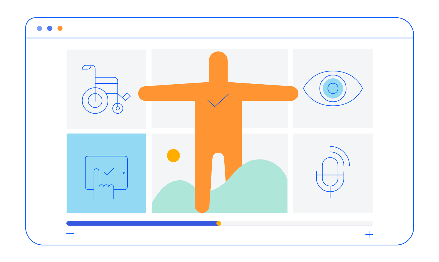
The Blazor SplitButton control is compliant with Section 508 and follows all WCAG 2.1 guidelines to be easily accessed by all users.
-
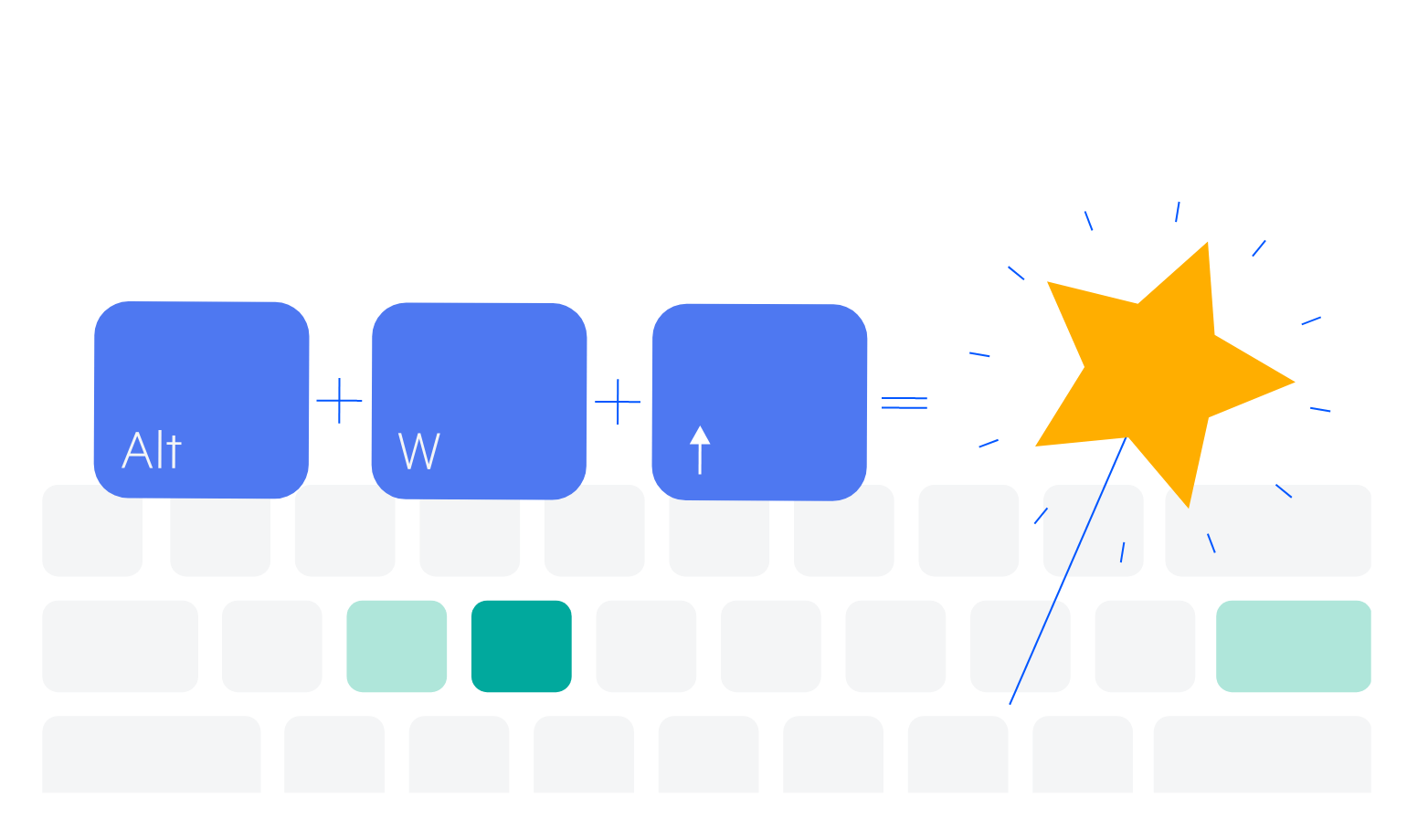
Keyboard navigation
The SplitButton control is one of the many components in the Telerik UI for Blazor suite with out-of-the-box keyboard navigation support. This allows users to easily navigate the component using only their keyboard.
-
Theming
The Telerik UI for Blazor SplitButton has several built-in themes such as Default (our own styling), Material (based on the Material Design guidelines), Bootstrap (which looks like the Bootstrap styling to integrate better) and Fluent (based on Microsoft Fluent UI). You can easily customize any of out-of-the-box themes with a few lines of CSS, or create new theme to match your colors and branding by using the Telerik SASS ThemeBuilder application.

-
Right-to-Left (RTL) Support
The Telerik UI for Blazor Split Button component supports right-to-left configuration. The RTL functionality is supported by most of our components to accommodate users who communicate in a right-to-left language script, such as Arabic and Hebrew.
Learn more in our Blazor Right-to-Left Support documentation

