
UI for Blazor
Blazor Upload
- The Blazor Upload control lets you select and upload files from local file systems to dedicated server handlers.
- Part of the Telerik UI for Blazor library along with 120+ professionally-designed UI components.
- Includes support, documentation, demos, virtual classrooms, Visual Studio Code Extensions and more!

-
Drag and Drop File Support
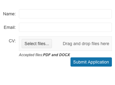
The Telerik UI for Blazor Upload component allows you to drag and drop one or multiple files from your file system in order to initiate an upload. Dragging and dropping can be done in the compact view of the Blazor Upload component, or through the integration with the Telerik UI for Blazor DropZone component.
See the Telerik UI for Blazor File Upload Drag and Drop demo
-
Single and Multiple Upload of Files in Blazor
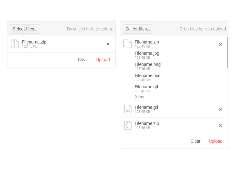
Users can select single or multiple files and upload them at the same time, which is quite useful when uploading large number of documents to a file sharing application, or images to a gallery. In addition to that, for large files you can monitor the progress of the uploaded files. Upon file upload you are presented with option to remove specific files that were part of the initial selection but are not relevant.
-
File Upload Validation
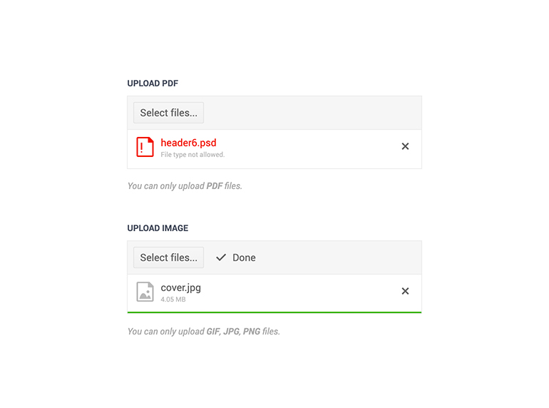
The File Upload control offers several built-in parameters to help you easily perform validation of the selected files on the client. You can set restrictions to the allowed size using MinFileSize and MaxFileSize properties, or file format using the AllowedExtensions parameter
Demo of file upload validation scenarios with the Blazor Upload component.
-
Initial Files
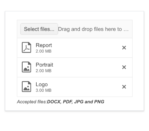
Elevate user experience by displaying specific and previously uploaded files in the file list. The Initial Files feature of the Telerik UI for Blazor Upload allows you to save a list of files that the user has uploaded. Once saved you can then display them again when the page is reloaded.
-
Custom Upload of FIles
Telerik FileUpload also exposes methods in the component API for triggering upload, file select dialog, as well as the ability to clear successfully uploaded files.
See example how to programmatically clear the files, open the file select dialog, and upload files in Blazor apps.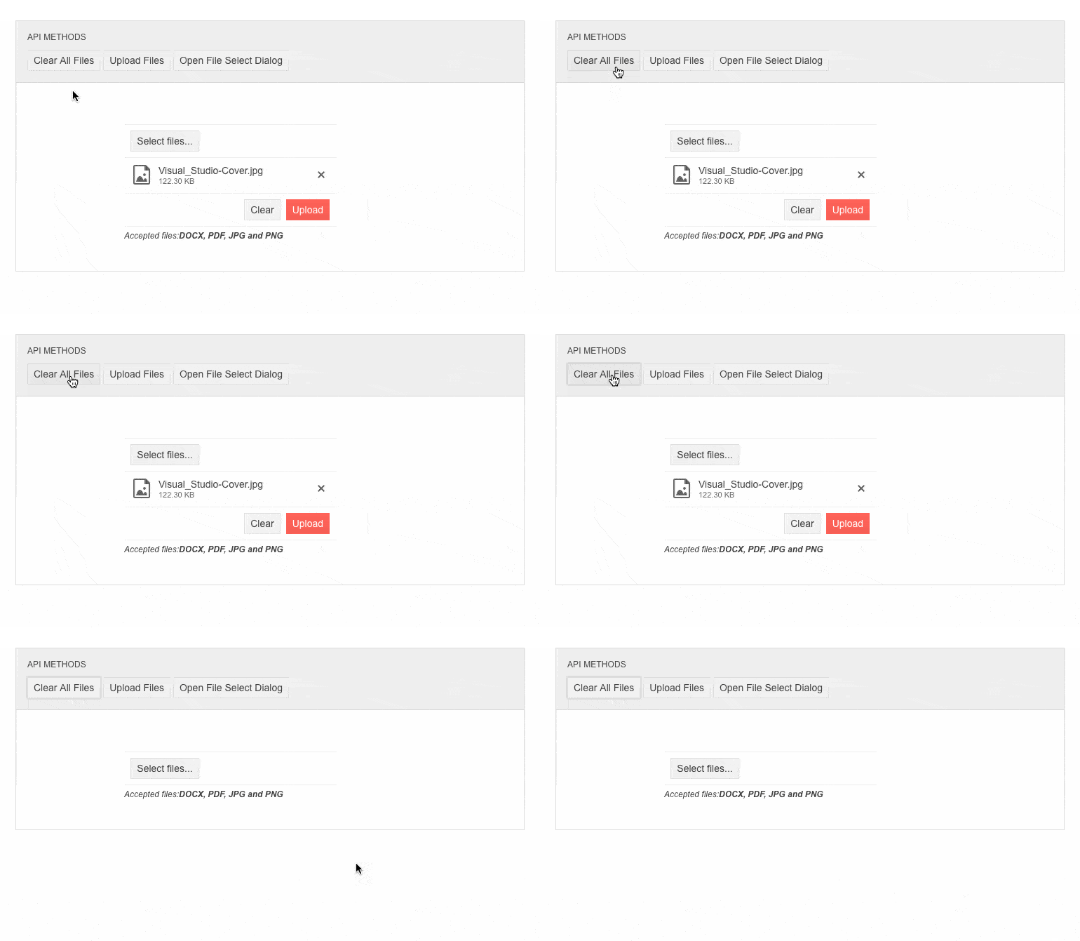
-
Upload Events
File uploads often require handling of both selected and uploaded files, and various steps of the file upload process. The Upload UI control comes handy with a long list of exposed events to help you easily handle various scenarios and have full control over the uploading. The events arguments provide a list of the files, corresponding actions (upload, deletion etc.) and access to the request objects so you can provide metadata to the server (such as authentication information).
- OnSelect – fires every time the user selects or drags and drops new files for upload.
- OnUpload – fires when files will be uploaded and allows you to add custom metadata with the upload request such as authentication tokens.
- OnRemove – fires when the users click the [x] button of an uploaded file. It sends a request to the server so you can clean up the file the user changed their mind about.
- OnProgress – fires each time a file makes progress in its upload process.
- OnSuccess – fires each time a request is successful - either an upload of a file, or the deletion of a file.
- OnError – fires each time a request fails - either an upload of a file, or the deletion of a file.
- OnCancel – fires when the user clicks the "Cancel" button on a file that is currently uploading.
- OnClear – fires when the user clicks the "Clear" button.

-
Upload Globalization and Localization
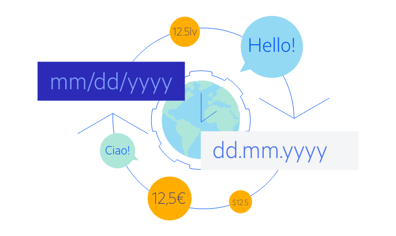
The Upload control has built-in localization support, which makes it easy to localize your Blazor upload to any language that your app may require.
-
Keyboard Navigation
Users can use the arrow keys to navigate between the uploaded files, retry a failed file upload, cancel an upload in progress or delete an already uploaded file—all without taking their hands off the keyboard.

-
Right-to-Left (RTL) Support
The Telerik UI for Blazor File Upload component supports right-to-left configuration. The RTL functionality is supported by most of our components to accommodate users who communicate in a right-to-left language script, such as Arabic and Hebrew.
Learn more in our Blazor Right-to-Left Support documentation

-
Upload Theming
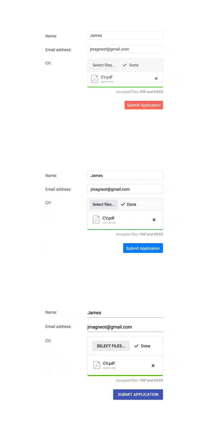
The Telerik Blazor Upload component has several built-in themes such as Default (our own styling), Material (based on the Material Design guidelines), Bootstrap (which looks like the Bootstrap styling to integrate better) and Fluent (based on Microsoft Fluent UI). You can easily customize any of out-of-the-box themes with a few lines of CSS, or create new theme to match your colors and branding by using the Telerik SASS ThemeBuilder application.
-
File Upload is Easy with Blazor Upload
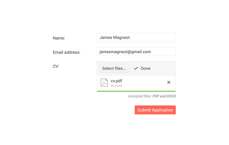
Many Blazor application require single or multiple files upload - images, documents, audio, video, and other files - as their core functionality. The Blazor Upload Component enables you to easily build asynchronous file upload and offers auto upload, multiple configuration options, file upload progress indication, validation, and events out of the box. With just a couple of lines of code your file upload requirements are implemented in both Blazor WebAssembly (WASM) and Server-side Blazor apps.
Demo of Upload Component with built-in validation and progress indicator.
-
Chunk Upload
The Telerik UI for Blazor Upload component supports chunk upload, enabling more reliable handling of large files. With chunk upload, files are automatically split into smaller parts (chunks) and uploaded in multiple requests. This feature is ideal for scenarios where large file uploads are common or where consistent upload reliability is critical.
All Blazor Components
Data Management
Scheduling
File Upload & Management
Editors
- AutoComplete
- CheckBox
- ColorGradient
- ColorPalette
- ColorPicker
- ComboBox
- DateInput
- DatePicker
- DateRange Picker
- DateTimePicker
- DropDownList
- DropDownTree New
- FlatColorPicker
- ListBox
- MaskedTextBox
- MultiColumn ComboBox
- MultiSelect
- Numeric TextBox
- RadioGroup
- Rating
- Rich Text Editor
- Signature
- TextArea
- TextBox
- TimePicker
Data Visualization
- Area Chart
- Bar Chart
- Barcode
- Bubble Chart
- Candlestick Chart
- Chart
- Column Chart
- Donut Chart
- Heatmap
- Line Chart
- OHLC Chart
- Pie Chart
- QR Code
- Radar Area Chart
- Radar Column Chart
- Radar Line Chart
- Range Area Chart
- Range Bar Chart
- Range Column Chart
- Sankey Chart
- Scatter Chart
- Scatter Line Chart
- Stock Chart
- Trendline Chart
- Waterfall Chart
Interactivity & UX
- Chat
- ChunkProgressBar
- Dialog
- Loader
- Loader Container
- Notification
- Popover
- Popup
- ProgressBar
- RangeSlider
- Skeleton
- Slider
- ValidationMessage
- ValidationSummary
- ValidationTooltip
Navigation
Layout
- Animation Container
- Avatar
- Card
- Carousel
- DockManager
- Form
- GridLayout
- MediaQuery
- PanelBar
- Splitter
- StackLayout
- TileLayout
- Tooltip
- Window
- Wizard
Geo Visualization
Document Processing
Productivity Tools
Gauges
Labels
Icons
