UI for Blazor
Blazor RangeSlider
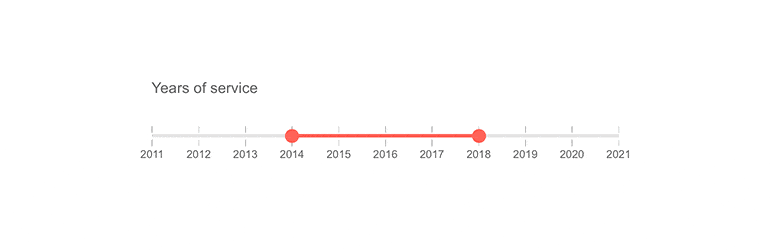
- The Blazor RangeSlider component lets you increase, decrease and select a range of predefined values.
- Part of the Telerik UI for Blazor library along with 120+ professionally-designed UI components.
- Includes support, documentation, demos, virtual classrooms, Visual Studio Code Extensions and more!
-
Expand Slider Capabilities with Blazor RangeSlider
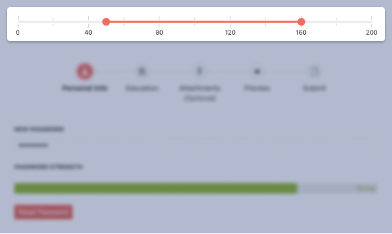
The Telerik UI for Blazor RangeSlider component is an input control, complementary to the Slider. It expands on the Slider capabilities by providing an intuitive interface for users to enter a numerical range instead of a single number. With its powerful customization options, it will match any design or use case scenario with little work.
See the Blazor RangeSlider demo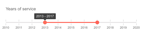
-
Customization
Multiple customization options are available for this control. Examples include:
-
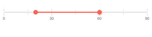
Controlling the min, max and step values
-
Controlling the component orientation (vertical or horizontal)
-
Specifying the distance between two ticks
-
Setting how many digits should the value be rounded to
-
-
Range Slider Label Templates
The control allows you to change how labels are rendered along the bar to approximate your application style. Doing that is as easy as providing an HTML template with your desired layout to the RangeSlider.
Explore the Blazor RangeSlider label templates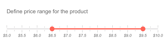
-
Events
The pair of StartValueChanged and EndValueChanged events are fired just after changing the start or end value, respectively.
-
Keyboard Navigation
When the RangeSlider has focus, you can use the keyboard to navigate and select the desired value. Arrow keys and PageUp/PageDown keys move the currently selected end of the range, Home/End sets both ends to the predefined min or max value and Tab can help you switch between the two ends of the range.
-
Globalization
The Telerik Blazor RangeSlider component detects the user’s current location and automatically updates the number formats to match the user’s settings. See the Globalization Demo for examples.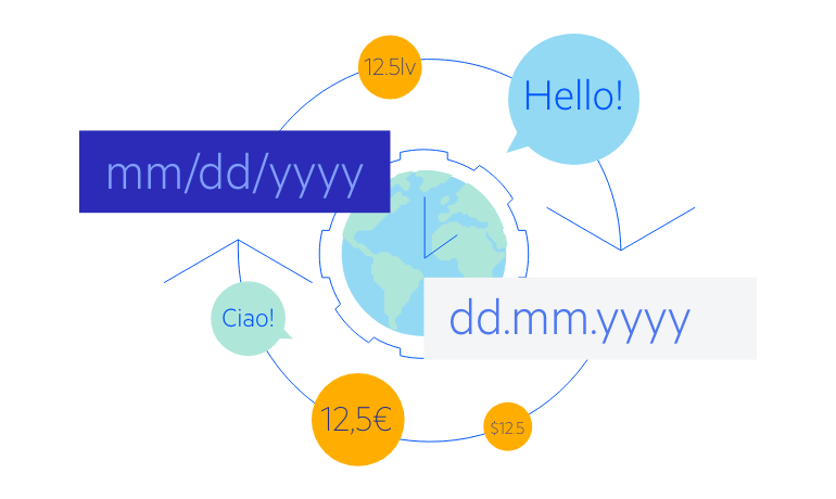
-
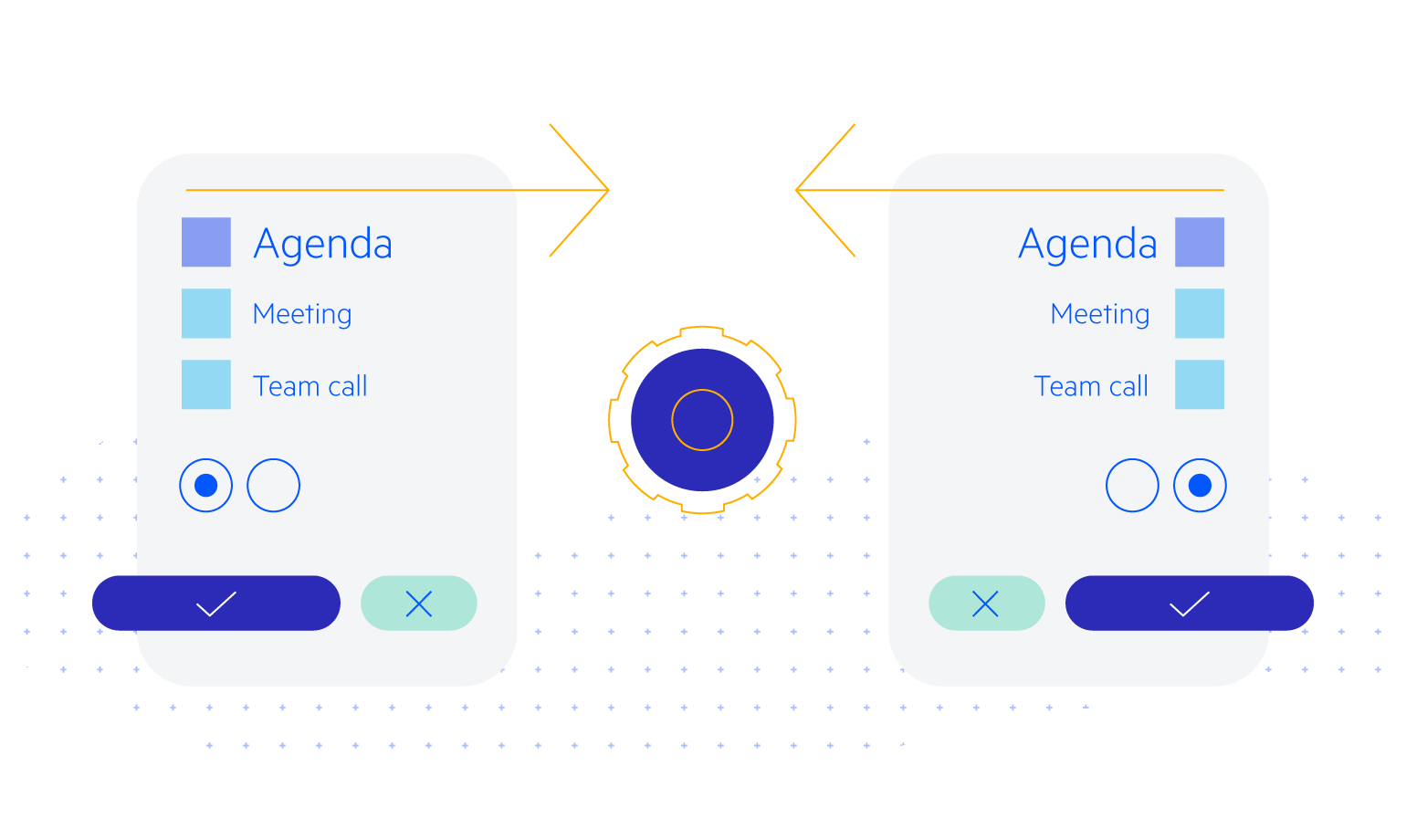
Right-to-Left (RTL) Support
The Telerik UI for Blazor Range Slider component supports right-to-left configuration. The RTL functionality is supported my most of our components to accommodate users who communicate in a right-to-left language script, such as Arabic and Hebrew.
Learn more in our Blazor Right-to-Left Support documentation
-
Blazor Range Slider Theming
The Telerik Blazor Range Slider component has several built-in themes such as Default (our own styling), Material (based on the Material Design guidelines), Bootstrap (which looks like the Bootstrap styling to integrate better) and Fluent (based on Microsoft Fluent UI). You can easily customize any of out-of-the-box themes, style a specific component instance or create new theme to match your colors and branding by using the Telerik SASS ThemeBuilder application.