
UI for Blazor
Blazor Avatar
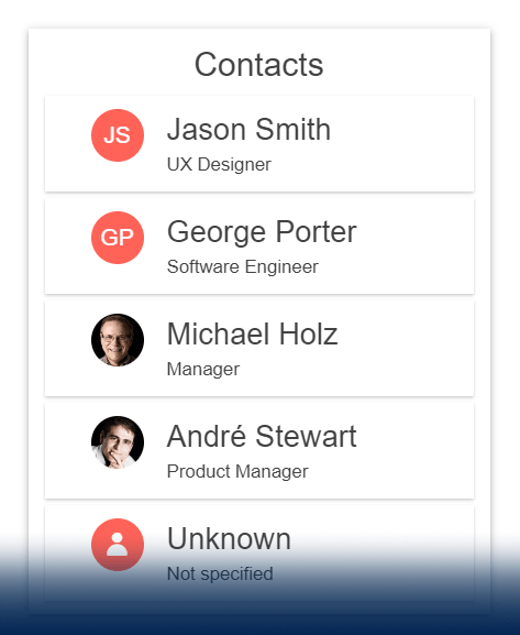
- Visually represent people or other entities when featuring profiles in your application with Blazor Avatar component.
- Part of the Telerik UI for Blazor library along with 120+ professionally-designed UI components.
- Includes support, documentation, demos, virtual classrooms, Visual Studio Code Extensions and more!
-
Build Forms, Profile pages or Navigation Bar Menus with Blazor Avatar
Easily display a graphical representation of a profile or online avatar, including people or entities, with initials, custom icons, and images with the Telerik UI for Blazor Avatar component. Build forms, profile pages or navigation bar menus as smoothly as possible, leveraging simple and customizable profile avatars that support various shapes.
See the Blazor Avatar component demo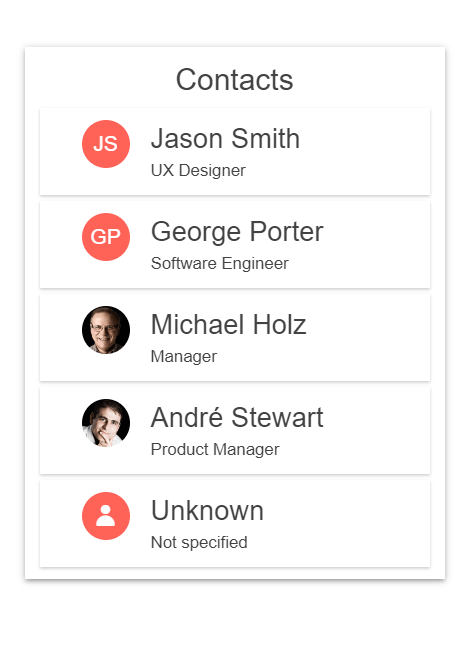
-
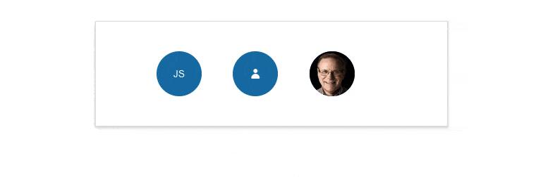
Appearance
The Telerik UI for Blazor Avatar component comes with a wide range of styling flexibility. Customize the look and feel of the component by configuring the desired size (small, medium, and large for various application scenarios), roundness, fill mode and coloring.
-
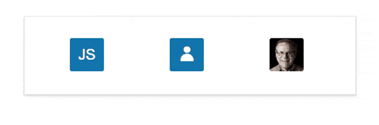
Avatar Types
The Blazor Avatar component exposes an AvatarType parameter with three predefined options: text (default), icon and image, and allows further customization of each option via additional parameters related to setting its content (imageURL, icon name, actual text and more).
-
Avatar Theming
The Telerik UI for Blazor Avatar component supports four built-in themes, including Default (our own Telerik-infused styling), Material (based on the Material Design guidelines), Bootstrap (which looks like the Bootstrap styling to integrate better) and Fluent (based on Microsoft Fluent UI).
Additionally, you can customize any of the ready-to-use themes with a few lines of CSS or create a new one to match your branding needs by using the Progress ThemeBuilder application.
-
Right-to-Left (RTL) Support
The Telerik UI for Blazor Avatar component supports right-to-left configuration. The RTL functionality is supported by most of our components to accommodate users who communicate in a right-to-left language script, such as Arabic and Hebrew.
Learn more in our Blazor Right-to-Left Support documentation

