UI for Blazor
Blazor Badge
- The easy way to display app notifications, show statuses and short messages with the Telerik UI for Blazor Badge.
- Part of the Telerik UI for Blazor library along with 120+ professionally-designed UI components.
- Includes support, documentation, demos, virtual classrooms, Visual Studio Code Extensions and more!
-
Enriching the UI Elements Context with Additional Information
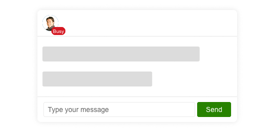
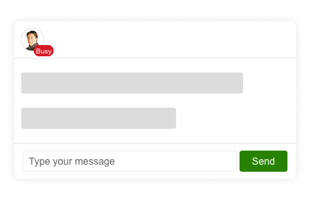
Leverage the Telerik UI for Blazor Badge component to display additional information to users such as status indicators, notification icons, short text and more. Typically, the Badge control is used in the context of other UI elements like showing the online status of a user overlayed on their avatar.
-
Position
Layout the Blazor Badge component any way you like with options for alignment, such as bottom and start, and position, such as inside and edge.

-
Appearance
Out of the box, the Telerik UI for Blazor Rating provides several different styles that can be set through a single configuration option. Styles include, but are not limited to, info, success, warning, error and more. Additionally, the Badge component provides settings for its shape, size, fill and border, which allows you to add padding around the badge, ensuring any-application-fit.