UI for Blazor
Blazor Skeleton
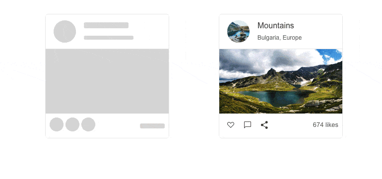
- Create a preview of how content is going to be displayed before it is loaded with the Blazor Skeleton component.
- Part of the Telerik UI for Blazor library along with 120+ professionally-designed UI components.
- Includes support, documentation, demos, virtual classrooms, Visual Studio Code Extensions and more!

-
Display a Content Preview with Blazor Skeleton
The Telerik UI for Blazor Skeleton component serves as a placeholder representing each of the underlying HTML elements while users are waiting for the page content to load. The Skeleton includes customization options for its shape, height, width, animation type, visibility, and CSS class.

-
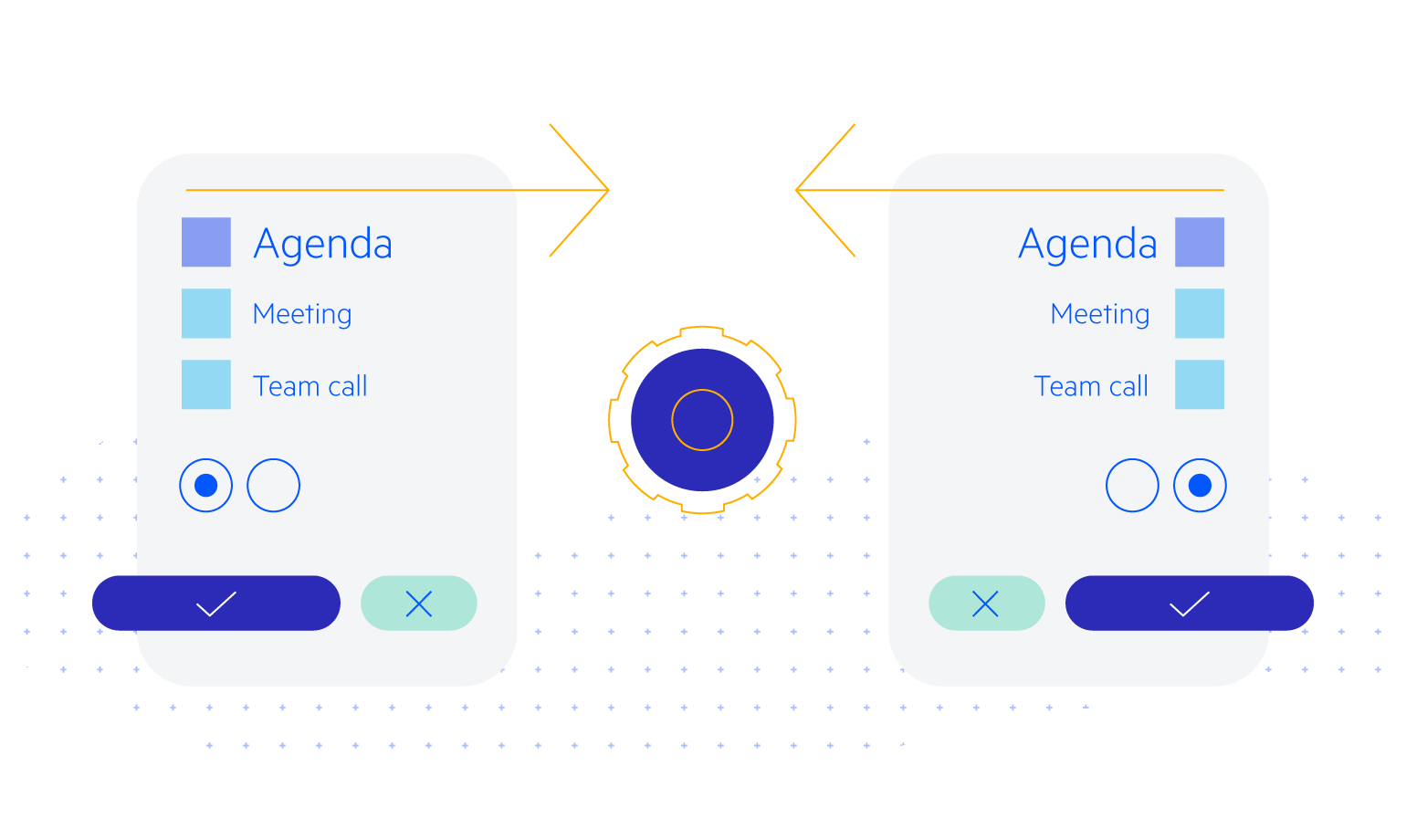
Blazor Skeleton Animations
The Skeleton component has the ability to animate the content loading process. The AnimationType parameter allows you to configure the animation types of the Skeleton component. You can choose between Pulse (default), Wave and no animation. -
Blazor Skeleton Shapes
The Skeleton component placeholders can take the form of text (default), а circle, or rectangle. To configure the shape of each skeleton placeholder, you simply need to set the ShapeType parameter to one of the available SkeletonShapeType enum values.
See an example of various Blazor Skeleton UI component appearance options.

-
Skeleton Theming
The Telerik UI for Blazor Skeleton component comes with several built-in themes and color swatches, including Default (our own styling), Material (based on the Material Design guidelines), Bootstrap and Fluent (based on Microsoft Fluent UI).
-
Right-to-Left (RTL) Support
The Telerik UI for Blazor Skeleton component supports right-to-left configuration. The RTL functionality is supported my most of our components to accommodate users who communicate in a right-to-left language script, such as Arabic and Hebrew.
Learn more in our Blazor Right-to-Left Support documentation
-
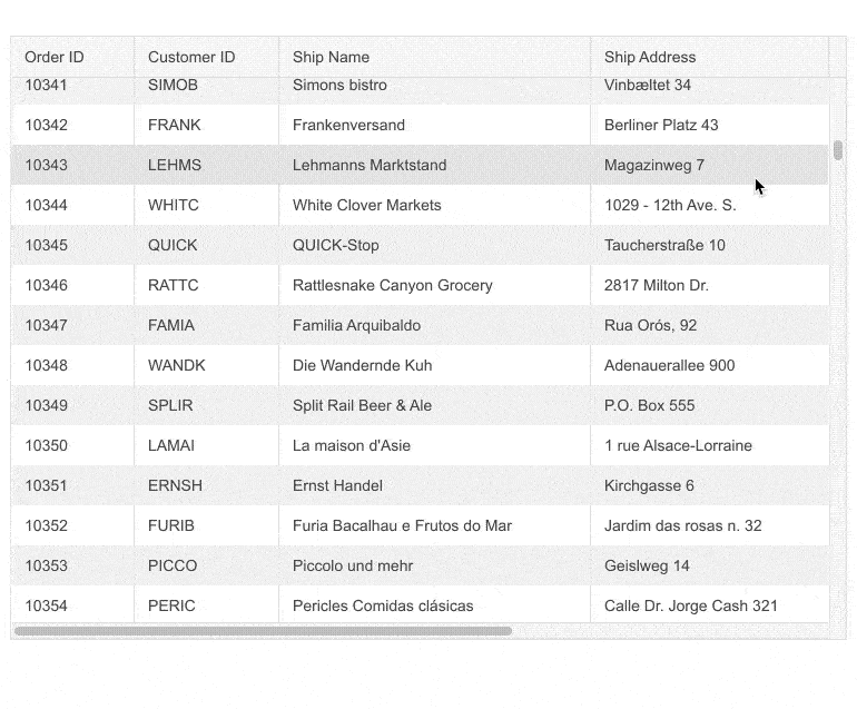
Integrating the Blazor Skeleton Component
The Blazor Skeleton allows seamless integration with other Blazor UI components, such as the Data Grid, to indicate that content is being loaded. A typical use case is mimicking the grid rows while data loading takes place, depicting a table with skeletons in its columns.
See an example of integration between Blazor Skeleton component and Data Grid.