UI for Blazor
Blazor Popover
- Display interactive content to provide users with additional information, leveraging the Telerik UI for Blazor Popover.
- Part of the Telerik UI for Blazor library along with 120+ professionally-designed UI components.
- Includes support, documentation, demos, virtual classrooms, Visual Studio Code Extensions and more!
-
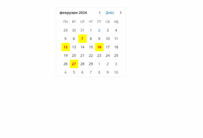
Position and Collision
Effortlessly control the position of the Telerik UI for Blazor Popover and modify its behavior to insufficient screen space. The Popover can be positioned on top, bottom, left or right, leveraging the Position parameter. To define how it reacts to insufficient screen space, simply set the Collision parameter to fit or flip.
See Telerik UI for Blazor Popover position and collision documentation
-
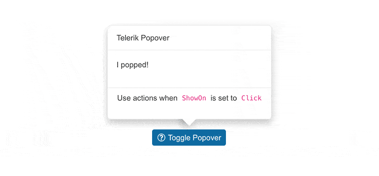
Animation
Telerik UI for Blazor Popover enables you to customize the animations when the additional content displays and hides. Simply set the AnimationType parameter to one of the available options and see how the Popover flows in and out of the screen. To control the duration of the selected animation, play with the AnimationDuration parameter.
-
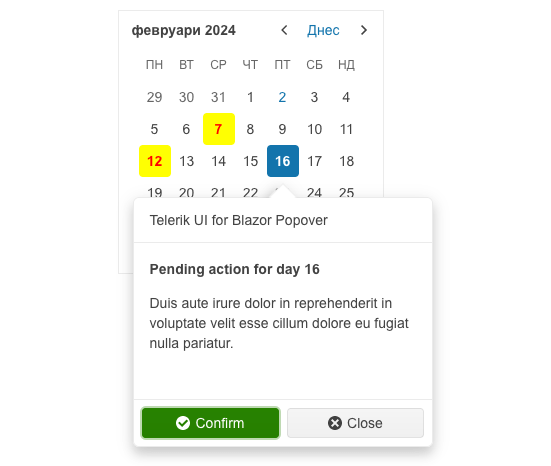
Appearance
Along with the position/collision and animation options the Telerik UI for Blazor Popover control includes predefined UI and styling that can be fully customized, however, as well as separate header, content, and actions areas.
-
Engage Users with Relevant Information on Click or Hover
The Telerik UI for Blazor Popover component elevates user experiences in scenarios with rich, interactive content that benefit from its structured layout. The Popover displays additional content or options when the anchor element is hovered, clicked, or focused.
Eliminate the risk of interrupting users’ workflow by navigating them to a new page – the Blazor Popover goes beyond the Tooltip and ensures more customization and display of rich content.