UI for Blazor
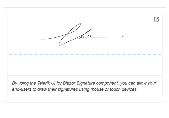
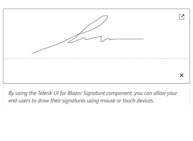
Blazor Signature
- Draw a signature using a mouse or a hand gesture on touch devices with the intuitive Blazor Signature UI component.
- Part of the Telerik UI for Blazor library along with 120+ professionally-designed UI components.
- Includes support, documentation, demos, virtual classrooms, Visual Studio Code Extensions and more!
-
Signature Validation
Integrate the Telerik UI for Blazor Signature component in an edit form. This is beneficial for scenarios where you want the end-user to make a confirmation (e.g., filling out application forms, receiving documents, etc.) and submit their decision using the provided form.
-
Signature Appearance
The handwritten signature includes multiple configuration options such as stroke width and color as well as the ability to select/change the background color and hide or display the dotted line where the signature should be drawn.
See how to change the background color of the Blazor Signature Component
-
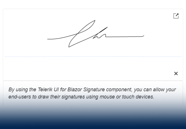
Signature Popup
The signature panel can be opened in a modal popup to maximize the signature canvas. To configure it, you only need to change the popup scale range.
-
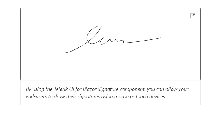
Line Smoothing
Drawing a signature on the screen with one's finger or mouse often results in choppy and jagged lines. Enable the optional line smoothing feature to help users provide clean-looking signatures. This feature will smooth out the lines and make the signatures look more natural.
-
Read-Only State
Set the state of the UI for Blazor Signature component to read-only to cover scenarios when the user should be able to perform some limited interactions, such as opening the signature in a popup, but should be restricted from modifying the signature itself.
-
Signature Component Events
To ensure smooth interaction, the UI for Blazor Signature component includes the following set of events:
- OnBlur: fires when the Signature loses focus
- OnChange: fires when the user presses Enter, or when the component loses focus
- ValueChanged: fires when signature is fully drawn
-
Signature Component Theming
The Blazor Signature component supports four built-in themes, including Default (our own Telerik-infused styling), Material (based on the Material Design guidelines), Bootstrap and Fluent. Additionally, you can customize any of the ready-to-use themes with a few lines of CSS or create a new one to match your branding needs by using the Progress ThemeBuilder application.
-
Right-to-Left (RTL) Support
The Telerik UI for Blazor Signature component supports right-to-left configuration. The RTL functionality is supported by most of our components to accommodate users who communicate in a right-to-left language script, such as Arabic and Hebrew.
Learn more in our Blazor Right-to-Left Support documentation
-
Capture and Save Signature with Blazor Signature
The Telerik UI for Blazor Signature component enables end-users to draw a signature using a mouse or hand gesture on touch devices. Your end-users can benefit from multiple features to customize their signatures and adapt them to their needs, including size, border radius, line and background color and fill mode.