UI for Blazor
Blazor ValidationMessage
- The Blazor Validation Message identifies the problem and displays the error right next to the problematic field.
- Part of the Telerik UI for Blazor library along with 120+ professionally-designed UI components.
- Includes support, documentation, demos, virtual classrooms, Visual Studio Code Extensions and more!

-
Blazor Validation Message
The Validation Message component takes another approach to signal incorrect input and is one which many applications prefer due to its core principle – display the error as close to the root of the problem as possible. The control will show the error text just next to the form field with incorrect data (usually below), making it easy for the user to understand where exactly they made a mistake.
Check out the documentation for more information on ValidationMessage. -
Localization in ValidationMessage Component
The Telerik ValidationMessage component can easily pick the correct error message to display depending on the active app language so your app is available to everyone in the world.
Learn more about the Blazor ValidationMessage Localization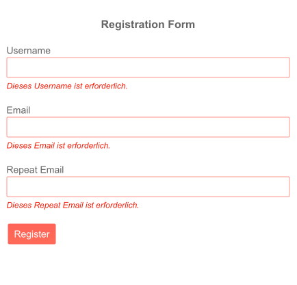
-
Templates
The control allows you to change how messages are rendered to approximate your application style. Doing that is as easy as providing an HTML template with your desired layout to the ValidationMessage component.
-
Full Set of Validation Tools to Use with Form Component with Blazor ValidationMessage
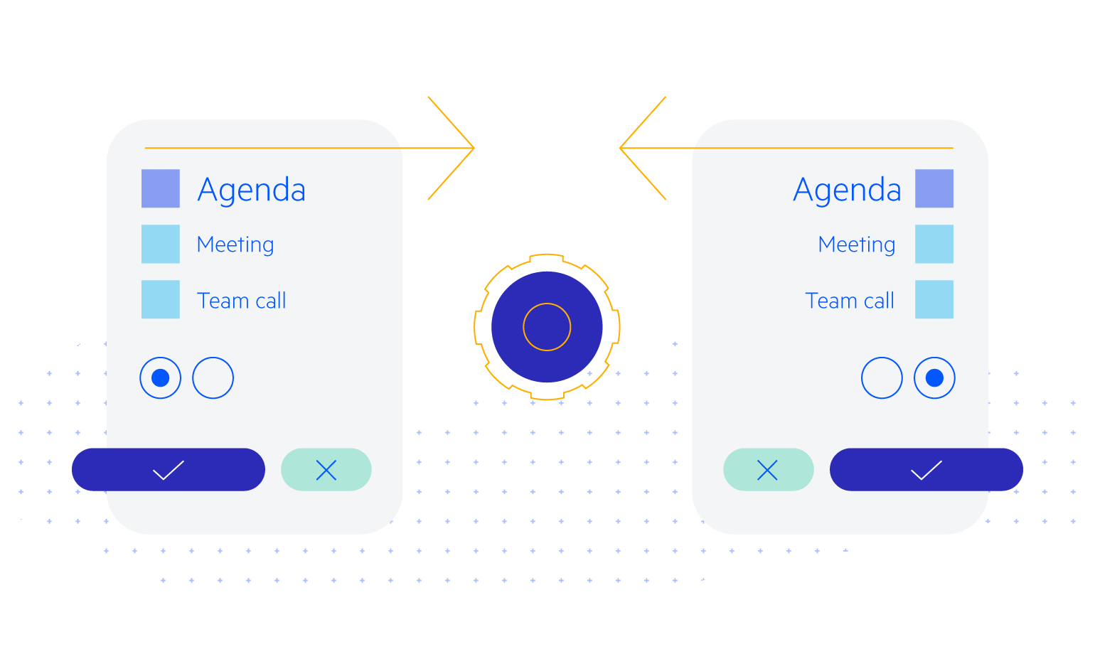
Telerik UI for Blazor provides a set of validation tools to use with our Form component and the standard Microsoft EditForm). The validation tools consist of 3 components, each providing a different way to report issues with user input validation. The components follow the modern Telerik UI for Blazor design principles – they deliver many features out of the box, while being flexible to be placed in a variety of situations – like the ability to completely alter their visual by specifying a template or a CSS class.
-
Right-to-Left (RTL) Support
The Telerik UI for Blazor Validation Message component supports right-to-left configuration. The RTL functionality is supported my most of our components to accommodate users who communicate in a right-to-left language script, such as Arabic and Hebrew.
Learn more in our Blazor Right-to-Left Support documentation