
UI for Blazor
Blazor Window
- Display content in a modal or non-modal popup window with Blazor Window component.
- Part of the Telerik UI for Blazor library along with 120+ professionally-designed UI components.
- Includes support, documentation, demos, virtual classrooms, Visual Studio Code Extensions and more!

-
Window Size
The Blazor Window component provides several options for defining its size. You can either use the predefined sizing options, set the width and height properties, or maximize and minimize the Window through action buttons in its title bar or through code.
-
Window Position
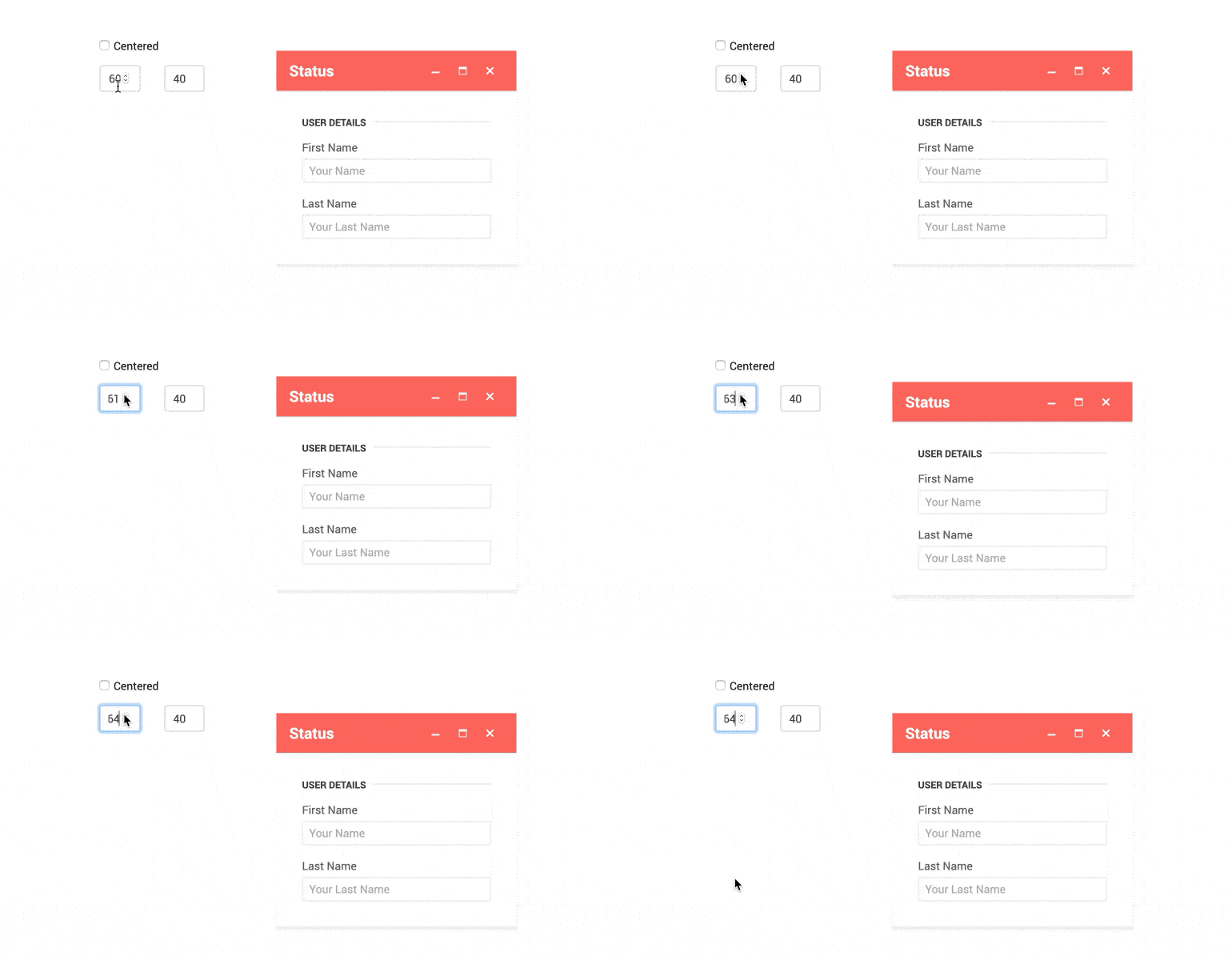
The Window component allows full control over its position that can be achieved by setting the three parameters it provides: Top, Left and Centered.
-
Resizable
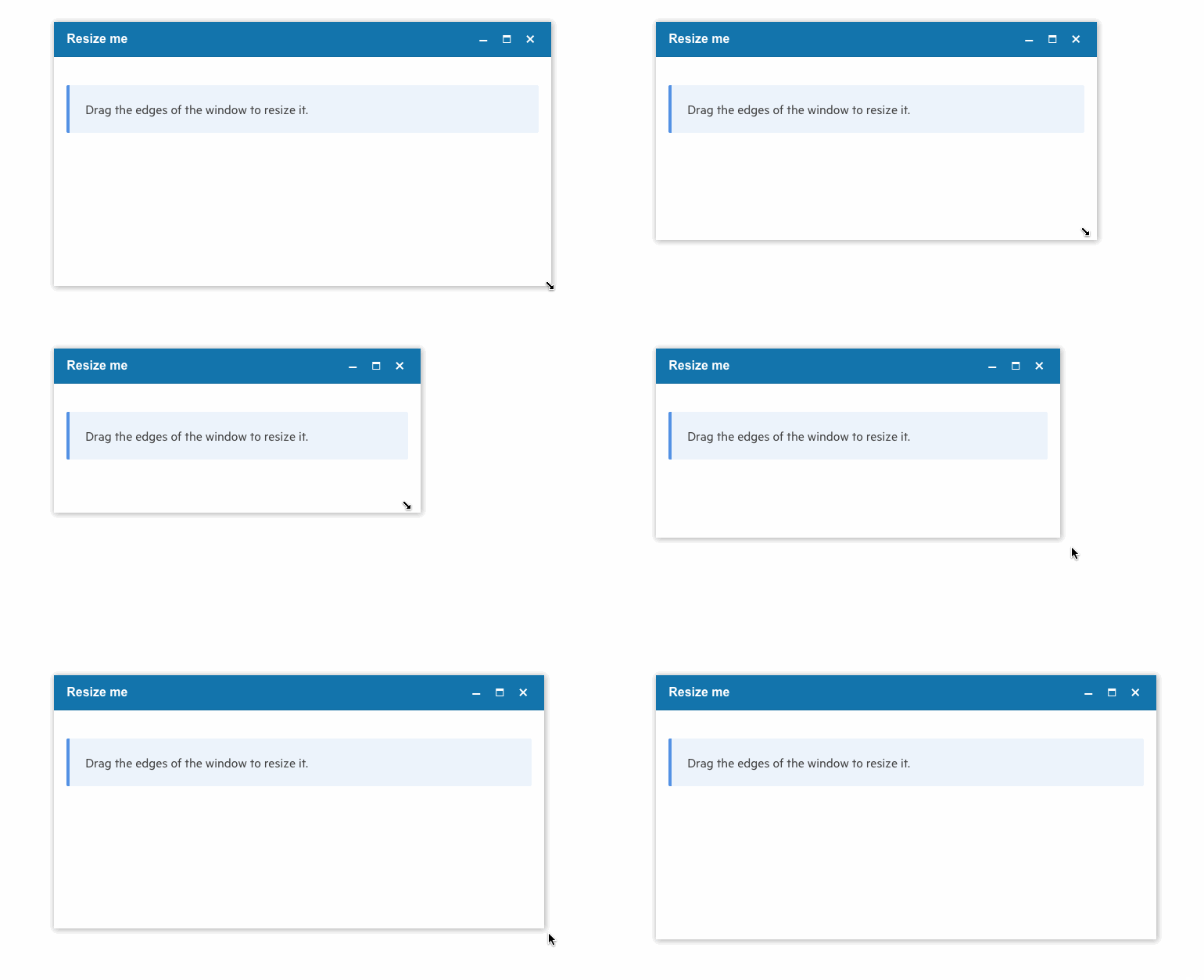
Users can choose to resize the Window component by dragging the borders of the control.
-
Window Actions
The Window component offers three built-in actions: Maximize, Minimize and Close. You can define custom action buttons such as Edit or Save and provide different settings for the action button properties.
-
Predefined Windows
The built-in Alert, Confirm and Prompt dialog windows are tools from which every newcomer to the web has benefited but which quickly fall out of use due to their limitations. The Telerik UI for Blazor Window component provides full replacements for these 3 dev favorites which abide by all rules of the framework – they can be styled and customized and you have complete access to what happens when!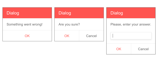
-
Stacking Windows
Different windows can be stacked on one another and the one who has been focused the latest will be visible. This lets you create new windows from within other windows if needed and gives the user the flexibility to potentially move the window around so that they can access both initial and secondary window.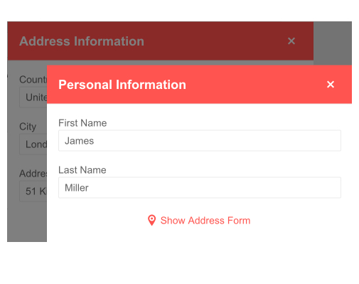
-
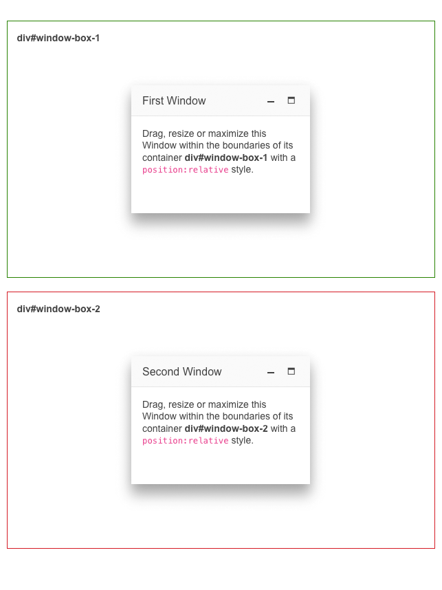
Constraint Movement
Drag, resize or maximize a Blazor Window within the boundaries of its container only. The constraint movement in Telerik UI for Blazor Window ensures peace of mind when building complex layouts.
-
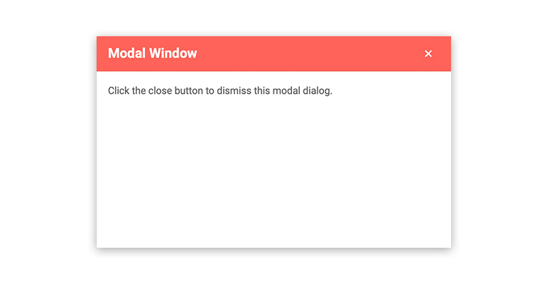
Modal Window
You can easily switch the Window to modal mode, so that users cannot interact with the rest of the Blazor page until it is closed.
-
Window Footer
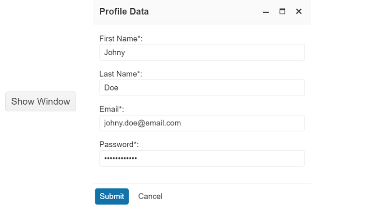
The Telerik UI for Blazor Window component supports customizable Footer section, which serves to provide a dedicated area for arbitrary content. Leverage the following parameters to unleash the full potential of the Window Footer:
- WindowFooter parameter renders a new section at the bottom of the window.
- FooterLayoutAlign parameter applies different styling to the buttons of the footer. Choose one of the available options and see how it fits your app: Start, Center, End and Stretched.
-
Draggable
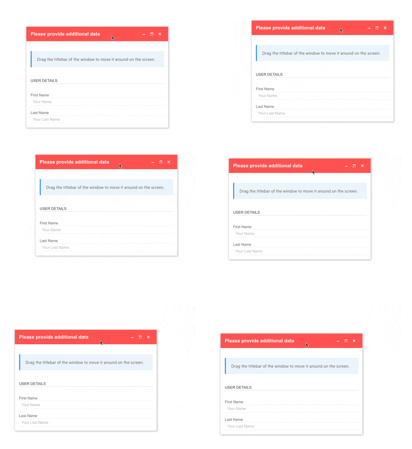
Enabling the draggable feature, allows users to move the window exactly where it’s needed. This touch of greater flexibility will be very much appreciated by your customers as it significantly diminishes the most major drawback of windows as a UI component – their intrusiveness – a draggable window can be moved so that you can see both its content and the content underneath.
-
Title Bar Theme Color
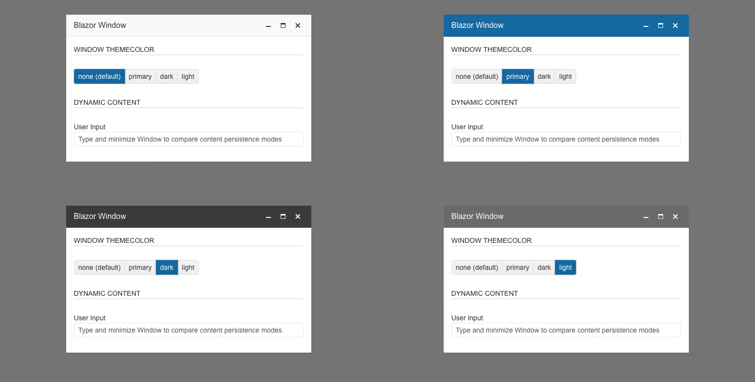
Effortlessly style the title bar of the Telerik UI for Blazor Window component with the ThemeColor parameter. It enables customization of the title bar’s color with one of the four available options—primary, dark, light and none (default).
-
Window Events
The Window component exposes several events to let you easily handle user action and control the application logic of the Blazor app. You can use the VisibleChanged event to get notifications when the user tries to close the window, or the StateChanged even when the user tries to minimize, maximize or restore the window. In addition to that, the window action buttons expose the OnClick event that enables you to quickly to implement custom buttons and invoke application logic from the Window's title bar.
Code examples with Blazor Windows events.

-
Window Accessibility and Keyboard Navigation
Like all other Telerik UI for Blazor components, the Window component supports out of the box Keyboard Navigation and web accessibility standards implementation (WCAG, Section 508 and WAI-ARIA attributes for screen readers). This enables easy navigation through it by using just the keyboard, as well as access to the component content through assistive technologies.

-
Window Theming
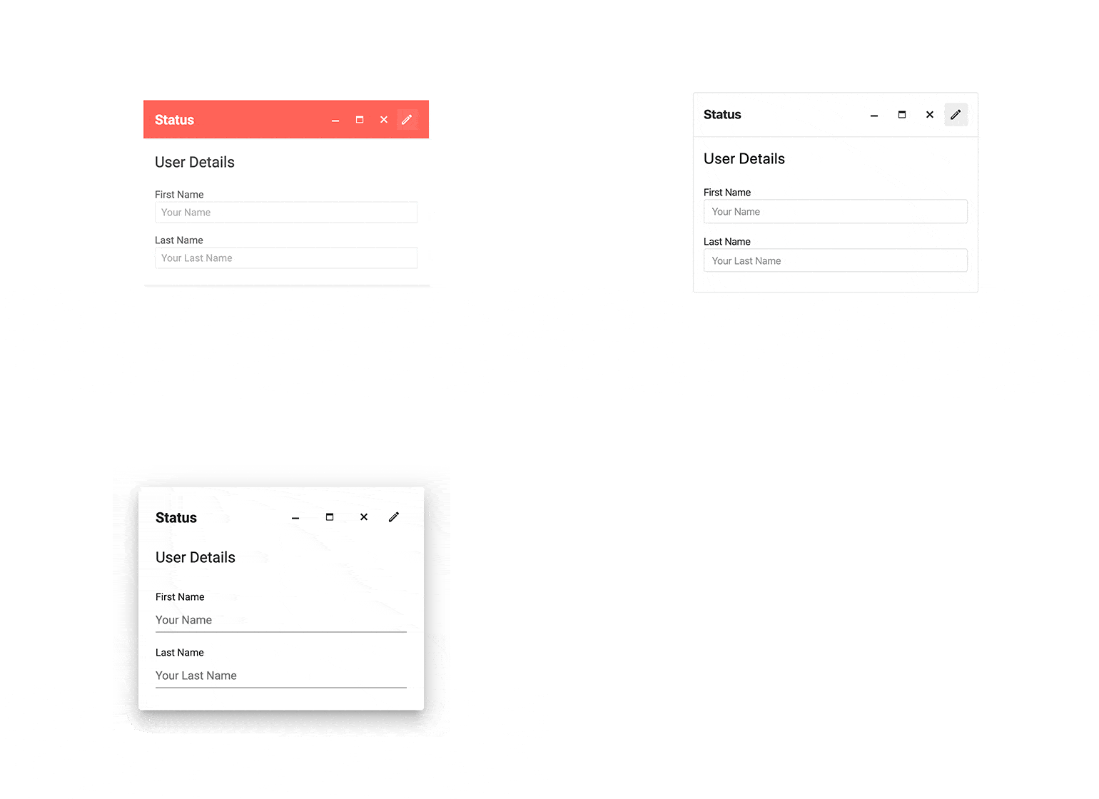
The Telerik Blazor Window has several built-in themes such as Default (our own styling), Material (based on the Material Design guidelines), Bootstrap (which looks like the Bootstrap styling to integrate better) and Fluent (based on Microsoft Fluent UI). You can easily customize any of out-of-the-box themes with a few lines of CSS, or create new theme to match your colors and branding by using the Telerik SASS ThemeBuilder application.
-
Right-to-Left (RTL) Support
The Telerik UI for Blazor Window component supports right-to-left configuration. The RTL functionality is supported by most of our components to accommodate users who communicate in a right-to-left language script, such as Arabic and Hebrew.
Learn more in our Blazor Right-to-Left Support documentation

-
Window Animations
Telerik UI for Blazor Window supports customizable opening and closing animations, allowing you to deliver a more polished and engaging user experience. You can fine-tune the animation behavior using two new parameters:
- AnimationType: Choose from a set of predefined animation types to control how the window appears or disappears.
- AnimationDuration: Define the animation speed (in milliseconds) to match your app's interaction style.
See the Telerik UI for Blazor Window animations documentation
-
Display Content in a Modal or Non-modal Popup Window with Blazor Window
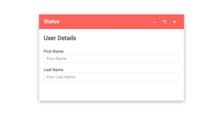
The Telerik Blazor Window component displays content in a modal or non-modal HTML window. You can alert users or present important information to them in a friendly and stylish way in both Blazor WebAssembly (WASM) and Server-side Blazor apps. The Window component consists of a content container and a title bar with predefined actions such as minimize, maximize and close. You can fully customize the Window by adapting its size, position and adding custom action buttons to its titlebar.
All Blazor Components
Data Management
Scheduling
File Upload & Management
Editors
- AutoComplete
- CheckBox
- ColorGradient
- ColorPalette
- ColorPicker
- ComboBox
- DateInput
- DatePicker
- DateRange Picker
- DateTimePicker
- DropDownList
- DropDownTree New
- FlatColorPicker
- ListBox
- MaskedTextBox
- MultiColumn ComboBox
- MultiSelect
- Numeric TextBox
- RadioGroup
- Rating
- Rich Text Editor
- Signature
- TextArea
- TextBox
- TimePicker
Data Visualization
- Area Chart
- Bar Chart
- Barcode
- Bubble Chart
- Candlestick Chart
- Chart
- Column Chart
- Donut Chart
- Heatmap
- Line Chart
- OHLC Chart
- Pie Chart
- QR Code
- Radar Area Chart
- Radar Column Chart
- Radar Line Chart
- Range Area Chart
- Range Bar Chart
- Range Column Chart
- Sankey Chart
- Scatter Chart
- Scatter Line Chart
- Stock Chart
- Trendline Chart
- Waterfall Chart
Interactivity & UX
- Chat
- ChunkProgressBar
- Dialog
- Loader
- Loader Container
- Notification
- Popover
- Popup
- ProgressBar
- RangeSlider
- Skeleton
- Slider
- ValidationMessage
- ValidationSummary
- ValidationTooltip
Navigation
Layout
- Animation Container
- Avatar
- Card
- Carousel
- DockManager
- Form
- GridLayout
- MediaQuery
- PanelBar
- Splitter
- StackLayout
- TileLayout
- Tooltip
- Window
- Wizard
Geo Visualization
Document Processing
Productivity Tools
Gauges
Labels
Icons
