
UI for Blazor
Blazor Toggle Button
- Change a setting between two states and indicate the currently active one with the Blazor Toggle Button.
- Part of the Telerik UI for Blazor library along with 120+ professionally-designed UI components.
- Includes support, documentation, demos, virtual classrooms, Visual Studio Code Extensions and more!

-
Flip a Switch with Blazor ToggleButton
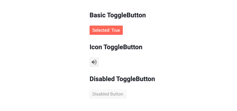
The Telerik UI for Blazor ToggleButton is a two-state button, perfect for when you need to provide the user with an option to flip a switch. It complements the Checkbox as a mean of toggling options in a more actionable way. For example, you might want to use it as Mute/Unmute or Play/Pause buttons in a media player. The button’s selected state is databindable to your model which makes using it a joy.
Blazor ToggleButton demo.jpg?sfvrsn=2c381f1b_0)
-
Icons & Styling
The ToggleButton can be styled in several ways:
- You can apply your own CSS class depending on its state.
- Icons can be added to illustrate the button. They can be loaded through a Telerik Font Icon, raster images, sprites or a custom icon font
- Content can be modified depending on its state too – going back to the Player/Pause example, you can switch between a Play and Pause icon depending on the state of your player.
- The button also possesses a disable state for when you want to forbid users from modifying it. This state comes with a default styling, but it can be overridden with an attribute.
-
Events
Two important events are provided – OnClick and SelectedChanged which are fired exactly when you think they are. SelectedChanged is more general than OnClick as it is also triggered by keyboard shortcuts.

-
ToggleButton Accessibility and Keyboard Navigation
Like all other Telerik UI for Blazor components, the ToggleButton component supports out of the box Keyboard Navigation and web accessibility standards implementation. This enables easy navigation through pages using just keyboard, as well as access to component content through assistive technologies.
-
Blazor ToggleButton Theming
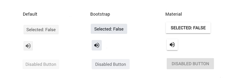
The Telerik Blazor ToggleButton component has several built-in themes such as Default (our own styling), Material (based on the Material Design guidelines), Bootstrap (which looks like the Bootstrap styling to integrate better) and Fluent (based on Microsoft Fluent UI). You can easily customize any of out-of-the-box themes, style specific component or create new theme using the Telerik Saas ThemeBuilder application.
-
Right-to-Left (RTL) Support
The Telerik UI for Blazor Toggle Button component supports right-to-left configuration. The RTL functionality is supported by most of our components to accommodate users who communicate in a right-to-left language script, such as Arabic and Hebrew.
Learn more in our Blazor Right-to-Left Support documentation

