
Coming in 2026
In 2025, we delivered a major wave of innovation for Telerik UI for Blazor, including AI-powered experiences, the new Chat, Diagram, and Speech-to-Text button components, and day-zero support for .NET 10. In 2026, we are building on this foundation with a strong focus on AI-assisted development, productivity, and long-term stability for business-critical applications.
Our 2026 roadmap is centered around three themes:
AI-First Blazor experiences that feel natural for both developers and end users
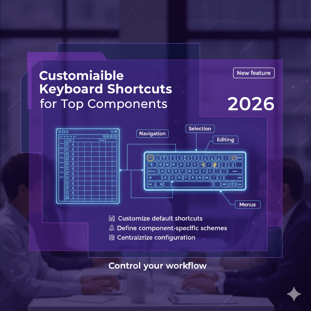
Developer productivity across real-world projects
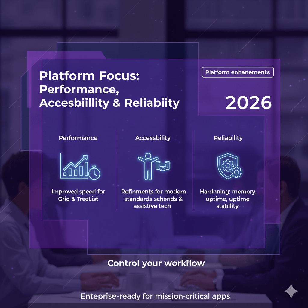
Performance, accessibility, and stability for complex, data-heavy applications
Your feedback remains a key driver of these plans. We encourage you to keep sharing your ideas and voting for features in the dedicated Blazor Feedback Portal so we can continue to prioritize what matters most to you.
The items below highlight what we are comfortable announcing today. Additional work is planned but not yet listed. Check back periodically as we refine and expand the roadmap throughout the year.