UI for Blazor
Blazor TextArea
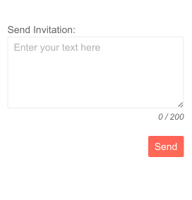
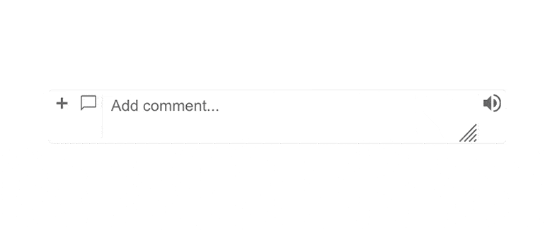
- The Blazor TextArea component is a highly customizable input to enable users to enter a text value on multiple lines.
- Part of the Telerik UI for Blazor library along with 120+ professionally-designed UI components.
- Includes support, documentation, demos, virtual classrooms, Visual Studio Code Extensions and more!
-
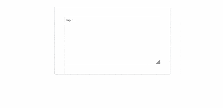
Auto Sizing
The AutoSize property will force the component to resize itself during keyboard input so that it takes just enough space to contain the text content but not any more than that.
-
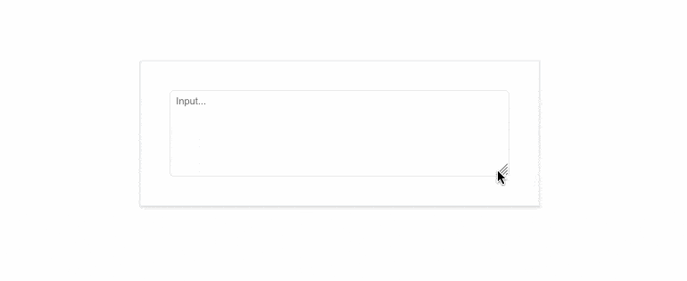
Resize Mode
Control the size of the Telerik UI for Blazor TextArea using the ResizeMode parameter. The component’s resize behavior can be modified through the available options:
- Vertical - resizes the TextArea in vertical direction.
- Horizontal - resizes the UI component in horizontal direction.
- Both - Blazor TextArea is resized both horizontally and vertically.
- Auto - automatic vertical resize during keyboard input.
- None - freezes the TextArea resizing option.
-
Rows and Columns
Leverage the Rows and Columns parameters to effortlessly control the initial size of the Telerik UI for Blazor TextArea component. Both parameters map to the rows and columns attributes of the inner textarea element. If not configured – the size of the TextArea would be the auto one.
See the Telerik UI for Blazor TextArea Rows and Columns demo
-
Floating Labels
Floating labels are important to creating modern UIs and are a part of all of our text input components. When enabled, the TextArea’s placeholder will float upwards and stop above the control for a sleek visual effect. If you don’t need this feature, you can always disable it and use a standard label attached to the TextArea. See how to implement a floating label on our demo page.

-
Validation Modes
The TextArea component includes validation modes that enable you to define whether to activate validation on change, blur or while typing, allowing you to choose the most fitting for a given use case.
See Blazor TextArea validation demo. -
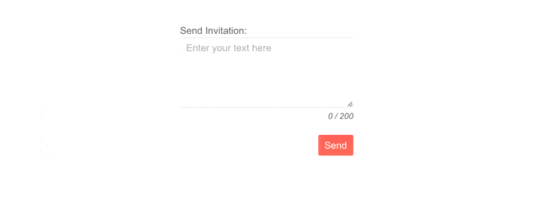
Prefix and Suffix Adornments
Elevate user interactivity leveraging the option for adding prefix and suffix adornments. These are custom items, usually an icon or button, inside the field before or after the input area. Typical prefix adornments are currency symbols or unit indicators, while suffix adornments are often used for password visibility toggles, formatting or clearing the input.
See Telerik UI for Blazor TextArea adornments demo
-
Events
The two standard OnChange and ValueChanged are available with the TextArea Component:
- OnChange is fired whenever the user confirms the new value – by pressing Enter or when the component loses focus. This event can be used with two-way binding
- ValueChanged is fired on every keystroke. This event cannot be used simultaneously with two-way binding
- OnBlur - an event which is triggered when it loses focus

-
TabIndex
The Blazor TextArea component, just like all other Telerik UI for Blazor input components, supports keyboard navigation to switch between components thanks to the HTML TabIndex property. Pressing Tab will normally focus the next available input component, the same way your users are accustomed to when standard HTML inputs are used. Having the TabIndex setting lets you customize that order. -
Theming
The Telerik UI for Blazor TextArea has several built-in themes such as Default (our own styling), Material (based on the Material Design guidelines), Bootstrap (which looks like the Bootstrap styling to integrate better) and Fluent (based on Microsoft Fluent UI). You can easily customize any of out-of-the-box themes with a few lines of CSS, or create new theme to match your colors and branding by using the Telerik SASS ThemeBuilder application.
-
Right-to-Left (RTL) Support
The Telerik UI for Blazor TextArea component supports right-to-left configuration. The RTL functionality is supported by most of our components to accommodate users who communicate in a right-to-left language script, such as Arabic and Hebrew.
Learn more in our Blazor Right-to-Left Support documentation

-
Enter a Text on Multiple Lines with Blazor TextArea
The Telerik UI for Blazor TextArea component is the control to use when you expect the user to type multiline text for long inputs like notes, comments or descriptions. It shares many properties with the other text-input components in the suite like auto resizing, floating labels and a number of events.
See the Blazor TextArea demo