UI for Blazor
Blazor Rating
- Integrate flexible rating option, enabling users to share feedback and modify the values they've chosen.
- Part of the Telerik UI for Blazor library along with 120+ professionally-designed UI components.
- Includes support, documentation, demos, virtual classrooms, Visual Studio Code Extensions and more!
-
Boosting User Interaction with Intuitive Rating
Enable users to express their opinions in a direct and intuitive way with the Telerik UI for Blazor Rating component. It allows you to embed a controlled rating to your app by letting users select a specific number of stars from a predefined maximum number of items. Telerik UI for Blazor Rating covers multiple use cases and can be leveraged in e-commerce sites, review platforms and anywhere user preferences are valuable.

-
Selection
Easily configure the selection mode with the available continuous or single selection options. You can allow either all stars up to the one selected or only the chosen star to be highlighted.

-
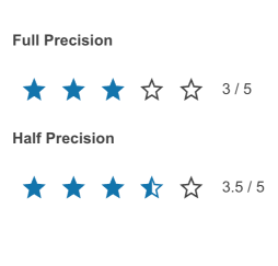
Precision
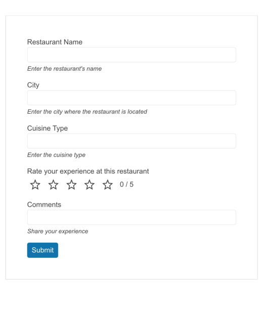
When it comes to sharing feedback through rating it’s not always about round numbers. Therefore, Telerik UI for Blazor supports the option to add halves, thus enabling a more granular rating. Modify the precision property to enable users to give a 4.5/5 rating or constrain the rating to an integer value.
-
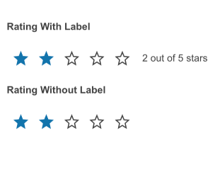
Label
Depending on your preference, you can add a label to the Blazor Rating component to show the current rating’s numeric value. It can be displayed either as “3/5” or “3 out of 5.” If you prefer, you can also disable labels altogether.
-
Templates
Easily customize the Telerik UI for Blazor Rating appearance with flexible template options. By default, each rating item is rendered as a star icon. To modify it, you can use the ItemTemplate and change the stars to hearts, for example.

-
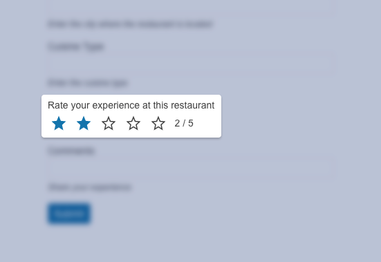
Integration with Other Blazor Controls
Effortlessly use the Telerik UI for Blazor Rating as an integral part of other components like the Blazor Form or Grid. Adding the Rating control in a product review form, for example, can boost user interactivity enabling a coherent feedback submission.
-
Events
The Blazor Rating component features a ValueChanged event thst fires when the user selects an item (icon).

-
Right-to-Left (RTL) Support
The Telerik UI for Blazor Rating component has built-in support for right-to-left scripts. You can easily adapt it by changing the default alignment from left-to-right to right-to-left and vice versa.
-
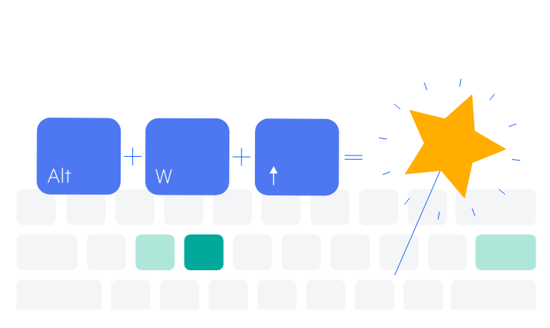
Keyboard Navigation
Enhance accessibility and productivity with keyboard-only navigation. The Telerik UI for Blazor Rating includes keyboard navigation support, enabling users to navigate and interact with its items efficiently using only the keyboard.
See Telerik UI for Blazor Rating keyboard navigation demo
Learn more about Telerik and Kendo UI accessibility standards/a>