
UI for Blazor
Blazor TextBox
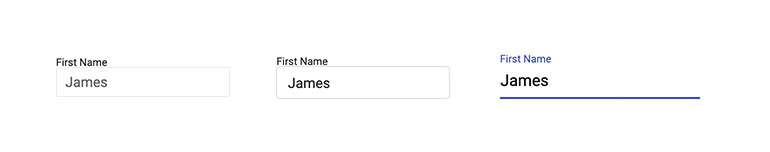
- The Blazor TextBox component is a highly versatile text input, featuring password entry, label and more.
- Part of the Telerik UI for Blazor library along with 120+ professionally-designed UI components.
- Includes support, documentation, demos, virtual classrooms, Visual Studio Code Extensions and more!
-
TextBox Validation with Forms
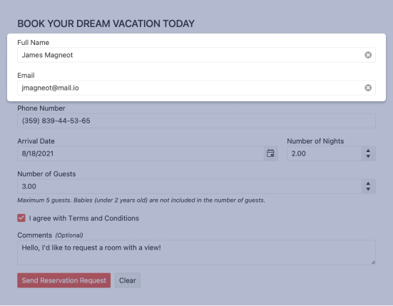
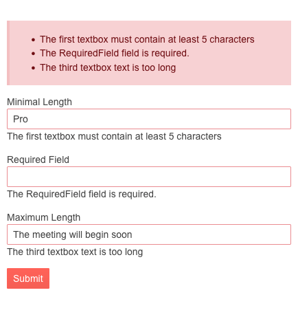
The Telerik UI for Blazor suite supports and integrates seamlessly into Blazor's Forms and Validation infrastructure. All Telerik UI for Blazor Input components (including simple inputs such as TextBox, Numeric TextBox and DateInput) work out of the box when placed inside an EditForm, respond to EditContext changes and provide default invalid styles. You can choose whether validation is triggered on change, blur or while typing – whatever the best option is for each scenario.
When you need to validate user input, the Telerik TextBox for Blazor is the perfect match.Example of user input validation with Blazor TextBox component.

-
TextBox Events for Handling User Input
The TextBox exposes OnChange and ValueChanged events to let you handle user input and perform the necessary flow of logic in your code. The component also fires the OnBlur event which is triggered when it loses focus. You have full control the user actions with the TextBox component – from capturing user keystrokes to confirmation of the changed TextBox values.

-
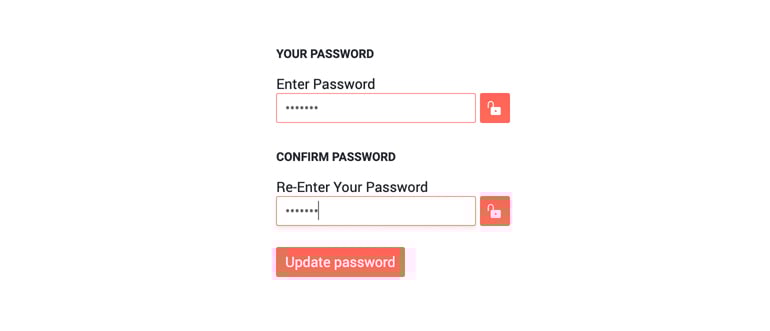
Blazor TextBox Password
The TextBox can also be used to input passwords in login and registration forms. Switching between a plain-text TextBox and one used for entering passwords is as easy as enabling the Password attribute on the element.
-
TextBox Validation Modes
The TextBox has validation modes that allow you to define whether to trigger validation on change, blur or while typing, allowing you to choose the best one for a specific use case.
-
Prefix and Suffix Adornments
Elevate user interactivity leveraging the option for adding prefix and suffix adornments. These are custom items, usually an icon or button, inside the field before or after the input area. Typical prefix adornments are currency symbols or unit indicators, while suffix adornments are often used for password visibility toggles, formatting or clearing the input.
-
Blazor TextBox TabIndex
The Blazor TextBox component, just like all other Telerik UI for Blazor input components, supports keyboard navigation to switch between components thanks to the HTML TabIndex property. Pressing Tab will normally focus the next available input component, the same way your users are accustomed to when standard HTML inputs are used. Having the TabIndex setting lets you customize that order. -
TextBox Theming
The Telerik Blazor TextBox has several built-in themes such as Default (our own styling), Material (based on the Material Design guidelines), Bootstrap (which looks like the Bootstrap styling to integrate better) and Fluent (based on Microsoft Fluent UI). You can easily customize any of out-of-the-box themes with a few lines of CSS, or create new theme to match your colors and branding by using the the Telerik Saas ThemeBuilder application.
-
Right-to-Left (RTL) Support
The Telerik UI for Blazor TextBox component supports right-to-left configuration. The RTL functionality is supported by most of our components to accommodate users who communicate in a right-to-left language script, such as Arabic and Hebrew.
Learn more in our Blazor Right-to-Left Support documentation

-
Display, Enter and Edit Plain Text Seamlessly with Blazor TextBox
The TextBox component allows you to display, enter and edit plain text in Blazor forms. You can completely customize the TextBox component using its built-in features: CSS Class for styling, Enabled (controls whether the input is enabled/disabled), Width, Value (getting and setting of value), Label (rendered text with additional information about the TextBox) and built-in validation within EditFrom. The TextBoxcomponent works in both WebAssembly (WASM) and Server-side Blazor apps.
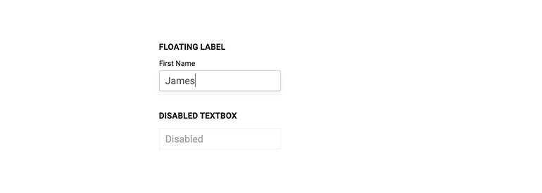
Example of Blazor TextBox Component with Floating Label.
-
Blazor TextBox Additional Parameters
There are several more minor parameters of a Telerik UI for Blazor TextBox component which control a variety of functionalities:
- AutoComplete – instructs the browser whether to provide autocompletion for this field and if so, how to do it exactly
- InputMode – instructs the browser what’s the best way to let the user enter his text. For example, the virtual keyboard on mobile devices is altered depending on whether the user is typing in an URL or an email.
- PlaceHolder – used to control the placeholder value of the input element in the browser.
- TabIndex – controls the ordering in which the browser visits elements on the page when the user presses Tab
