
UI for Blazor
Blazor Splitter
- The Blazor Splitter component separates a page into sections and allows users to control its layout.
- Part of the Telerik UI for Blazor library along with 120+ professionally-designed UI components.
- Includes support, documentation, demos, virtual classrooms, Visual Studio Code Extensions and more!

-
Control the Size of Panes with Blazor Splitter
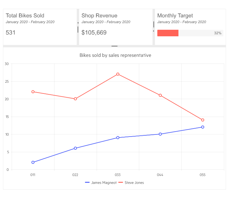
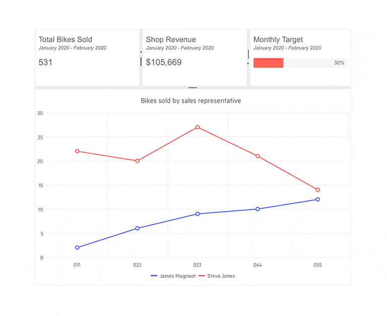
The Telerik UI for Blazor Splitter is a layout component whose main goal is to let users control the size of several subcomponents known as panes. Panes can be resized to the user’s preference and collapsed to free maximum screen space.
-
Customization
The Splitter and its panes can be customized in several ways. The control can be positioned horizontally or vertically. You can add a CSS class to both the Splitter and its panes to configure their default, minimum and maximum sizes and define if they can be resized and collapsed.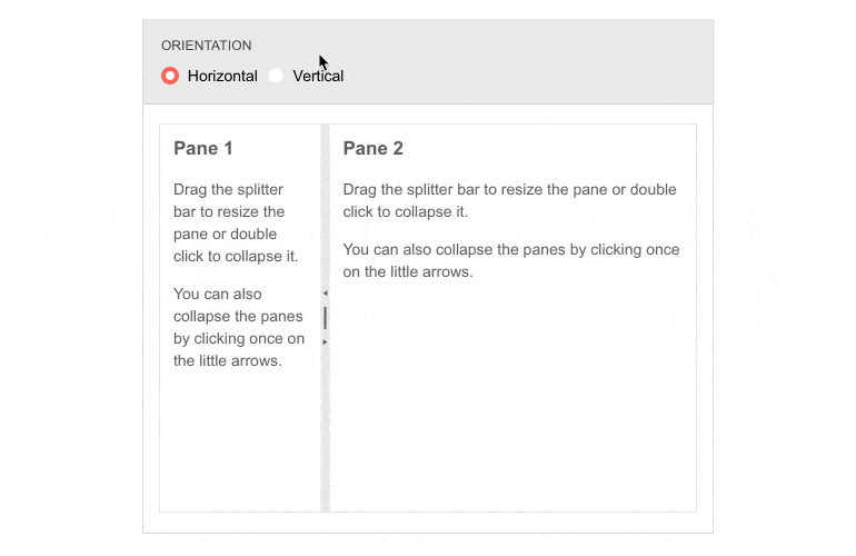
-
Splitter Events
Three events are triggered by the component—OnResize, OnExpand and OnCollapse. Each event is fired when a pane of the splitter is resized, expanded or collapsed with the pane being passed as an argument.
Learn more about the Blazor Splitter Events in our documentation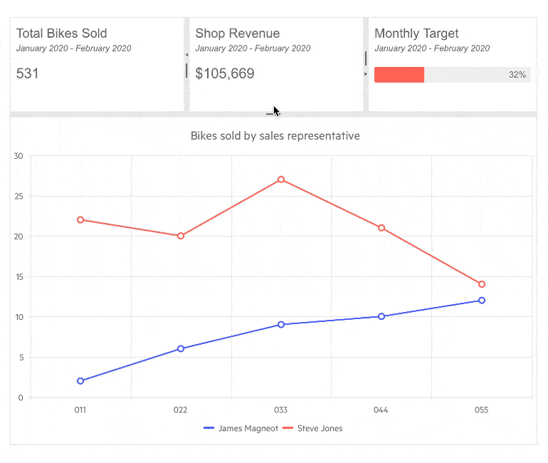
-
Nested Splitters
In more complex scenarios, you might want to nest several splitters into one another. You can place a horizontal splitter inside a vertical one or vice versa to help users resize panes in multiple directions. This functionality is well-supported by the component and an example is available in our documentation. -
State
Providing a good user experience makes it mandatory for the Splitter to remember its state so the next time the user opens the web application, the same panes are displayed in their appropriate dimensions. For this reason, the Splitter’s state can be programmatically saved, restored and modified.
See how to configure the Splitter State -
Theming
The Splitter component has 20+ built-in themes such as Default (our own styling), Material (based on the Material Design guidelines), Bootstrap (which looks like the Bootstrap styling to integrate better) and Fluent (based on Microsoft Fluent UI). You can easily customize any of out-of-the-box themes with a few lines of CSS, or create new theme to match your colors and branding by using the Telerik SASS ThemeBuilder application.
-
Keyboard Navigation
The Splitter component allows users to navigatepanes by using a keyboard only. Whether your application’s audience consists of avid keyboard users or prefers the old-school mouse approach, they would all enjoy using the control.
-
Right-to-Left (RTL) Support
The Telerik UI for Blazor Splitter component supports right-to-left configuration. The RTL functionality is supported by most of our components to accommodate users who communicate in a right-to-left language script, such as Arabic and Hebrew.
Learn more in our Blazor Right-to-Left Support documentation

