UI for Blazor
Blazor PivotGrid
- Leverage Telerik UI for Blazor PivotGrid to provide data driven experience similar to Pivot Tables in Microsoft Excel.
- Part of the Telerik UI for Blazor library along with 120+ professionally-designed UI components.
- Includes support, documentation, demos, virtual classrooms, Visual Studio Code Extensions and more!
-
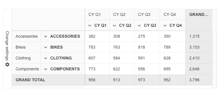
Organize and Summarize Multi-dimensional Data with Blazor PivotGrid
Deliver an out-of-the-box experience similar to the Pivot Tables in Microsoft Excel. The Telerik UI for Blazor PivotGrid component enables users to effortlessly process, aggregate, visualize and analyze both tabular and multi-dimensional data. This feature-rich, interactive UI component allows data binding to an Online Analytical Processing (OLAP) service and supports extensive customization.

-
Local and Remote Binding to OLAP Data Sources
Leverage the Telerik UI for Blazor PivotGrid to bind data to a local source or to a remote OLAP service via HTTP. You can easily pull or create data within the client and bind it directly to the Blazor PivotGrid component by simply defining the rows, columns and measures. Meanwhile, accessing data that is aggregated and organized in a multidimensional structure called a “cube” is supported by OLAP. It enables users to perform interactive analysis of such multidimensional data.

-
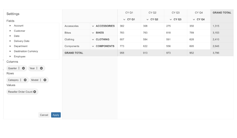
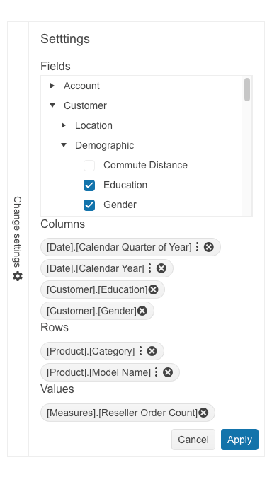
Configuration Panel
To elevate the user experience, the Telerik UI for Blazor PivotGrid component is equipped with an intuitive and simple configuration panel, or configurator. Similarly to what users see in Microsoft Excel, the configurator consists of a list of fields via which users can apply modifications like filtering or what fields to pivot against.
-
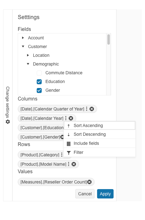
Sorting
Allow users to sort a single or multiple columns and display data in an ascending or descending order thanks to the sorting functionality of the Telerik UI for Blazor PivotGrid component. The sorting feature of the component can be applied to various data types. Users have the option to click multiple times to switch between ascending and descending order, or to remove any existing sorting and revert to the default order.
-
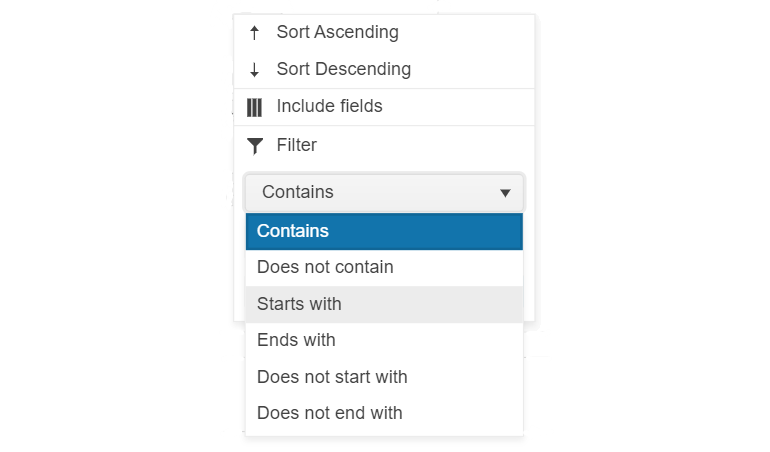
Filtering
Enable the filtering option in Telerik UI for Blazor PivotGrid to give users more flexibility to display data that meets their specific criteria. This feature provides a swift response from the PivotGrid and offers a range of filtering options. Users can filter data based on specific values, leverage operators like "contains" or "starts with" or utilize predefined fields such as time periods. Both rows and columns can be subjected to filtering. The Blazor PivotGrid further supports filtering via XMLA access to the OLAP Cube service.
-
Customization
The Telerik UI for Blazor Pivot Grid Table can be customized in multiple different ways. Customizing the look and feel of each cell, row and column, including the headers of the rows and the columns as well as their width, is a piece of cake.