UI for Blazor
Blazor DropDownList
- The Blazor DropDownList control lets you predefine a list of items and control the data, sizes and appearance options.
- Part of the Telerik UI for Blazor library along with 120+ professionally-designed UI components.
- Includes support, documentation, demos, virtual classrooms, Visual Studio Code Extensions and more!

-
DropDownList Data Binding
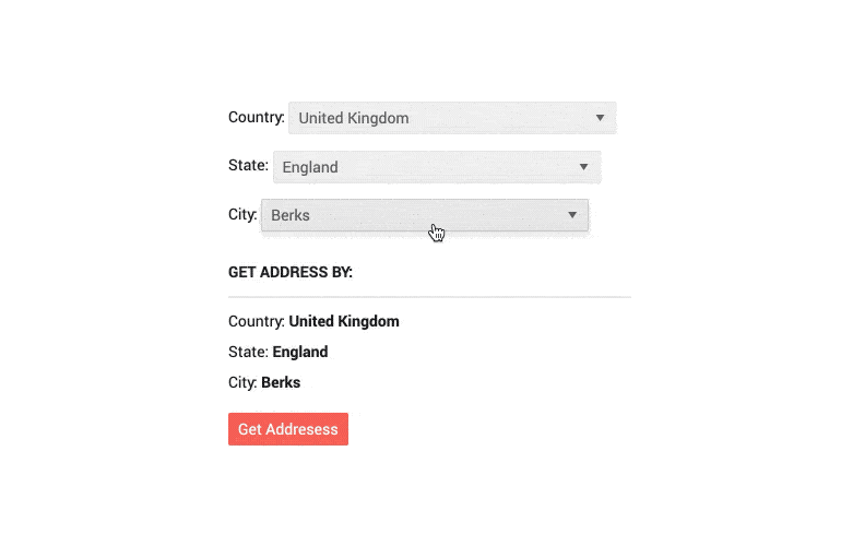
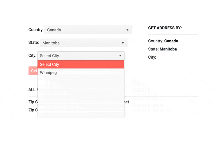
You can bind the Telerik dropdown to a simple collection of numbers or strings, or entire models from your Blazor app.

-
DropDownList Events
The DropDownList component exposes 3 events – OnChange, ValueChanged & OnBlur to let you handle user input any way you need to. They are triggered as their names suggest – when the value is submitted, on every keystroke and whenever it loses focus.
-
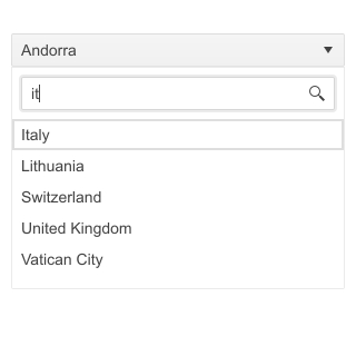
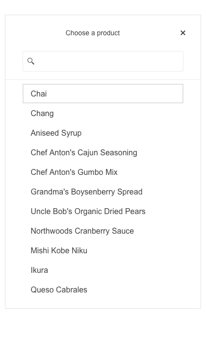
Filtering
The Telerik UI for Blazor DropDownList supports filtering—perfect for when you have a huge amount of entries in the list. Your users will benefit from quickly finding the information they need, especially when searching through long lists of countries, brands or people. To facilitate user interactions even further, you can modify the empty filter input in the popup by setting a hint through the FilterPlaceholder parameter.
See how to filter items in the UI for Blazor Dropdownlist component
-
DropDownList Popup Settings
Within a single dedicated tag, the Blazor DropDownList allows you to simply configure minimum and maximum dimensions along with width, height and class that are already exposed parameters. In addition to that, the Open and Close methods of the DropDownList allow you to toggle the popup visibility without triggering the OnOpen/OnClose events.
-
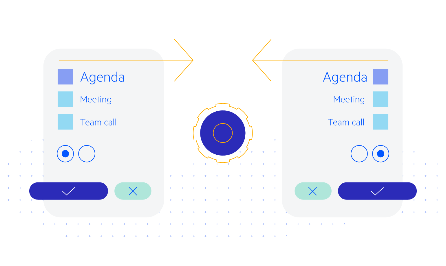
Customizing DropDownList with Templates
You can customize the appearance of the Telerik UI for Blazor DropDownList component through templates to display data in your desired manner—from adding more data formats than just text (such as price) to implementing a grid-like multi-column dropdown with a few lines of CSS. You can modify the:
- Value Template – what the user sees from the selected item
- Header Template – your own content above the list of items in the dropdown
- Footer Template – Always visible below the list of items
- Item Template – how the individual items render, so you can add more than just their text
- No Data Template – when there are no items to be displayed
Check out the Blazor DropDownList appearance customization demo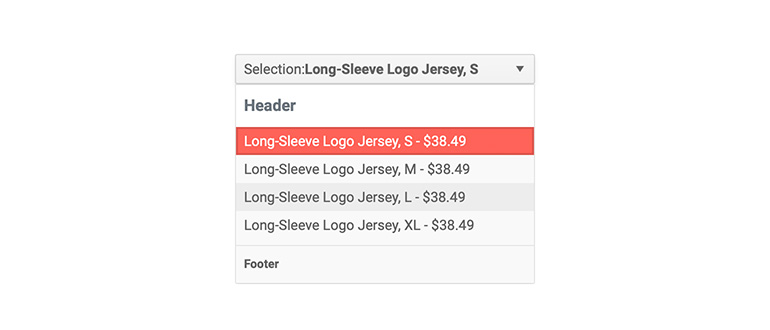
-
DropDownList Forms Validation
Built-in support for EditForm and DataAnnotation validation is a must, and it is available out-of-the box in all Telerik Blazor components, including the DropDownList.
-
DropDownList TabIndex
The Blazor DropDownList component, just like all other Telerik UI for Blazor input components, supports keyboard navigation to switch between components thanks to the HTML TabIndex property. Pressing Tab will normally focus the next available input component, the same way your users are accustomed to when standard HTML inputs are used. Having the TabIndex setting lets you customize that order. -
DropDownList Grouping
The built-in grouping functionality enables category distinction within the DropDownList. You can easily separate options in different groups and categories, the category that is currently displayed is shown at the top of the list for easier navigation with the control.
Check out the Blazor DropDownList Grouping functionality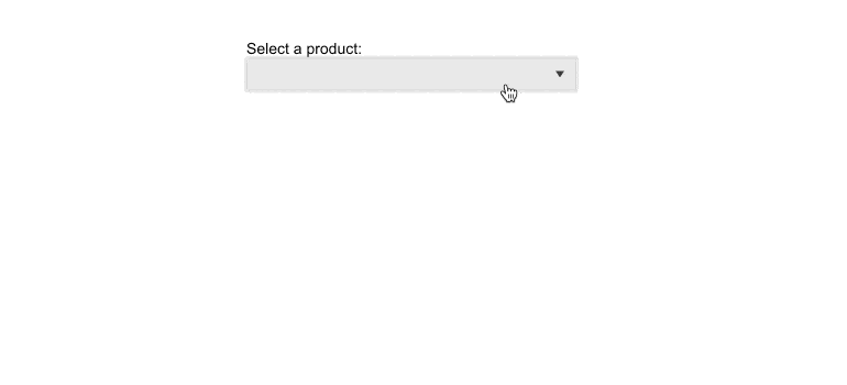
-
Virtualization
Virtualization enables on-demand loading of the items in the DropDownList, significantly speeding up the time needed to display the list. Combine virtualization with the filtering feature and you get a blazing-fast DropDownList even for large amount of entries.
-
DropDownList Adaptive Rendering
Setting the AdaptiveMode parameter to AdaptiveMode.Auto provides you with a mobile-friendly rendering of the DropDownList suggestion popup. This mode allows the component to change its rendering and automatically adapt to the current screen size. In auto adaptive mode, the DropDownList component also allows you to define the title text rendered in the header of the popup.
-
DropDownList Accessibility and Keyboard Navigation
Semantic HTML and support for the accessibility standards (WCAG, Section 508 and WAI-ARIA attributes for screen readers) let users with disabilities use the Telerik dropdown list with ease. The built-in keyboard support lets you navigate the component and select the desired item without having to touch a pointing device.

-
DropDownList Theming
The Telerik Blazor DropDownList has several built-in themes such as Default (our own styling), Material (based on the Material Design guidelines), Bootstrap (which looks like the Bootstrap styling to integrate better) and Fluent (based on Microsoft Fluent UI). You can easily customize any of out-of-the-box themes with a few lines of CSS, or create new theme to match your colors and branding by using the Telerik SASS ThemeBuilder application.
-
Built-in Boundary Detection
Blazor DropDownList enables you to set its boundary detection functionality by using the collision binding property. The property specifies the behavior of the component when it does not fit in the viewport. By default, the component fits horizontally and flips vertically.
-
Right-to-Left (RTL) Support
The Telerik UI for Blazor DropDownList component supports right-to-left configuration. The RTL functionality is supported by most of our components to accommodate users who communicate in a right-to-left language script, such as Arabic and Hebrew.
Learn more in our Blazor Right-to-Left Support documentation
-
Utilize a List of Choices with Blazor DropDownList
The Blazor DropDownList lets the user choose one option from a list of choices. It provides flexible data binding, appearance customization through templates, events, validation, accessibility and keyboard navigation. You can also have a placeholder message for no selection. The DropDownList works in both Blazor WebAssembly (WASM) and Server-side Blazor apps
Telerik UI for Blazor DropDownList demo