
UI for Blazor
Blazor Chip
- Leverage the dynamic UI building blocks within Blazor Chip component to display information in stylish containers.
- Part of the Telerik UI for Blazor library along with 120+ professionally-designed UI components.
- Includes support, documentation, demos, virtual classrooms, Visual Studio Code Extensions and more!
-
Organize Items in Stylish Containers with Blazor Chip
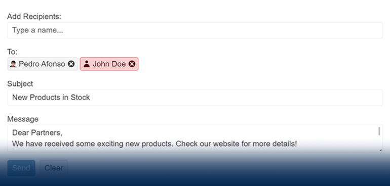
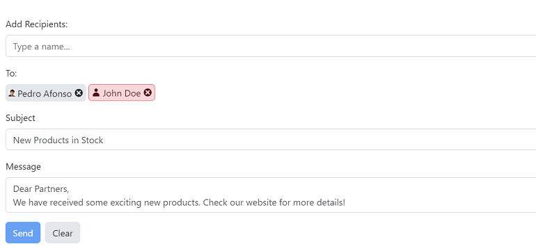
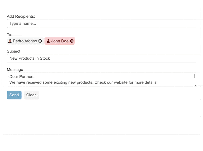
Create compelling UX by listing items in stylish containers called chips or pills with the Telerik UI for Blazor Chip component. This small building block component can contain text, an image, avatar or a close or delete icon to indicate optional call-to-action. You can leverage the Chip exclusively or alongside other components to showcase unique values that have been selected by the user.
-
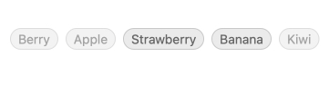
Appearance
Play with the multiple appearance option within the Telerik UI for Blazor Chip to better fit your design needs. The FillMode controls the component background, while the RemoveIcon defines what icon will be used for chip removal. Rounded configures the chip corners and the Size adjusts the chip dimensions. Last but not least, the ThemeColor allows the chip to apply one of a set of predefined theme colors to the text color and background color.
-
Chip Types
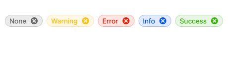
The Telerik UI for Blazor Chip component comes with multiple ready-to-use types, each with its own style. Save time and efforts by leveraging the already available base, info, error, success and warning chip types.
-
Customization
The Telerik UI for Blazor Chip component is equipped with multiple customization options, enabling you to include icons, images, avatars, custom icons, links or any other content within the chip. Alter the look and feel of the Blazor Chip component by simply setting custom CSS classes.
-
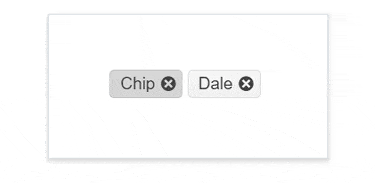
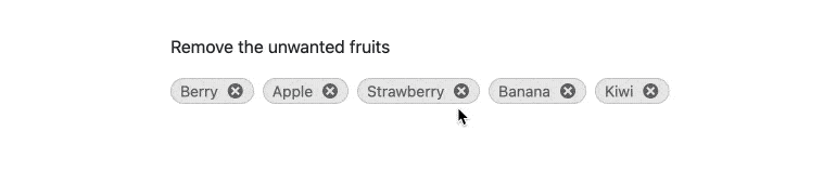
Removable Chip
Easily configure whether the Telerik UI for Blazor Chip should provide a built-in close or delete icon through the removable property. This will enable users to remove certain chips from the list of available items with a single click. If the property is set to false, the Blazor Chip component will render without this icon.
-
Disabled Chip
Meet all use case scenarios including those that require the Blazor Chip component to be disabled until a specific condition is met, e.g., when certain items are not available at the moment. Although, the Chip component is enabled by default, you can use the disabled property to quickly disable the component or vice versa.
-
Events
To ensure smooth interaction, the Telerik UI for Blazor Chip component exposes different events related to user interaction - clicking, selection and removal.
-
Accessibility and Keyboard Navigation
Leverage the Ocean Blue A11Y color swatch within the Telerik UI for Blazor Chip component to ensure AY11 compliance—it addresses corner cases for color contrast. Moreover, with this component you can navigate around and invoke all actions using the keyboard alone.

-
Chip Theming
The Telerik UI for Blazor Chip component has several built-in themes such as Default (our own styling), Material (based on the Material Design guidelines), Bootstrap (which looks like the Bootstrap styling to integrate better) and Fluent (based on Microsoft Fluent UI). You can easily customize any of out-of-the-box themes, style a specific component instance or create new theme to match your colors and branding by using the Telerik SASS ThemeBuilder application.
-
Right-to-Left (RTL) Support
The Telerik UI for Blazor Chip component supports right-to-left configuration. The RTL functionality is supported by most of our components to accommodate users who communicate in a right-to-left language script, such as Arabic and Hebrew.
Learn more in our Blazor Right-to-Left Support documentation

